Hi @Marius, I think it is mostly subconscious ignored on my end ^^
And most of the time, when I notice something there is an update that pops up, which already provides a fix 
1 Like
Unfortunately, I’m not able to do that.
I fixed that right in the beginning on my end around 1 year ago and totally forgot about it.
Wasn’t aware this still exists.
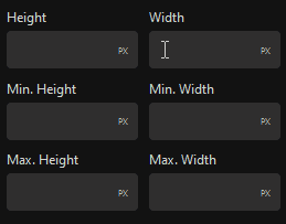
Overflow related issues are kind of annoying since every browser and/or OS uses their own scrollbars.
There are probably dozens of combinations in the end which just can’t be checked or tested by the devs themselves.
But I don’t see any problem here, since users can always report their issues and fixes are delivered quickly.
While we are on this subject already:
I really like the newly introduced custom scrollbar for the Navigator.
It gives consistency (OS/Browser), saves space, and prevents annoying content shift when the scrollbar appears and disappears.
Any plans to add it for the page/block options panel?
3 Likes
@Louis nice work on the refreshed UI. You’ve somehow managed to keep the compactness of the icon approach while making each section a lot more intuitive with the labels.
vs
5 Likes
Thank you @sunny, really appreciate it 
It’s been an evolution from trying to completely remove the scrollbars to finding that spot where icons can serve their role for groups of properties, while giving the necessary space to labels to do what they do best.
A search bar will also be coming to help you go faster in those necessary moments!
3 Likes
Agree. The new one is more intuitive. The labels clear all the confusion. Good job @Louis
Appreciate it. 
1 Like
An excellent improvement indeed.
Absolutely remarkable how much effort and detail is put into the UI and UX.
1 Like
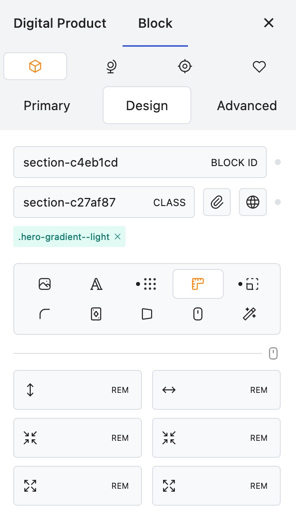
Selecting a value of the position property, owed to the dropdown, feels a bit cumbersome in my opinion.
It’s used so frequently; I think the process could benefit from an improved area.
The order of the values inside the dropdown doesn’t make much sense to me either.
Maybe just something like it was done with the display property?
Very minor, but feels kind of random for me that the visual tab, which by the way in my opinion is a perfect fit for the last position anyway, is placed before the position tab.
I somehow miss the possibility of selecting the position inside the Primary’s tab as well.
What do you think?
3 Likes
Great improvment!
I’m sure structure panel could benefit from it, as well as other parts of UI, removing borders and reducing blocks height a bit (not so much as my drawing!).
And I would unify buttons and input height too.
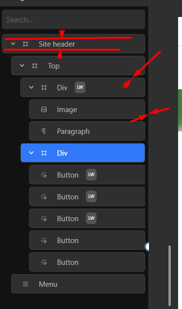
@yankiara Refer to this thread for Navigator suggestions. Navigator Experience
It’s a nice suggestion. So, did you mean, the rest of the values will be visible as a dropdown option when “+” is clicked?
1 Like
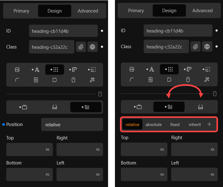
Yeah, as mentioned, just like we control the display property:
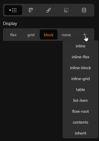
How it could look like in the end isn’t that important to me. But the current dropdown is kind of fiddly, which wouldn’t be an issue, but it’s a property which is used all the time…
2 Likes
Sounds good. This arrangement is a minor improvement, but it makes workflow faster. 
1 Like
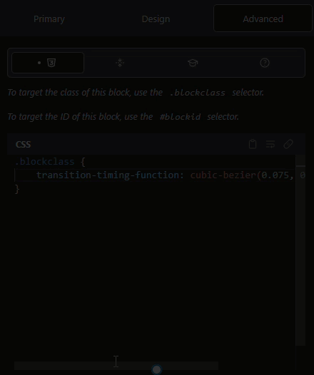
Are there plans to address this section at some point?
Maybe there are plans to implement an own solution?
Looks a bit old-school inside this modern UI 
Anyway, my original intention addressing this, is the non-optimal appearance, when the dark mode is enabled, dropdown list included.
So, in case there are no plans to change things here at some point, some tweaks for the dark mode would be great.
1 Like
Hi there,
It has been a while since the UI Update. @sunny showed the difference of the icons and labels here:
I like the approach for adding the name of the field, this helps especially beginners for finding the right fields without hovering over the symbols. I also like the bigger bar for changing the size of certain block aspects that comes with the addition of the name.
But I still catch myself pausing for reading the UI names, where no icon is present. I am someone who prefers visual guidance and liked the icon approach better. Personally, I would keep the icons, because there is the space for it, but this might also clutter the UI…
An alternative could also be to be able to toggle the icon visibility/ have an advanced mode like before where just the icons are displayed? Well, this would improve my UX 
Not sure why the icons were removed so it is hard for me to compare the old concept to the new one…
_
Hi @Marius, I like the approach you mentioned for displaying the position property like the display property.
As for the position of the visual and position tabs, I would also agree to change the position for a better workflow switching from the display tab to positioning.
_
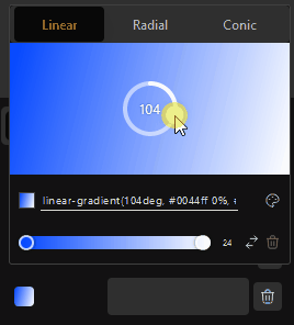
Love the Global Gradient addition that came with 1.2.9.4.3 .
But the color picker selection radius could be a little bigger otherwise new color stops are added quite easily
2 Likes
@Louis Thanks for fixing the Quick Inserter. From a couple minutes of testing, it seems much more predicable now.
Edit: I did actually notice something minor.
- Try inserting a Div > Heading > Paragraph > Button > Div with the Quick Inserter. Initially it goes in the proper order, but then starts inserting above instead of below.
Thanks, @sunny.
While the insertion position has been fixed, the selection of the blocks when inserted needs to be tweaked (next update).
Appreciate the example!
3 Likes
Hi,
l really like the addition of the Font Manager that came with v. 1.2.9.5.
The font manager was also mentioned in some other topics:
And here are some additional personal thoughts from me 
The UI could be a little bigger
- The Install Button, Styles, Font, variation, trashbin should be Bigger, you have the space
- I would love a secondary View mode (Big) like in the Windows Explorer. So if I am actually exploring a font I can view the font in detail.
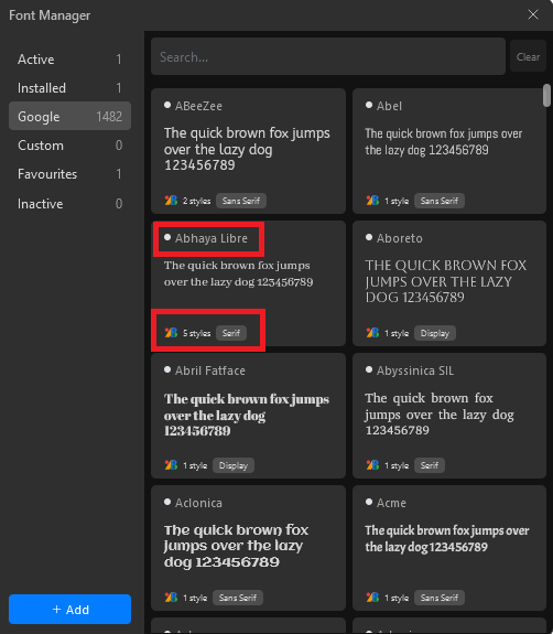
I would really like a global option to disable the google hosted option completely. Or to disable it by default? That blue shining button gives me the creeps and won’t let me rest peacefully 
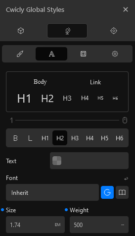
Or maybe a better indication for when it is used?
This Screenshot is from a Header. I know the font is Inheriting at the moment, but the Value is missing. Additionally, is the font Google Hosted on or not? Again, that creepy blue button. 
Apart from that, this is a super awesome feature
+The YouTube Tutorials have become super focused! I really like that a lot 
4 Likes
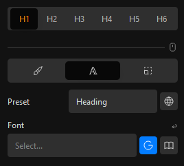
I have to add something here.
The choices of font weight should be shown as a dropdown list.
Hi there @T-low,
Thanks for the feedback, really appreciate it.
As for the size of elements, we will try to accommodate a bigger font size although you will be surprised how quickly space is occupied depending on the font properties themselves.
I can assure you that no Google fonts are called for on the frontend if you don’t specify a font on the backend. The font location property is simply a way to modify the selection options between Google and locally hosted fonts, and its active state does not mean that Google fonts are loaded.
The only issue we currently have with switching the defaults of the font location (Google or Local) is that this would also modify the behaviour on existing blocks that might possibly have Google fonts attached. We can provide the option to remove Google hosted fonts completely, but this would come with the understanding - on the user side - that doing so will disable all Google fonts on previously created blocks.
1 Like