I want to create a place where we can “cwicly” add small UI/UX suggestions/feedback without creating a new topic for each of them. So feel free to jump in with your ideas, mockups, complains etc.
1.1.6. is a nice update. Small/medium iterations like this will compound over time and will lead to a much more enjoyable user experience and also higher productivity.
Here we go with some random thoughts:
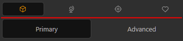
-The new Primary tabs is a step forward. I would argue that Sizing should also be squeezed in there for DIV’s or switch with typography block. (these are mostly controlled globally anyway)
-For the global CSS stylesheet editor, it would be suitable to have it’s width controllable (just like the structure panel). In it’s current format, I find it to narrow to work with it.
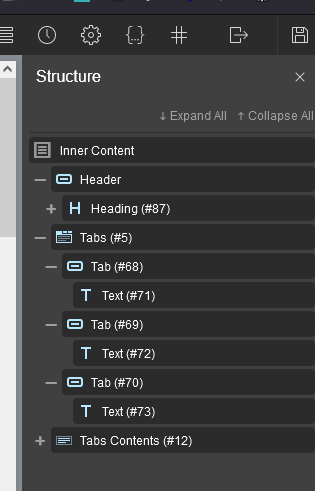
-For a hidden element (from the conditions panel), we should have somewhere a visual representation of that. (maybe an eye icon in the structure panel so we can quickly identify it)
Here’s one for me: Allow for “pop-out” on the Nav block (and if possible, the settings block) to a separate window that can be moved to a secondary screen. For those of us without ultrawide/hidpi monitors, the workspace gets pretty crowded, pretty fast.
I’m thinking of a new dedicated window that’s initiated with no “chrome”, i.e. window.open(url,'window','location=no, menubar=no, resizable=yes, scrollbars=yes, status=no, titlebar=no, toolbar=no');
Another one: More immersive editing experience for global classes, including the option to “promote/demote” to/from local & global classes.
Global classes are supper useful, but the most immersive design formation experience obviously exists directly on a block itself. It’s not uncommon therefore, in my flow of formulating a design, to want to take the settings from a local block and “promote” them to a global class that is (obviously) then available to style blocks site-wide. Conversely, it’s not uncommon to want to create a variation of a prior global style, so “converting/copying” the settings from a global class into a local block could help to complete the circle of this workflow.
In the same vein, it would be incredibly useful to be able to edit the settings associated with a global class directly from a block where it’s assigned. I envision this working the same way that the “Relative Styling” settings pop-up over the standard settings sidebar, with the difference being that it provide as “shortcut” into the global class settings (and can be dismissed in the same way).
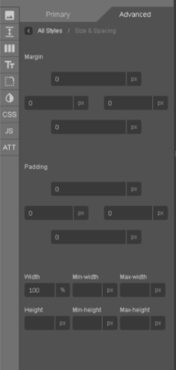
For me it would be a more consistent writing orientation. The UI is really consistent but has potential for improvement.
Like here in the Margin & Padding section. The Margin and Padding headers are aligned left but in the selection boxes it is aligned to the right.
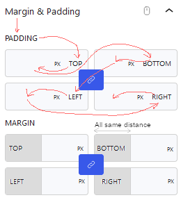
On my part this creates a very complex reading experience compared to reading normally from top to bottom and from left to right. As the image below shows with the red arrows.
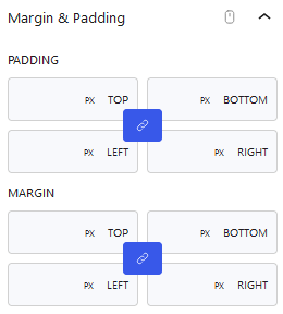
I am also missing focus points. In the lower part of the picture above I edited the layout a little and it already looks more appealing, well at least for me. But with the additional color in the fields, you see the fields more easy. I would also apply this to the active Advanced Tab and mark the active menu tab in a darker color.
Well those are my thoughts. Love the work of the cwicly team and especially the active progress of it all.
I do agree with the part of consistency and find the best solution would be to replace the text with icons.
This saves valuable space, size is always the same, and also makes it more “readable” in my opinion.
A tooltip that appears on icon hover (with position description; e.g. “top”) could be added, if necessary.
I do disagree with the position swap, it should stay where it is. It could become a possibiliy in case icons are used instead of text
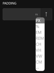
In addition, the dropdown values should be larger, right now they are barley readable.
Also, if possible, it could be made dark-mode ready.
Thanks @alex, I really like the idea behind this post.
Suggestions and feedback on how to make the interface easier to use/clearer is something we really appreciate.
Yes, the Primary panel could welcome a few more components in certain cases. We are still in the process of reviewing the Advanced panel and seeing how we can best use the tabs approach.
For a width/height controllable CSS editor (on another note, we’re also looking at SCSS support)
If conditions are applied to a block, a small CD acronym will appear in the navigator (or am I misunderstanding what you meant?)
Regarding conditions, indeed it appears when a condition is added (when at minimum the new condition + button is hit), but it doesn’t when just one of the quick hide conditions is used (hide block for logged, hide block for guests)
1.1.6.1 - Awesome that we have the quick block inserter. I would have been my next suggestion on the list (based on the fact that now drag and drop works smoothly on all block)
I see this doesn’t support drag-and-drop, but it speeds up the workflow anyways.
It would be awesome if the Quick Block Inserter features an edit mode to re-arrange, add and delete items.
So instead of the “add Block to the Sidebar” icon, an “edit Quick Block Items” icon could be introduced.
This would offer the possibility to drag and drop the blocks into the Navigator or Canvas directly.
Well, at least in theory.
Not sure if it’s possible, but this is my suggestion how things could be improved even more.
It’s an extremely useful addition in its current state, please do not get me wrong here.
I would like the navigation panel to have smaller boxes. Right now, I think it takes up too much room. It can be resized, but depending on how deep you go with the nesting, you then have to scroll horizontally, which can be a pain.
I see a request to be able to move off screen, which would be good, too.
Basically, just want more real estate (probably just need an UW monitor)
Definitely can see your point here, this has also been an issue for me.
But this is not exclusively on Cwicly, it’s rather a general “problem”.
The space for possible improvements is small (in my opinion, but it’s definitely there) and significant changes will most likely harm the UI.
Do you have specific suggestions?
I agree it’s not much space with a standard 1920px display, the new scaling feature improved this situation a lot for me. I’m now able to work on my 14" notebook without workarounds like decreasing the browser zoom.
Sure, an UW monitor or a higher resolution will always improve things. It’s an entire different workflow experience compared to a simple full hd monitor.
What is also needed is a resizable options/designer panel, which would’ve fit actually pretty good in the recent update.
The boxes take up a lot less room, which is what I would prefer. Or at least the option to resize.
It’s really just CSS. I’ve played around with it before in DevTools, but I don’t know how to edit backend styles and add my own custom CSS that will “stick”. If so, I’d just tweak a bit and add the snippet to Advanced Scripts.
An option to switch from default to compact is an amazing idea, great suggestion.
Scrolling bar also takes away an awful lot of space. Would recommend to change that in case you are on W11. That also removes the annoying content shift inside the right panel when opening an accordion and the scrollbar appears.
I am missing 1-2 things inside the block inspector.
The reason why I didn’t mention it to date is, because it was cluttered, especially the Primary tab.
It got better over time but with v1.1.6 I’m seeing great improvements.
So there could be an area, for instance here (red area):
where the current block (description from the Navigator) is displayed and maybe even also editable.
In addition it could contain the Navigator tree (clickable block breadcrumbs), like:
Section > Columns > Column > Heading
I know this is already available in Gutenberg, but same problem here like with the block description from the Navigator:
The way you have to move with the mouse and/or eyes is just too far, in case I just want to check which block I am currently editing.
I’m losing focus, travelling all the time from one area to another.
Hope things are clear, was too lazy to create a mock-up, but will do if necessary.
In case this gets considered, in could come with an option to enable/disable it, because space is valuable and there are people who don’t need this anyway.
Also, the blocks in the Navigator could be collapsed by default.
Not sure why it would make sense to display everything when entering FSE mode.
It’s just 1 click so I really don’t care about it. Just on a side note.
How about doing it (visually) like the Quick Block Inserter on the left side
Tabs instead of the accordion would be so much better.
Plus, the user could declutter the panel on its own and just remove the areas which are not used, e.g. custom CSS, AOS, etc.
For reference and giving a visual example, Recoda for o2 does it a similar way:
Target could be:
No scrolling, max. 2 clicks to reach the desired option.
It would save so much space, existing design could be re-arranged to give elements more space, inputs (where necessary) could be done larger, etc.
 For a width/height controllable CSS editor (on another note, we’re also looking at SCSS support)
 (based on the fact that now drag and drop works smoothly on all block)
