Hi @jornes,
I agree with your point.
The dropdown will be re-introduced soon, although we might wait until dynamic variables are available.
Cheers,
Hi @jornes,
I agree with your point.
The dropdown will be re-introduced soon, although we might wait until dynamic variables are available.
Cheers,
Alright. Thank you @Louis !
The MDN Reference popover, which appears when hovering a CSS property inside the Quick Code editor:
Aside from that, I never make use of this popover information and it also kind of distracts me in other areas where custom CSS comes into play.
Maybe an option to disable the popover would be it.
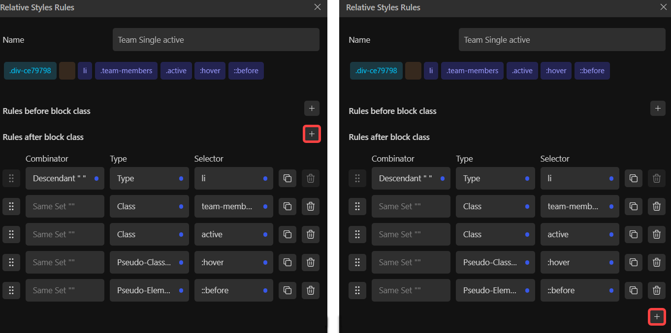
Some thoughts about some Relative Styling areas.
Adding new selectors inside the rule editor doesn’t feel convenient.
I tried it regularly since the UI update but couldn’t get used to it.
The more selectors are involved, the more mouse travel is required.
Not sure, it just feels and looks wrong.
Left, how it currently is. Right, which would improve things for me.
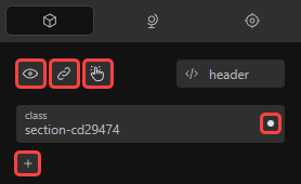
I would appreciate a right-click menu for the RS items below the class area.
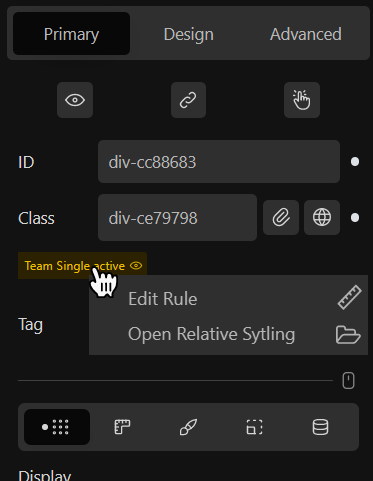
I am using relative styles more and more frequently. @Marius that right click > edit rule & styling menu idea is brilliant.
Agreed, @Marius, both moving the [+] button’s position and adding a right click menu on the relative style chip are both worthy of inclusion.
Navigator context menu → Include Popover block for Insert and Wrap functionality.
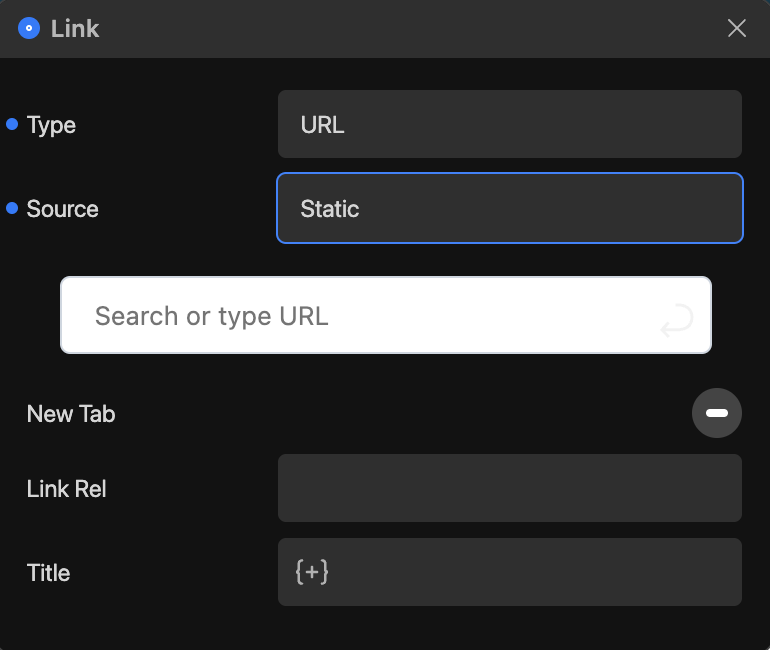
Just resurfacing this. Agree with @Marius 100%, the bright background for the initial link selection field is an eyesore (literally  ) in dark mode. Given how polished the rest of the UI has become, this is just asking to be made consistent, even if just starting with making the background and font colours grey / light grey instead of white / dark grey.
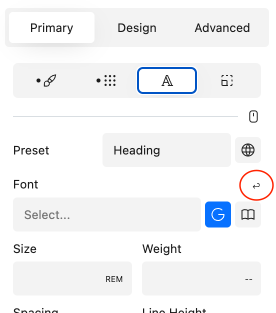
Any thoughts about the order of the transition property inputs here?
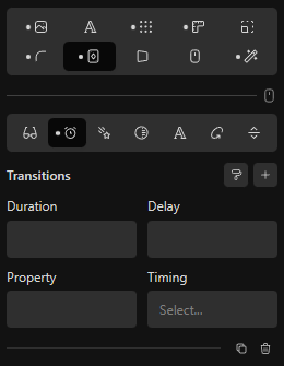
My personal preference would be:
Timing could be on 2nd place as well to have duration and delay on the same row.
But when I start defining these rules, I start with the property I want to address.
Not sure if there is a standardized way, it’s just how it makes sense to me.
The Swatch block icon has a different color (#2c3e50) than the other ones (#9e9e9e).
Thank you for addressing that @Louis.
It’s been changed for quite some time and since then I’m really enjoying that tiny tweak.
It just feels native now.
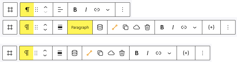
I have a question regarding the toolbar.
1.) Gutenberg Block
2.) Cwicly Block with block name
3.) Cwicly Block without block name
Is it necessary to display the block name in Cwicly? Does it fulfil any functionality?
Gutenberg doesn’t do that. The icon (with the tooltip) is sufficient in my opinion.
The toolbar in Cwicly reached a considerable size and this small adjustment could improve it a bit.
On a side note, the align icon(s) do not match the icon design language of the other icons.
The Gutenberg’s one is also more meaningful/intuitive (imo).
How about using the Gutenberg ones (if possible/allowed) to streamline the general experience?
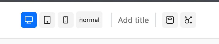
1.) Old UI
2.) New UI
Items on bottom are not separated anymore from each other.
Community item should probably move to a new line.
With the icons approach, the tooltips inside the editor are quite important in Cwicly.
In dark mode, the contrast is not optimal. This could be improved.
Is there any reason why the following ones do use GB tooltips?
I think due to the tooltip delay, some users do not know what some elements are doing - they never see the tooltip.
For instance, Show/Hide (which also lacks description; show/hide what and where?).

Lack of description; neither a GB nor a Tippy tooltip.

A Switch to Class/ID tooltip could be added, in case there are currently no plans to make it more obvious to the user.
Probably self-explanatory, but for the sake of consistency, a tooltip wouldn’t hurt:

Quick Inserter Add Block Icon
Hopefully by adding tips on discourse, we can help people new to Cwicly find features like this more easily.
First of all a big THANK YOU to the awesome Cwicly team. 
I like the changes in the new site header layout which gives me a sleek clean impression:
old
new
I allso like the elements of the Design Library, Components and the Navigator.
My muscle memory is a little affected by them, but that will go away with time.
Since my personal selection of blocks just fits into the Quick Inserter, everything is fine for me. This might be different for others. I would probably have placed them in the top bar of the header layout as before, as they add great functionality (are important). An alternative might be to remove them and put them as blocks in the Quick Inserter so you can personalise the bar as before.
Was there already a keyboard shortcut to toggle the navigator? 
And oh my, what great stuff Components are
Well, since I thought the link selector got a new design, I was going to mention that too, but it seems to be back to normal. 