Hi @Marius,
really like the thoughts that you brought up.
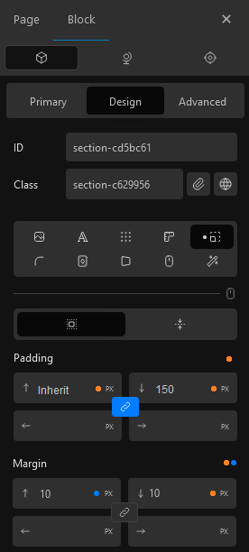
Love the collapsible UI design that you showcased here ![]()
I would directly approve all except for the third?
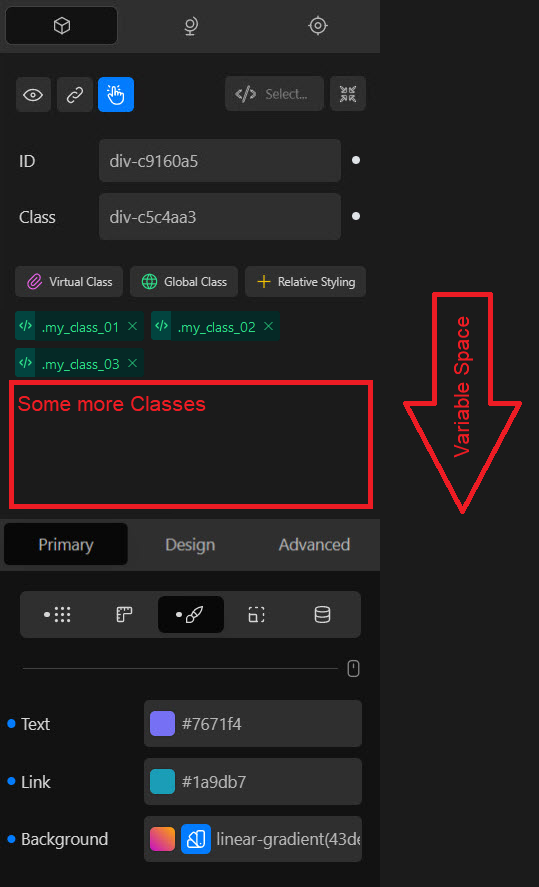
If you mean these three:
![]()
I think those are as main tabs in the right position and give in that position a better overview.
The other reason would be that if for whatever reason you have a lot of classes or other fields that push down the menu. One would have to scroll, and the menu would be in a different position for each block when the block editor would not be collapsed and with that the consistency would suffer from it.
As for better reach or a better focus I would probably prefer the possibility of hotkeys.
I would like to add my own thoughts to your list:
- More dropdowns of properties for not that knowledgeable people and simplicity.
Edit Wrong example
- I miss some visual guidance that was removed, which slowed down my working progress by reading labels. I already mentioned it in the big UI/UX topic:
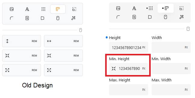
As even the new version would have enough space for bigger numbers…
Especially for things like Row and Column:

- The other thing is, that I am still missing a proper concept for the Indication Of Default Values, which are inherited from a parent, linked blocks or classes.