Just want to address a topic, I do struggle with for quite a time.
I really have my issues to work efficiently with the Navigator in its current state.
There is a monotony present which leads to some chaos in my opinion.
Often, it is the case that I can’t recognize on which level my actual block lives and when checking on the right spot, I’m losing focus.
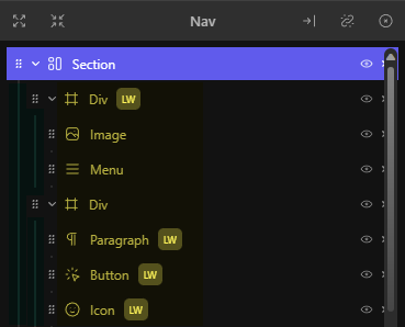
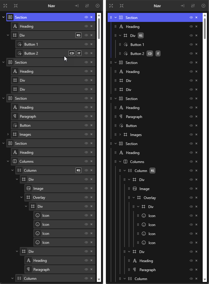
As an example:
The highlighted blocks do suggest me to sit on the same level, but that’s not the case.
In case these would be all the same block type (e.g. Div Block), it would be even more confusing.
My orientation point is the block icon and the block label.
Before the new design was introduced, I identified the block level by the blocks items itself which came with a background and border.
In more complex designs with deep nesting and many blocks on the same level, I lose the overview.
The (green highlighted) lines are not a visual present indicator which do support that in a sufficient way and as soon as I check this orientation point, my flow gets interrupted.
In my opinion, each individual block needs to stand out in a sufficient visual way.
Yes, this will need additional space which is a downside and I’m pretty sure there are people who like and appreciate the current state of the Navigator.
Unfortunately, there is no solution with some CSS, so I can’t improve things the way I need it.
It just looks and feels like an unfinished/barebone tool for me.
There needs to be a compromise between saving space and a clear structure/visualization, whereby the latter has more weight.
What’s your experience with the re-designed Navigator?
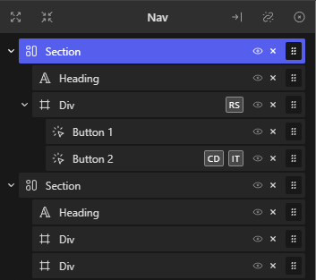
Just for reference here is how it changed.
I feel similarly, it could definitely be indented or delineated a little more clearly to make the parent-child relationships easier to see at a glance.
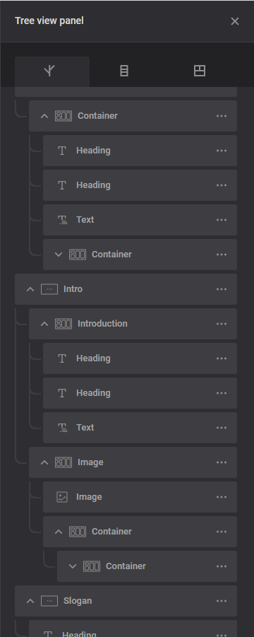
EDIT: In the latest version 1.2.4, however, the indentation now seems to be somewhat clearer than before (in your screenshot, Marius).
EDIT 2: Sorry, I was wrong, some child notes are more clearly indented by wider symbols than others:
I am missing only two things from Bricks now in Cwicly.
First is the Navigator (Structure Panel) with better visibility (I like Marius suggestion) and ability to drag block from the Block inserter into the navigator.
Second is the ability to keep block inserter open after inserting a section block. Block inserter stays open after inserting other blocks. But after inserting the section block, the block inserter closes for some reason.
I decided to dig deeper and could find a solution that fits my needs and requirements, it’s CSS only.
If someone is interested in that as well, please let me know.
I’ll check for browser compatibility then and will comment the CSS properly, so you can make your own teaks with ease.
I didn’t know I had any issues with the navigator until you pointed it out. Thanks! haha, but I like this look, where each element is in a distinct “boxed” section.
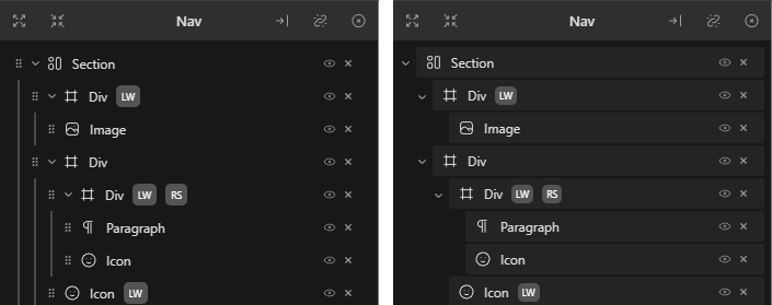
1.2.7.1 should help with the Navigator experience.
The docking/undocking logic has been reworked, as well as the resizing logic which should provide a more coherent experience.
Indentation has also been improved to provide a clearer view.
The dragging of blocks is now applied to the whole block, although keyboard accessibility is still present.
There may be a couple of bugs and/or odd behaviour. When docked, I cannot ‘open all’ or ‘close all’. If I undock the Navigator, sometimes the undocked window will be empty. If I close it, and reopen the Navigator from the CC menu button, the nav section elements reappear in the Nav window. When undocked, the ‘open all’ and ‘close all’ functionality works as expected. If I close all sections and dock the undocked Nav to the left or right, the sections are docked in an all open state.
Sometimes (but highly inconsistent) there will be two undocked Nav windows - one with the Nav elements, and one without. Usually when this happens, they are stacked perfectly on top of each other, so you need to move one to reveal the one underneath.
Are you able to confirm this behaviour at your end?
Click on the “Undock” condition.
To show all: click “Close all”.
It seems to work then.
BUT afterwards there is a
second bug:
Click on “Dock left” or “Dock right”.
Click on “Open all” or “Close all” => it no longer works.
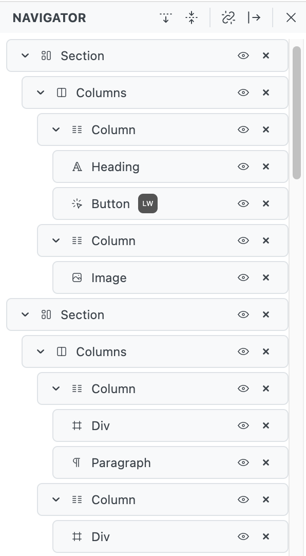
PS: I also find the visual view better now. However, I wonder how often you need the “Eye” icon or the “Delete” icon. Especially this repetitive view of the two icons in a narrow navigator list I still find a bit jarring.
Suggestion: Basically, highlight the hovered entry a bit (i.e. with a blue border) and then show the two (or only one) of these icons. Deleting, for example, is also possible with the keyboard and by right-clicking, but of course these are personal preferences.
What I noticed rather negatively is that you have to aim very precisely to select a list element. As soon as you click in the name area, the element is not selected, but you can change the name.
Suggestion: Use this area for selection as well and only allow renaming when double-clicking or right-clicking.
Thanks for the suggestions.
Indeed, looking at how narrow your navigator is and the general feedback we’ve received on our support, the visibility and remove actions will be removed and accessible in the context menu.
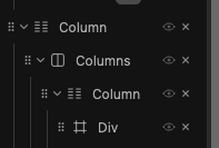
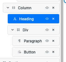
I’m not sure why your block icons aren’t aligning, since this is how it’s supposed to be:
We did try Double clicking/clicking to edit the block name but it didn’t end up being a consistent experience, and would eventually lead to more distress than anything!
And also show an indicator when there has a custom CSS code for that element.
Suddenly something came across my mind about the custom CSS.
As I noticed now, the custom CSS was inserted into a block by selecting a global class, but it didn’t stick to the global class.
In Bricks, when we insert a custom CSS into an element by selecting a global class, the custom CSS sticks to the global class. That being said, when I use the same global class for another block, I will see the custom CSS inserted and able to edit the custom CSS wherever I can when I select the global class.
New experience is awesome @Louis.
The Navigator has become really flexible and seems like I can use it in an efficient way now when it’s undocked.
Moving the icons to the context menu, I’m not sure about it.
They could both be available there, yes. But I think the users should be able to decide for themselves. So an option is rather what I would like to see here instead.
I have one small issue and maybe a small code snippet is sufficient here instead of an option which might not make much sense.
I would like to control the gap between the Navigator items. Seems like they stagger at 36px now. Is there any chance to de- or increase this value?

