As we wrap up the first phase of the Cwicly rework, and before focusing on the Design Library and Themer, I’d like to take about a week to focus on fixing some of the bugs that may be making it difficult for you to work with Cwicly.
Prioritising which bugs to tackle can be challenging, as it sometimes means addressing one user’s needs over another’s. All bugs are equal, but some are more equal than others
I’d really appreciate it if you could share up to three bugs (a link to an open thread would be great) that you think should be addressed as soon as possible.
I’m currently not able to use the color picker (not sure if this the only trigger for this issue) without breaking the builder, which also removes the possibility to save the page.
Users will just lose their progress when this happens.
The other spacing control “issue” should also be addressed.
With the new popover not working in a for the mainstream logical way, in its current state, I would also call it a regression.
It needs to work efficiently, as with the popover, an additional layer got added, which leaves no room for further cushions or compromises.
2.)
Modified indicators should work reliably, this is even more important as long as the “applied styles” overview has not been introduced:
3.)
Default units not working affects the workflow and efficiency to some extent.
I do not want you to waste time on this though, if this gets implemented to the block panel options in the foreseeable future.
It’s maybe not a bug, and it’s not reported yet I think, but there’s one thing that annoys me and confuses my clients when working with components, and it’s the inner block feature.
As much as I love it (and I really love it ), editing/adding stuff to an inner block is a bit of a pain.
Imagine a deeply nested Dom structure with an inner block at the end. It would be cool, when focusing the component that this inner block gets autoselected, otherwise they have to click their way through the navigator until they found the inner block and insert their blocks then.
Ir would also be cool to define default children of that inner block, which potentially also solves that problem above. For example when inserting that component always having a heading and a paragraph inserted too (not necessarily filled with text). It’s just so annoying to edit/add blocks to that inner block. Having the placeholders of paragraphs or headings there would let them click that placeholder on the canvas and get a better editing experience without the need of clicking through the navigator. Alternately for me it would be enough if every inner block renders an empty paragraph block by default if no content was set yet…
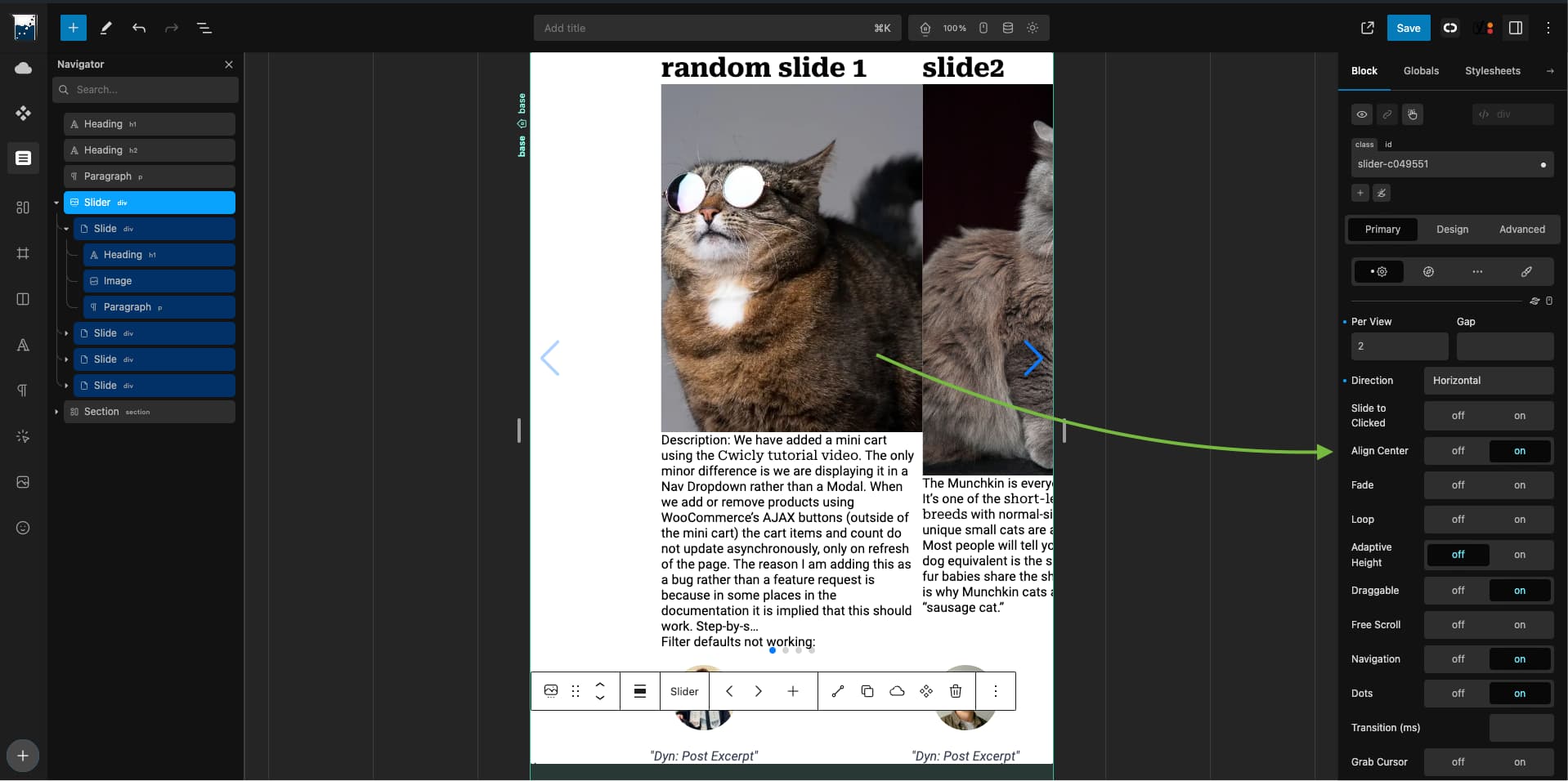
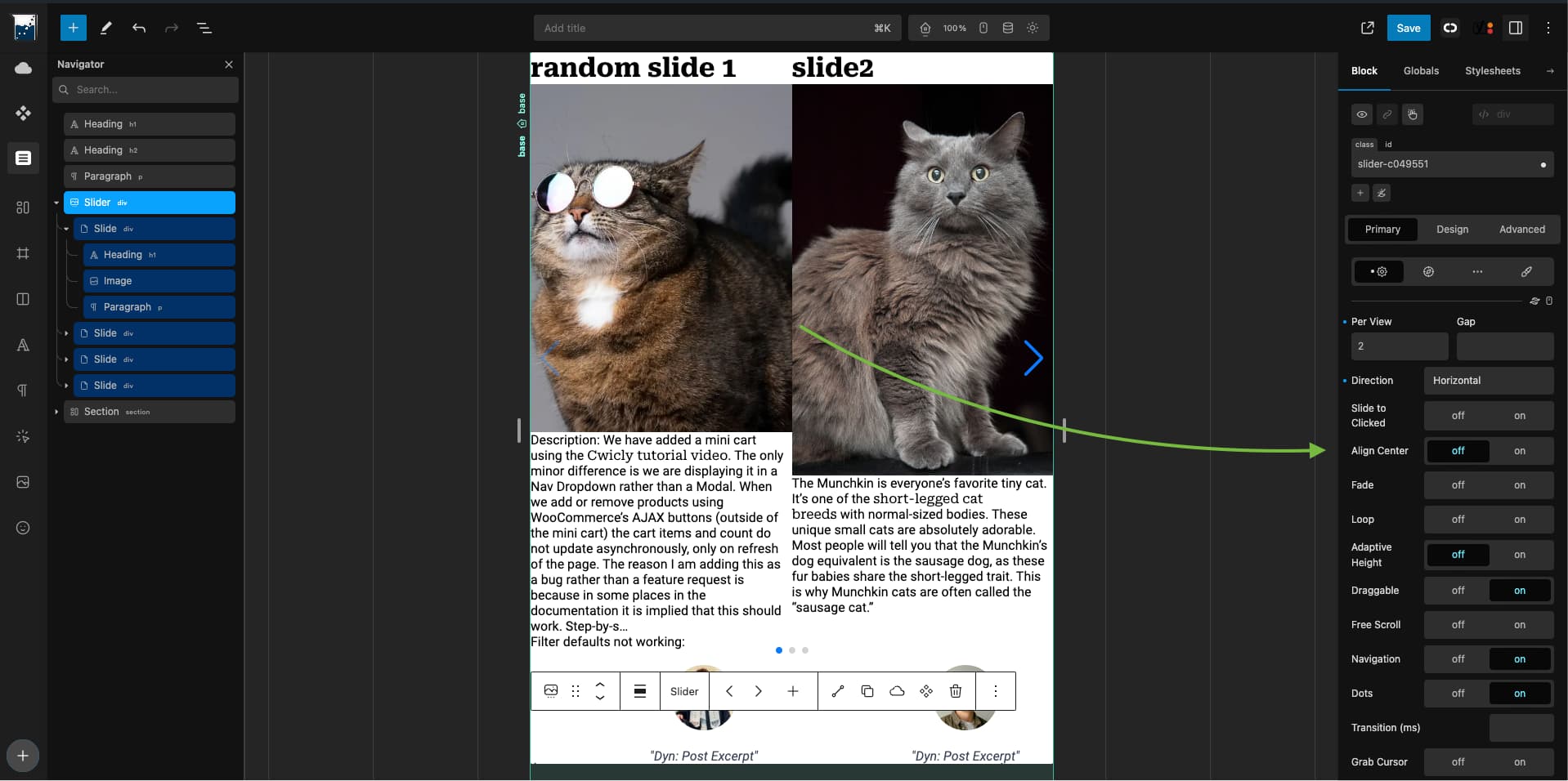
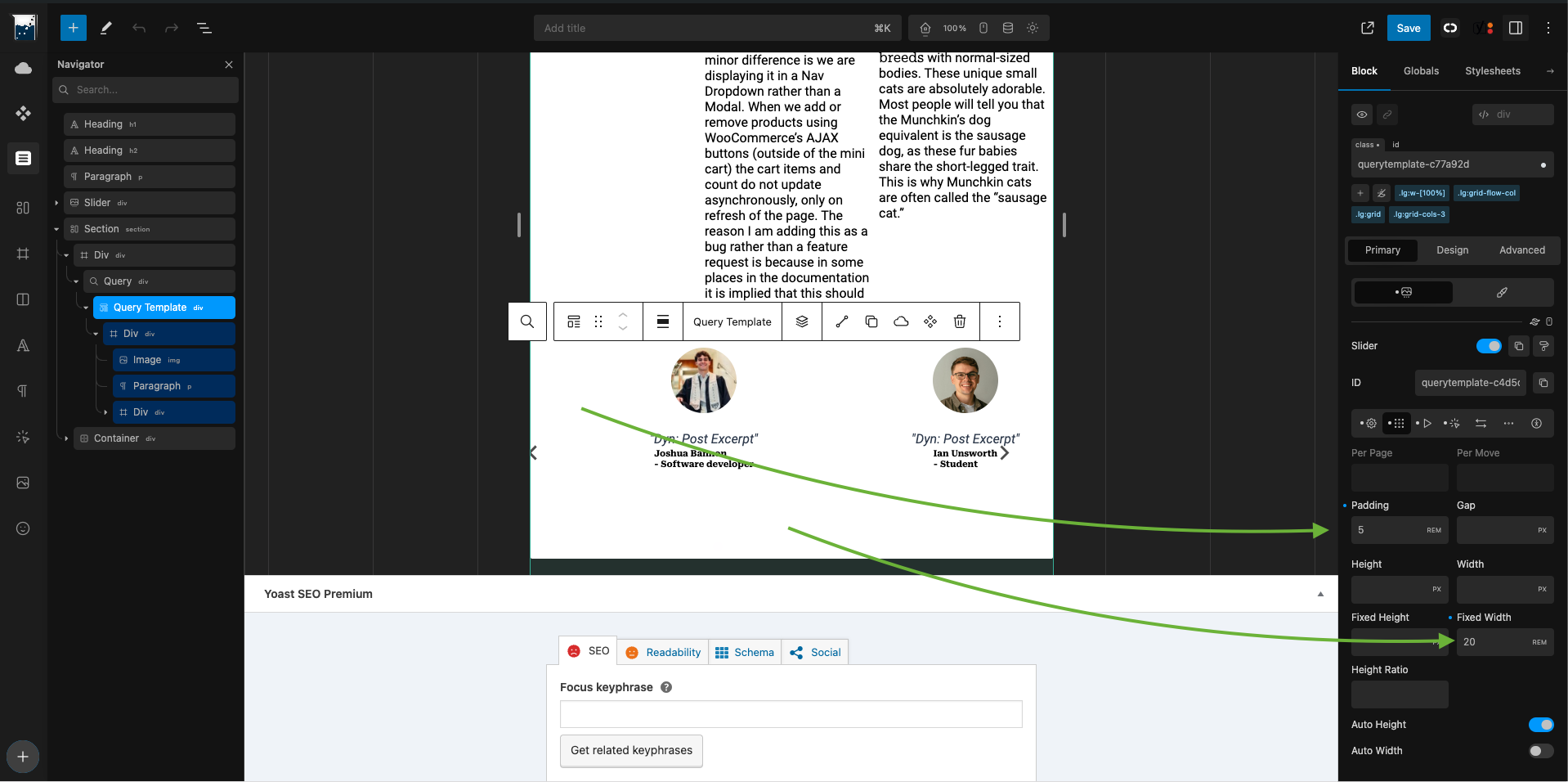
I haven’t yet reported this as a bug, but I’d love to get help with this. When I use the Cwicly slider functionality (in either the query block or as a standalone component), the items are cut off by the edge of the space allotted, leaving partially displayed paragraphs and pictures that omit the right (or left) halves of faces. I can’t get an integer number of items to display in the slider. I guess I can use Wonder Carousel, but I’d really rather not as its heavy, clunky, and inflexible.
Also, with sliders (less important since I can just hide them), the buttons migrate all over the page.
I’m really open to any workarounds/tips (“do this and it will work better”, or even “What made you do this?!?!”), or any ideas to make the cutting off of elements look intentional.
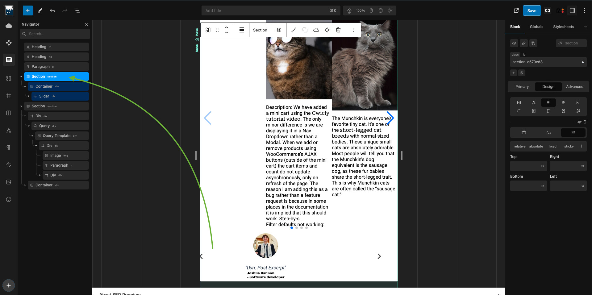
Buttons positioning (caused by first slider not being contained which then conflicted with second slider - wrapping first slider in section fixes it immediately):
That’s my favorite type of answer – it’s really easy for me to fix “I’m doing something wrong”. Thank you so much for bailing me out here! Is there anywhere I can look first, before posting, next time?
If you can’t find what you are looking for in the docs (e.g. Slider | Cwicly), searching the discourse is usually a solid first step - you can find all sorts of related goodies:
@Louis, I not sure how I missed the bugs in this report when reviewing the list earlier this week:
These were by far the biggest stumbling blocks for us this year and happened when we were developing a specific site that required a lot of taxonomy related content.
Currently we have had to use multiple code blocks to achieve what we needed, and it will be amazing to replace these with real Cwicly blocks, when these issues are resolved. So in my opinion definitely worth prioritising, as technically Cwicly already has everything in place.