When you’re heavily working on the post/template structure, having to right click then left click for all this is really anti-ergonomics.
Having some shortcuts is OK, but not sufficient, because sometimes you’re moving blocks with mouse, then you need to delete others, and now you either have to right click or to reach the keyboard, which is disrupting the workflow.
Some specific thoughts:
The delete button is hardly replaceable by a shortcut: I hate Gutenberg’s ALT-SHIFT-Z, and DEL cannot be used on text-based blocks because it deletes characters.
I think Hide/show has no shortcut but I could be wrong.
The old buttons should at least be accessible on HOVER, overwriting the right indicators.
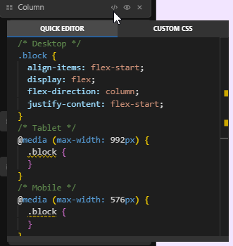
The quick code is not quick any more Besides, its position is not remembered. And when you leave it open, selecting blocks doesn’t update it, so it is very misleading.
By the way I’m not sure that Quick code should be part of navigation… It is a quick way to have a style overview, but I think it would suit best in inspector panel.
The “collapse/expand all” buttons have disappeared as well, although there is space left for them; dock/undock buttons are way less useful IMHO (at least in my workflow).
The custom CSS / relative style right indicators make no sense to me here because we’re dealing with structure (contrarily to link indicator which is related to site structure); I think they should be moved to inspector panel instead.
We took a look at a lot of different navigators out there - while also looking at the feedback left here and through our support help - and found out that the majority of them do not include quick actions.
Add to that the difficulty of displaying these quick actions when the navigator can be resized / very nested blocks, and you find yourself with the difficulties we encountered in the past Cwicly navigator.
Shortcuts are preferred in these circumstances (there is also ⌘X to remove blocks).
We might also be adding actions to the current indicators (links etc… to make them directly editable) which makes positioning quick actions (delete etc…) much harder.
Of course, nothing is set in stone, and we’re always happy to review this.
You might want to try Alt + clicking the block in the navigator (or global class/linked block class in the class list of a block)
Nothing much quicker than that, although the quick in Quick Code does not imply fast access as a primary function.
A screencast of the position not being remembered would be welcome, as I can’t reproduce it on my end.
The whole point of this new persistent mode for the Quick Code is being able to move between different elements in the editor without losing the currently edited element in Quick Code. The same applies to a Quick Code for a Global Class or a Linked block, I’m not quite sure I see what you’re pointing out like issue here. The Quick Code has never been linked to the currently selected block.
Also, it isn’t part of the navigator, it is part of the menu context, the context being the block, not the navigator.
Another shortcut for this is available: Alt + L
I’ll let other users respond to this if they choose to. We haven’t received this kind of feedback until now, and I’m always willing to revisit this if necessary, although I do believe these are essential.
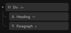
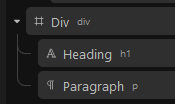
You’ll also notice that attributes have been added.
I’ve mentioned this somewhere else, the ability to create shortcuts for any/most context menu items for the Navigator items would be great to cover individual user preferences. So I agree with that.
But I would rather see that in the new Navigator options menu with a dedicated sub menu that contains all shortcuts to toggle on/off.
since this post turned more into a discussion, here I go too
I haven’t had the time to check out the new additions that came with 1.4.1 and only now updated a test site.
It looks really nice as far as I tested on what I have red in the comments.
I saw a lot of clips from @Araminta and really liked that. Would love a combination of those into a small video for better access, if not already planned
Removing the X icon, to remove an element is a little daring, when I think of new Cwicly users. I still find new areas and functionalities regularly, based on the fact that they are hidden with a simple right click. And a remove button is one of the things I would want to see → as someone new to Cwicly.
I am quite flexible and will probably adapt the Ctrl + X shortcut since I always and almost solely used the X button in the navigator. Will build new muscle memory
Would also love:
I like every aspect of granular control for a personalized UI experience
The other thing I directly noticed was also mentioned by @dennis77:
I have a HD monitor and I think the tags are a little small.
And sorry for keeping the praise short, it is as far as I tested a really great update
Thank you a lot
I have noticed in other builders they also don’t have those wee buttons on the blocks. Just something I became accustomed to in Cwicly for quick access. Suppose I will get used to it. Possibly leave it as an option in Cwicly settings to turn them off or on. But surely keep them in the context menu as well as this is a great addition. Providing multiple methods to achieve the same thing gives us options which is always a plus. Just my thoughts.
I think an option to convert blocks in the context menu would be brilliant. As to the tags @T-low if you make them any larger they will really impede with custom block titles This was a great addition, I have been waiting for that, thank you @Louis
I think the navigator has been drastically improved now. It is more inline with the Cwicly UI.
I have really good eyes and when I am messing with the new navigator, I would actually tend to turn the tags off rather than have them in the current size at all.
And a little tweaked example here where the titles are from 12px to 13px and the tags are from 8px to 10 px, which is much nicer on the eyes… at least on my end
@T-low Maybe sizing options for the complete UI like ‘sm’ or ‘lg’ would be a good solution. But implementation could be a tedious process
I completely understand some will like the font slightly larger. I know Bricks uses 12px in their navigator.
The more I use it, the more I adjust and understand why those icons where removed. I might of in the past, accidentally clicked that deletion ‘X’ followed by a curse Maybe it is for the best in my case that it is gone
I did read that @Louis has added fast keys for the next update. That will ease the workflow.
Yes, coming from Bricks, I would really like to have the Duplicated and Delete on hover of any element.
INCLUDING the default (esp. paragraph) element. Currently, the contextual menu is not working on it so we cannot have the delete duplicate… I would love to have it added also on those. (I really hate to see my regular browser right-click in the inspector),