Hi,
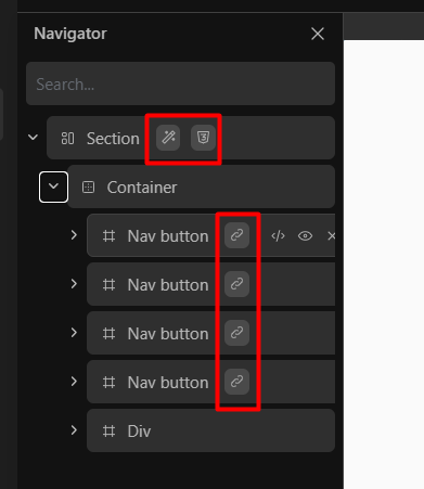
I’m a little concerned by the navigator link / relative styling / CSS indicators:
- they look like buttons, and I always want to click them

- they are way more visible than the block buttons appearing on hover, although they are not interactive;
- they can look a bit overwhelming on a crowded page.
While I won’t argue on their necessity (can be useful to retrieve links in the page, for instance), I think they could be improved:
- make them clickable to open link popup or relative styling / CSS panels;
- make them more coherent with hover buttons, or at least a bit less prominent;
- add a global setting to hide them.
What do you all think of these little buddies?