Currently in Cwicly there are multiple places that different types of user settings can be configured.
The Role Editor
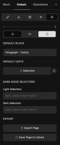
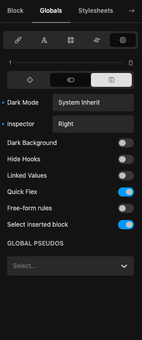
The Globals > Settings tab
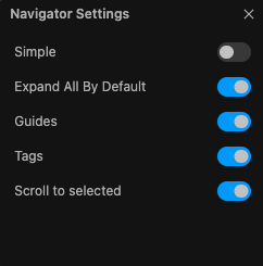
The Navigator Settings dialog
The Role Editor can be configured by an admin for any user or user role, the other settings are configured on a per user basis and to edit them requires the user to be logged with the editor open.
When we want to provide defaults for clients/editors, the above system works for a small number of users that are created up front.
For larger projects/companies that have a lot of WordPress users, or for scenarios where more users are created later either by the client themselves or dynamically by WordPress, it is not possible to provide defaults given the current setup.
Representative example case study: a company has 7 branches and over 100 employees, they need a website with a blog where each employee can post from their own user account.
As Cwicly is becoming more and more full-featured, the number of these types of settings will only likely increase, so we are requesting to have all of these user settings configurable via a dedicated section in the Role Editor.
Thank you Cwicly team!
Related requests:
Currently Cwicly helpfully allows us to set the default block for the current user.
Each user profile has its own settings and always defaults to “Paragraph - Core”.
This is not ideal when setting up a website where the client can create their own user accounts because then the responsibility of setting this falls on them and they need additional training to do so. In addition for many user roles we hide the settings anyway, which would make it impossible for them to set it.
On this basis, it…
It may be useful to have a way to apply your styles to the base breakpoint regardless of which one you are currently in.
This will be very useful in the case of a client or editor who only does basic text formatting changes and/or adds components.
They may add a component or block in the lg breakpoint and then apply styling to it, not realising their styles haven’t been applied (for example to the smaller breakpoints in a mobile first approach, or the larger breakpoints in desktop-first approa…
The new enhancements to the Navigator added in 1.4.1 are very welcome and excellently done.
The new right click options for folding/unfolding are very useful, however, the change to have the blocks folded by default does now require additional clicks every time we open a page or template.
I know we now have the ability to right click to unfold child blocks, but this requires two clicks every time and as the Navigator is one of the UI elements we interact with most when developing this can add …
For sites that make significant use of components it is really useful to be able to assign them to folders.
As it is optimal for our clients/editors to be able to see which folders relate to them, it will be very useful to be able to toggle the Folder view on by default for specific users/roles.
This will really help keep naming simple and semantic and avoid them having to scroll through a long list/grid or having to know the name beforehand in order to search.
Thank you!
Now that components are full featured and stable and Cwicly recommends their use particularly with Tailwind, a site can quickly rack up a lot of components of different types and with different purposes.
We have found it useful to separate out components that are specifically for clients/editors and ones for developers.
It will be extremely helpful to be able to control which components are available for specific users/roles, similarly to how WordPress enables us to limit which blocks are avai…
Now that we have components, it is more practical to use them consistently, therefore Patterns and Reusable Blocks become redundant.
It will be great for Cwicly to be able to hide these completely from the UI to avoid confusion.
This will also be especially useful for Template editing as the Patterns tab is selected by default which is not useful.


