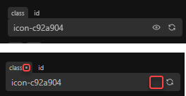
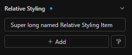
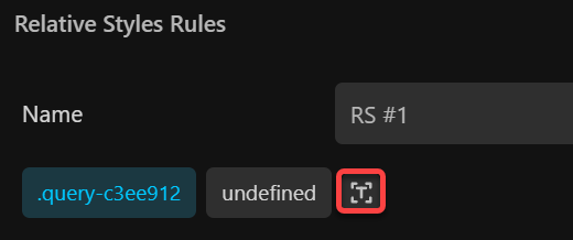
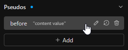
Unless deleting RS items do not support the undo action, this shouldn’t be a thing imo.
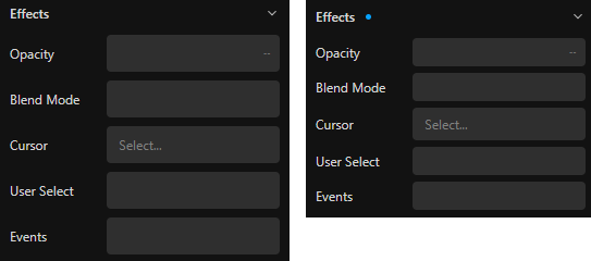
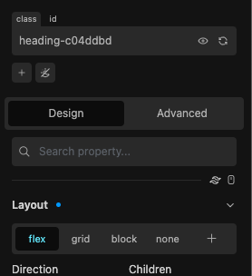
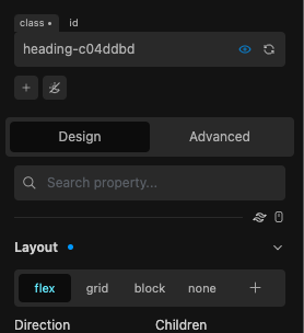
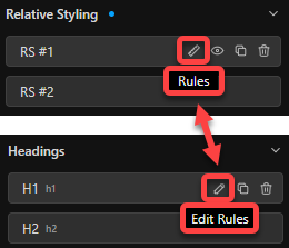
I also realized that the blue dot might not be in the right spot. At least when it also has the ability to delete the corresponding styles.
Accidentally clicking it happened too much for my liking.
Maybe a right click context menu, or something else, is a more suitable option to explore here.
Good points here.
Scrubbing without opening the Popover should also still be a thing, imo.
Will there be default options, too?
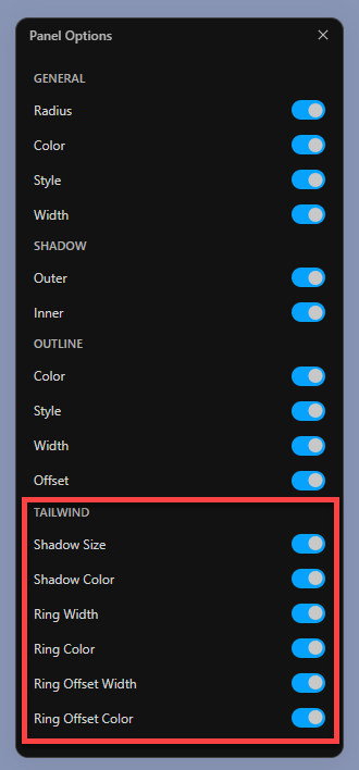
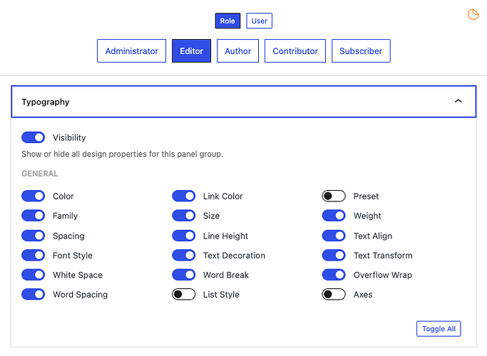
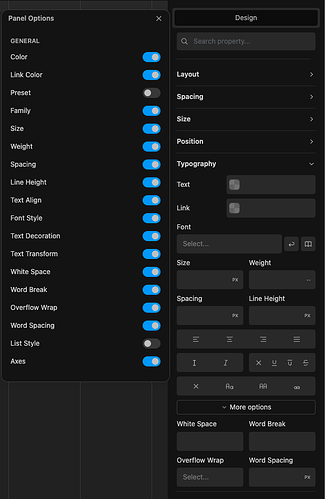
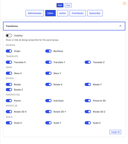
Not sure if I got it right, but shouldn’t the panel options work per block basis and not globally, whereas the defaults represent the global behavior?
Fully agree. So powerful and should also be ready for any future enhancements.
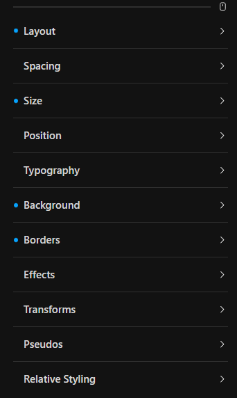
Not specifically the icons imo, it’s just the tabbed naviagtion.
Accordion with jumping elements and long lists isn’t just it 
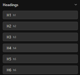
Removing the sub-tabs, turning them into lists, like we have now, but retaining the main tabs would’ve been best of both worlds.
Merging some areas (for example transforms with effects) and moving some stuff to the advanced tab (like RS and Pseudos), would’ve also allowed a single tab row for even simpler navigation.
Seeing the disadvantages of the panel navigation in action makes me a bit sad tbh.
Maybe there will be a time when considering a tabbed navigation as an optional feature.
After checking things, it shouldn’t bee too hard to include that.
But that shouldn’t probably even thought about until the current process has been completed and everything is maxed out polished and optimized.
It’s great, indeed!
Maybe some refinements, when time allows? But certainly not necessary at all!

New logic here is great, much more clear and makes sense now.

These little UI improvements are awesome, too!

Remove Tailwind from Panel Options, when TW is disabled in the Cwicly settings.
Changes already made should be preserved.
General Options for the Design Panel, like have for the Navigator, such as:
- Allow opening all, not only one at the time
- Open/close all (toggle)
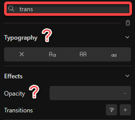
Maybe something like a toggle (settings/gear icon) for quick access next to the property search.
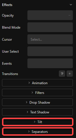
Ability to remove Tilt and Separators via Panel options as a whole (no granular options needed, doesn’t make sense here).

Not exactly sure about this and I would appreciate more opinions here.
Would it make sense to move the Pseudos and Relative Styling areas to the Advanced tab? I mean from the workflow perspective, etc.
Are there any downsides?
Custom selectors and pseudos are not a design thing, and logically should be part of the Advanced tab. But there’s more to consider, so I’m asking what other users think here.
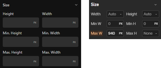
I also think, and this is something which is in my mind for a long time, but didn’t mind too much because of the space-saving tabbed navigation, but for my liking, the inputs are too tall.

Visually, it’s a bit more appealing with all the nice padding, etc.
But shouldn’t play a role inside an efficient working environment.
Basically same goes for quick inserter.
At least an optional compact mode could be implemented:
Any thoughts are appreciated here, too!
I’ll get straight to the point.
Webflow in this area just nails it, and I’ve seen many other tools adopted this as well.

You kinda started this process here already:


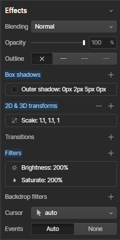
Merge inner and outer shadows, great opportunity to implement other stuff (also text shadow, etc.) easily, thanks to the simplified and efficient UI.
Include the transforms to the effects, because with this approach, it wouldn’t make any more sense.
Make the items draggable, which is also essential for filters.
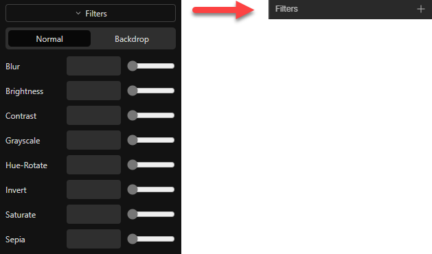
There is such a significant difference:

Displaying all these properties when not needed, just doesn’t make sense
Other areas could be optimizes as well, like:

(but which would require something like recently discussed).
Not trying to change Cwicly’s identity here, just throwing in some thoughts how to improve things, as the general accordion navigation, like we know it from other builders, is awful - and we all know that.
The ultimate goal should be to have an UI available which you can still work with nicely and efficiently, when all panels are opened at the same time.
I hope you don’t mind when sharing some more general feedback, which is not specifically related to the beta.

These could receive some modern overhaul, to fit into the overall UI.
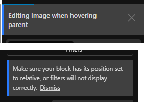
Also in terms of UX (dissmiss link / close icon, etc.)
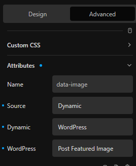
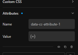
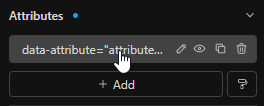
Could we reduce the Attibutes’ UI a bit? Using ACF, it just gets worse.

When using multiple attributes, it’s not a good experience at all.
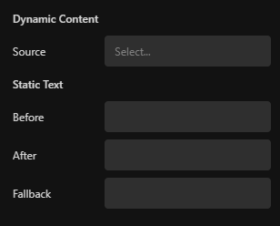
Maybe only displaying the attribute and value in the panel, and everything else the user sets up inside a modal, like:

Or maybe using the dynamic inserter?

Some small things:

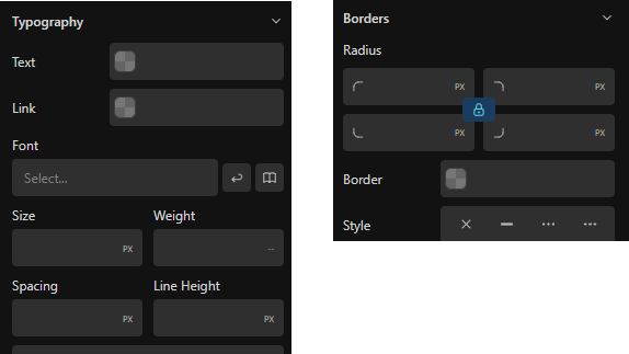
Spacing should be Letter Spacing, as we also have Word Spacing, to streamline the labels.
Border (same goes for Outline) should be labeled as Color instead.
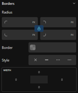
For my liking, for the purpose to just set a simple border, this takes too much space:

Especially, as in most cases, radius and width only needs a single value.
Somehow, this could be cut in half, with some UI elements expanding when granular styling is required (different widths and radius).
Similar things with Outline.
I think there is just room for overall improvement (in whichever way) and I think you got my point without going through everything in detail.

Thoughts?
I know Webflow does it that way, but not a big fan tbh, but that’s rather an individual thing.
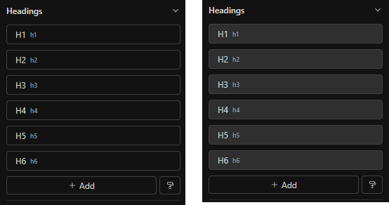
All these items, also in the block editor, like RS, border, transitions, etc, could receive some contrast to the background color.
It lacks a bit in hierarchy.

There are multiple instances where the term “Duration” is unclear.
I think this has been brought up somewhere else in the past.
This needs to be streamlined, by at least add the unit, like (s) or (ms) or giving the user the ability to specify the unit by removing the limiting inputs that only accept specific values.
The limiting inputs, which unfortunately are still a thing in several instances, should be finally addressed, too. This is part of the basic builder functionality which hasn’t been focused on for too long.
What I hope to see with the initial version on the WP repository, is a UI overhaul of the Role Editor and Settings. Some polish and a better overview (organizing this immense number of available options) would be appreciated, also to align with the modern design of the builder and themer.
Again, sorry for being a bit more general.
Just added some things to consider for the current and ongoing process.
