The big UI/UX topic

@yankiara Refer to this thread for Navigator suggestions. Navigator Experience

It’s a nice suggestion. So, did you mean, the rest of the values will be visible as a dropdown option when “+” is clicked?

1 Like

Yeah, as mentioned, just like we control the display property:

image

How it could look like in the end isn’t that important to me. But the current dropdown is kind of fiddly, which wouldn’t be an issue, but it’s a property which is used all the time…

2 Likes

Sounds good. This arrangement is a minor improvement, but it makes workflow faster. :blush:

1 Like

Are there plans to address this section at some point?
Maybe there are plans to implement an own solution?
Looks a bit old-school inside this modern UI :melting_face:

Anyway, my original intention addressing this, is the non-optimal appearance, when the dark mode is enabled, dropdown list included.
So, in case there are no plans to change things here at some point, some tweaks for the dark mode would be great.

1 Like

Hi there,

It has been a while since the UI Update. @sunny showed the difference of the icons and labels here:

I like the approach for adding the name of the field, this helps especially beginners for finding the right fields without hovering over the symbols. I also like the bigger bar for changing the size of certain block aspects that comes with the addition of the name.

size change on lable hover

But I still catch myself pausing for reading the UI names, where no icon is present. I am someone who prefers visual guidance and liked the icon approach better. Personally, I would keep the icons, because there is the space for it, but this might also clutter the UI…

An alternative could also be to be able to toggle the icon visibility/ have an advanced mode like before where just the icons are displayed? Well, this would improve my UX :yum:

Not sure why the icons were removed so it is hard for me to compare the old concept to the new one…

_
Hi @Marius, I like the approach you mentioned for displaying the position property like the display property.

As for the position of the visual and position tabs, I would also agree to change the position for a better workflow switching from the display tab to positioning.

_
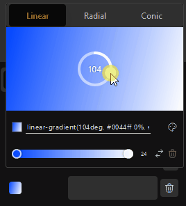
Love the Global Gradient addition that came with 1.2.9.4.3 .

But the color picker selection radius could be a little bigger otherwise new color stops are added quite easily :wink:

Gradients

2 Likes

@Louis Thanks for fixing the Quick Inserter. From a couple minutes of testing, it seems much more predicable now.

Edit: I did actually notice something minor.

  • Try inserting a Div > Heading > Paragraph > Button > Div with the Quick Inserter. Initially it goes in the proper order, but then starts inserting above instead of below.

CleanShot 2023-02-02 at 16.18.55

Thanks, @sunny.

While the insertion position has been fixed, the selection of the blocks when inserted needs to be tweaked (next update).

Appreciate the example!

3 Likes

Hi,
l really like the addition of the Font Manager that came with v. 1.2.9.5.
The font manager was also mentioned in some other topics:

And here are some additional personal thoughts from me :smiley:

The UI could be a little bigger

  • The Install Button, Styles, Font, variation, trashbin should be Bigger, you have the space :wink:
  • I would love a secondary View mode (Big) like in the Windows Explorer. So if I am actually exploring a font I can view the font in detail.

I would really like a global option to disable the google hosted option completely. Or to disable it by default? That blue shining button gives me the creeps and won’t let me rest peacefully :sweat_smile:

grafik

Or maybe a better indication for when it is used?

grafik

This Screenshot is from a Header. I know the font is Inheriting at the moment, but the Value is missing. Additionally, is the font Google Hosted on or not? Again, that creepy blue button. :scream:

Apart from that, this is a super awesome feature :+1:
+The YouTube Tutorials have become super focused! I really like that a lot :heart:

4 Likes

I have to add something here.
The choices of font weight should be shown as a dropdown list.

Hi there @T-low,

Thanks for the feedback, really appreciate it.

As for the size of elements, we will try to accommodate a bigger font size although you will be surprised how quickly space is occupied depending on the font properties themselves.

I can assure you that no Google fonts are called for on the frontend if you don’t specify a font on the backend. The font location property is simply a way to modify the selection options between Google and locally hosted fonts, and its active state does not mean that Google fonts are loaded.

The only issue we currently have with switching the defaults of the font location (Google or Local) is that this would also modify the behaviour on existing blocks that might possibly have Google fonts attached. We can provide the option to remove Google hosted fonts completely, but this would come with the understanding - on the user side - that doing so will disable all Google fonts on previously created blocks.

1 Like

Hi @jornes,

I agree with your point.
The dropdown will be re-introduced soon, although we might wait until dynamic variables are available.

Cheers,

2 Likes

Alright. Thank you @Louis !

The MDN Reference popover, which appears when hovering a CSS property inside the Quick Code editor:

  • makes me click the link inside the popover unintentionally quite frequently when intending to click an actual CSS property
  • prevents me from interacting with the CSS properties that it covers
  • prevents me from seeing the content inside the Quick Code editor

Aside from that, I never make use of this popover information and it also kind of distracts me in other areas where custom CSS comes into play.
Maybe an option to disable the popover would be it.

2 Likes

Some thoughts about some Relative Styling areas.

Adding new selectors inside the rule editor doesn’t feel convenient.
I tried it regularly since the UI update but couldn’t get used to it.
The more selectors are involved, the more mouse travel is required.
Not sure, it just feels and looks wrong.

Left, how it currently is. Right, which would improve things for me.

I would appreciate a right-click menu for the RS items below the class area.

image

  • Edit/rename rule (open RS rule modal)
  • Shortcut to open RS panel/tab (which would be rather a nice to have / alternative method)
1 Like

I am using relative styles more and more frequently. @Marius that right click > edit rule & styling menu idea is brilliant.

2 Likes

Agreed, @Marius, both moving the [+] button’s position and adding a right click menu on the relative style chip are both worthy of inclusion.

2 Likes

Navigator context menu → Include Popover block for Insert and Wrap functionality.

2 Likes

Just resurfacing this. Agree with @Marius 100%, the bright background for the initial link selection field is an eyesore (literally :wink: ) in dark mode. Given how polished the rest of the UI has become, this is just asking to be made consistent, even if just starting with making the background and font colours grey / light grey instead of white / dark grey.

Any thoughts about the order of the transition property inputs here?

image

My personal preference would be:

  • Property
  • Duration
  • Delay
  • Timing

Timing could be on 2nd place as well to have duration and delay on the same row.
But when I start defining these rules, I start with the property I want to address.

Not sure if there is a standardized way, it’s just how it makes sense to me.

2 Likes