This unified look is brilliant @Louis.
Cutting the right area down by a half or even 2/3 in height is a major improvement!
Any ETA? 
2 Likes
I will take the contrarian position  .
.
It looks nice, but it will take a lot of time till the muscle memory forms to know which icon is for what. (so in the end more click to find what you are looking for then). Even with the new primary ones, I think I make more clicks then before.
Not sure about the majority, but I have plenty of space on my screen :). (so having more then half of it empty, not sure how it help)
I think the webflow approach is good, by having a toggle to switch to full or condensed is the ultimate way to bring pace on both sides 
1 Like
I like what I see
This is just text to get to 20 char
Reasonable doubts @alex.
Here is how I think about it, based on experiences with similar tools.
It will take a certain time to adopt, sure thing.
But that’s a tiny invest of time in terms of overall time savings in the future.
Icons are just for first orientation until I got used to it.
As soon as being confident, I won’t see them anymore, it’s all about the position.
Reducing the panel content height will give you the ability to constantly(!) focus on a specific area on your screen.
This is currently not possible. A workflow improvement which some have to experience first to understand.
I also want to stress that this is just my opinion, so experiences can be very different, since people are used to different workflows.
Thanks for that! Important and appreciated.
One thing I am not entirely sure about yet, need to get hands on first, is indeed the amount of clicks which are required in some cases.
This could turn out to be an issue.
I’m just amazed at how the UI has changed. I was just about to write that there are still labels instead of icons and hey what is that… there’s a new update and everything is fixed 
After half an hour in the new UI it is almost muscle memory, no reading thanks to the symbols and I use the design tab more than the primary tab.
1000  for the last Updates
2 Likes
Thanks for sharing your thoughts, I couldn’t agree more!
Is there more feedback from other users about the new UI?
Would like to hear some more reports based on the new experience.
My only concern, fortunately has not been confirmed, not even a tiny bit:
I love everything about it and it also seems it’s making the way free for more features which would’ve just bloated the previous UI even more.
2 Likes
Wow, thanks @T-low for the feedback, really appreciated. This makes us feel like we’re going the right way!
Definitely something to keep an eye on. The choice was between legibility and “faster” access to properties (which I don’t find the panels gave us because of the continuous height changes in the advanced panel).
As usual, we do listen to the community so if there’s something that needs adjusting, we’ll be there.
This! Opens quite a realm of possibilities 
1 Like
I haven’t worked yet in a sustained way with the new interface (to get a real feel), but I still think it has too many subcategories.
For example for Layouts, the Display, Visual and Positioning settings could easily fit under one. Same for the Backgrounds and some others. To many clicks to find something makes me dizzy :).
1 Like
The new code block modal option is awesome.
Custom code has become a real option in Cwicly.
It went from “useless”, at least for me, to a smooth and intuitive experience and with all the stuff which gets recently added, it’s becoming more and more an all-in-one kit.
Will this also be available in the custom CSS block options?
Also, is the modal really draggable? Is there a dedicated area where I need to grab it?
Update regarding draggable code block modal. It’s working, probably a browser extension conflict.
Will investigate and update.
1 Like
Hi @Marius,
Thanks for the feedback! Much appreciated.
The modal option will be added to the Custom CSS block options, as well as slowly moving towards using it in most modal cases so that one isn’t contrived when having to open one up.
Interesting, haven’t come across any issues on our side, but would appreciate if you find something.
1 Like
A browser hard refresh did it.
Sorry for the confusion 
1 Like
With the 1.1.8.5.2 Update, I really like the min-height fix.
I was not really aware until it changed, but it feels waaay nicer than before. Especially when I create smaller blocks in a template part.
2 Likes
Would love to see this on the icon picker.
Hi there @owynter et @all,
We’ve taken into account your feedback about the navigator and have pushed a new revision of its UI in 1.1.8.5.5.
Would love to know your thoughts about it.
Cheers,
2 Likes
It’s really nice now, Louis. Lots more real estate and easy to move around.
Will continue to play around with it and send feedback.
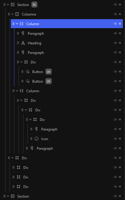
For anyone who is curious, here is a direct comparison with the exact same dimensions (old/new):

First impression
Not sure if this is it.
For me, it’s more confusing and it “only” gives me 4 more blocks on a 1440p screen.
Horizontal space saving is a big plus.
It is (more than) one step forward, but it needs fine tuning imo.
Need to get used to it, maybe I am able to make some suggestions then.
Note
UI issue on W11 with floating scrollbar. It’s overlaying the “remove block” icon.
#Update
So i played a bit with the color scheme and found out, for me it’s just the high contrast.
I also think that the “black” background var(--cc-inspector-background) is too aggressive in general.
It was mentioned a couple of times before and I think it’s an important part inside the editor: Changing colors of editor panels, elements, etc.
Is this something we can expect at some time?
Just as a small example. This is far more better, for me. Other people will have different opinions, and this is the reason, a color scheme manager/designer would be a good idea.
4 Likes
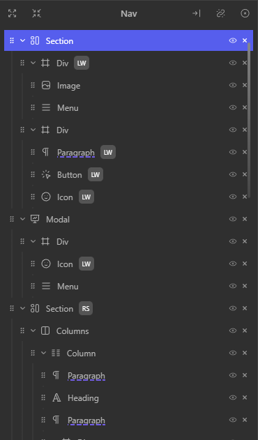
Visibility Toggle for Navigator
Would it make sense to implement the visual indication inside the Navigator for a hidden element plus all of its children and remove the visibility toggle from all of them?
Hi @Marius,
Thanks for your thoughts and suggestions on this.
The contrast issue is definitely something where a colour manager has to come into play since our initial background colour was much less dark, but we received quite a few comments at the time about it not being contrasty enough.
Interesting, will make sure to get my hands on this. Thanks.
Good question… We did look at several possibilities when working through this, but finally decided on only signifying which element had been toggled off.
I see by the thumbs up that this is something people would like to see.
Maybe a different indication for children affected by parent visibility.
1 Like
Hey @Louis, thanks a lot for your answer.
I can confirm that the contrast was lacking for me as well, but at the end it all comes down to personal preference so it’s good to hear something like a color manager is at least considered.
Regarding the new UI of the Navigator, it’s great.
After getting used to it a bit, I definitely can say these changes were needed.
Thanks @owynter as well for bringing this up.
Especially the horizontal space savings will help a lot.
What I would like to see, as now everything is more compact, a visual indication for all children of the selected block (maybe also when hovering the blocks?).
Just an example to make it more clear what I mean, not sure what would be the best way to go:
5 Likes
What I would like to see, as now everything is more compact, a visual indication for all children of the selected block (maybe also when hovering the blocks?).
That would be a nice touch. Although I wonder if it would get very noisy, visually, with lots of colours?
1 Like