When we build with dark mode enabled, every class we apply to a block gets the “dark” pseudo prefix. The is a very wonky behavior, because faulty classes are being added (e.g. layout or font sizes) JUST for dark mode.
This ultimately results in a click fest and does not align with the current way of selecting the other pseudos.
I would even consider this a bug, since it is impossible to build a site with Tailwind and dark mode enabled.
Now that I’m used to build in dark, it is a pain to have to go back to light to use Tailwind.
This is all the more important that the current implementation is incompatible with Cwicly’s light/dark mechanism for global colors.
Indeed, dark variations are ignored in dark mode when applying a color to a block, because the TW class which is applied doesn’t respond to dark toggle.
It means that when designing in dark mode, we have to constantly switch to light mode to set any property to prevent the “dark:” prefix to be added to TW classes.
For instance, setting a font-size in dark mode will only apply it in dark mode, whereas we want it to be set regardless of the color mode.
Maybe a switch could allow ignoring dark mode for editing properties?
2- SECOND ISSUE (CONSEQUENCE)
As for Cwicly global colors dark variations, it is almost the contrary. They are simply ignored in dark mode because we don’t set the “dark:” class in dark mode.
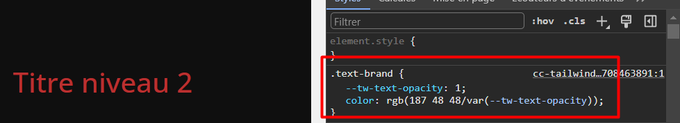
For instance, I have a “brand” color with light and dark variations. Normally, I would set the color to a block, and variation would be automatically applied when switching mode.
But now, if I set the color on a block, the TW class .test-brand is applied, and since TW doesn’t use the Cwicly’s global color mechanism, the actual CSS doesn’t use the global color variable, so dark mode doesn’t recall the dark variation:
The category chosen for this thread is Feature Requests. You keep mentioning issues, that is why I asked you to be more specific.
Reading through your last post, these do seem like features you’d like to see added or improved upon (which we’ll happily consider doing).
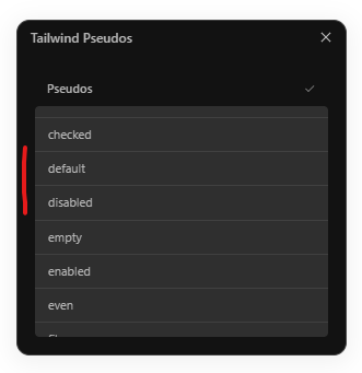
Tailwind considers the dark selector much like a pseudo item, which we have replicated throughout the Cwicly UI just as if you were editing a pseudo like hover etc…
Please remember that Cwicly is a visual builder. And logic has to apply in some cases. As a Tailwind user, you would expect to apply dark mode classes whenever you’ve toggled the dark mode (as this is a deliberate user action. Dark mode is not toggled on by default).
You can turn this the other way round. This expected behaviour applies to you more specifically, we have to find some common ground.
I welcome this kind of suggestion, feel free to add more to this if you want.
Once again, we are following the Tailwind recommended implementation.
The behaviour you describe was observed during the development of this first instalment of the Tailwind integration within Cwicly.
We have different options being worked on at the moment, along with the Cwicly x Tailwind global styles implementation.
I appreciate your frustration here, @yankiara. Let’s also put into perspective that the Tailwind integration is 20 days old. We’ve had a lot of constructive feedback that will only improve it. Let’s continue on that path.
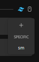
The dark pseudo was added to the non-interactive pseudos in 1.4.0.3 (as well as the placement of the + icon) and appears alongside other active pseudos.
Yes, I was describing the issues I was facing to support the feature request because I had the feeling t was not a bug but an expected behavior
Yes, I totally agree, but I guess I secretly hoped that TW mode and classic Cwicly like color variations would cohabit right out of the box
And it turns out they actually do, because the switch I mentioned kind of already exist
So an easy workaround for issue 2 is to switch OFF TW, set the global color “classic Cwicly’s style” and switch back TW to ON to continue editing.
It is a bit denying Tailwind, but so much easier than setting both dark and light as TW classes, IHMHO.
It was pretty obvious you were aware of it, and you’ll come up with a great implementation, I know it.
Of course!
And I’m sorry if my french grumpy mood takes over my english. This is not what I want to convey through my posts. I really love all the team’s work, and I just write my thoughts and wishes (maybe without enough filter sometimes) to make things happen
I just can’t wait to see what’s after the next to the next update
Absolutely not! I didn’t mean to imply any form of reproach.
These are definitely valid points which I know need to be addressed.
I may not say it as often as I should, but I do realise that everyone on this forum brings so much to Cwicly in their own time. Please feel free to share openly without filtering anything
First of all, thank you very much for implementing the suggestion to show the plus icon on the top! And the addition to the other pseudo selectors is greatly appreciated
However, changing properties not meant to be set in dark mode specifically, such as border radii or widths, can be confusing and is an obstacle rather than a feature. When I am in the flow, I do not want to think about being in Tailwind Dark mode first and then probably making a switch; and a mistake that needs to be undone later on.
As opposed to vanilla Cwicly where we don’t have this logic currently:
For example, when toggling to dark mode and setting a font size or border radius, the changes remain when toggling back to light mode. This is the expected and learned behaviour.
I suggest decoupling the global dark mode switch from the dark:pseudo. This will help to avoid confusion.
While I understand the sentiment behind this. there may be cases where a design will change slightly (such as border widths) in dark mode.
I think it makes logical and practical sense to switch to dark mode to edit dark mode specific styles and then switch out of it to edit styles that apply to both light mode and dark mode.
it makes sense to select the dark:pseudo from the list like any other pseudo. the common ground, as @Louis coined it.
the global dark mode switch should just have the function to switch modes. my point is practically not to co-toggle the dark:pseudo selector. we gotta select it from the list to actively, and purposely, set combinatorial classes.
I fully agree for decoupling, because it seems it suits best my current workflow with Cwicly, but now I can see some drawbacks with the Tailwind workflow.
With Cwicly’s global colors, you can actually define a color and its dark variation with the color popup, which switches mode when editing both color variations. So it’s very easy to work with colors and preview the changes. And on the canvas, you just select a color for a block, and it’s OK for both modes, since the color definition itself contains both variations. It is actually very smart because the color definition enables previewing without actually manually switching mode.
With TW philosophy, if I’m not mistaken, you’ll have to manually set both color variations on each block, so if pseudo and preview are decoupled, you’ll have to constantly switch pseudo AND preview when working on colors.
So, what could be interesting is putting a switch in the color selector popup, which would switch pseudo AND preview in SYNC so that one can comfortably appreciate and select colors.
As for editing properties other than colors, it seems statically a minor use case to me, but I could be wrong.
Now, if in the future this light/dark mode evolves towards some complete theming/skinning (yes please, with unlimited skins and a frontend dropdown!), this is different because then all properties could be considered…
So a global SYNC switch could be interesting too, so that a user can work with pseudo and preview synced or not.
Another option could be to restrict the dark pseudo to all color related fields, but allow EVERY combination that the developer might see fit, e.g. different border widths in dark mode like @StrangeTech proposed, in another context.
That concept would follow the feature request I put up the other day:
With a text input for classes in place we could just write dark:rounded-md for example.
This allows for a workflow that is far less error prone, yet offers endless possibilities for combining Tailwind pseudo-classes.
