Description:
I am currently using mobile first and 1 additional custom breakpoint. See screenshot below for exact setup.
I discovered one day when regenerating my HTML/CSS via Settings, that my desktop menu was no longer visible (and my mobile menu button was visible for all breakpoint). However, when I made a change to the header (updated anything) and saved in the editor - the visibility was working correctly again for all breakpoints. But when I regenerated CSS via the settings panel again (specifically Block CSS button) - the issue reappeared again.
I look at this thoroughly to see if any blocks on my header were causing errors - and narrowed it down to the css file (cc-tp-cwicly_header.css?ver=1703796068) - which contained different content depending on if I saved changes through the editor view or regenerated css through the settings panel.
I also narrowed it down to specifically the 1 additional custom breakpoint that was missing in the above css file when regenerating css.
I also need to mention that everything always appears as intended on the backend. This issue is only reflected on the front-end.
I also recreated this issue in a test cwicly environment. See this link. cwiclydemo – Just another WordPress site (instawp.xyz)
Below are the steps to recreate this issue.
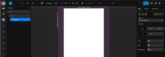
Created the following custom breakpoint settings:
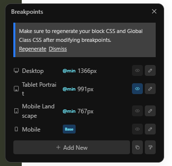
Step 1
Created a new standard header and inserted a Heading.
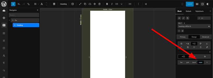
Set to Display: None at base breakpoint
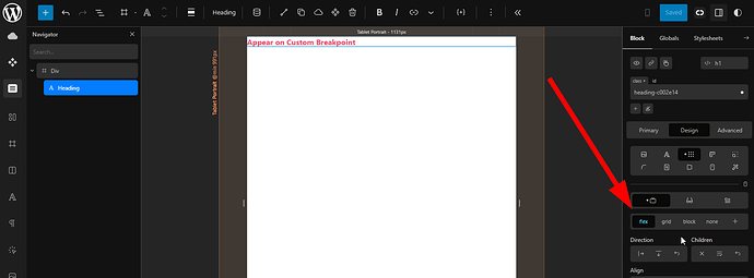
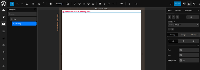
Set to Display: Flex at Tablet Portrait (custom breakpoint)
Back-end View (appears correctly):
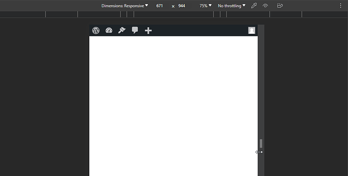
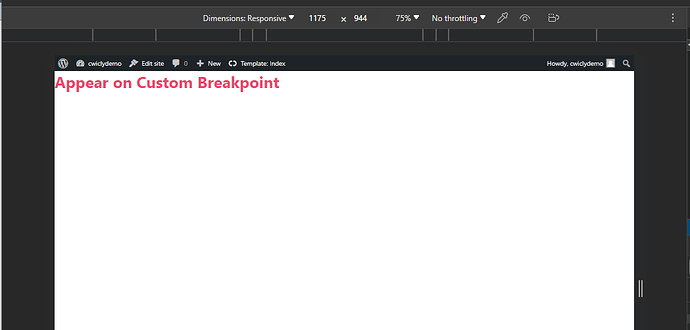
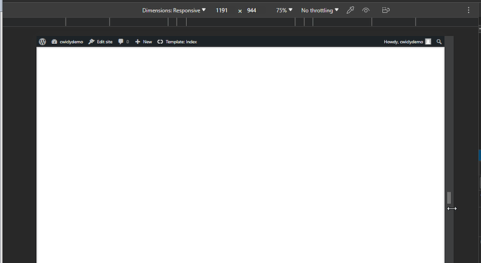
Front-end View (appears correctly):
Content of CSS file (cc-tp-cwicly_header.css?ver=1703800369):
.heading-c002e14 {
    color: var(--cc-color-1);
    display: none;
}

@media screen and (min-width: 767px) {
}

@media screen and (min-width: 991px) {
    .heading-c002e14 {
        display:flex;
    }
}

@media screen and (min-width: 1366px) {
}
Step 2
Regenerate Block CSS (via Settings panel):
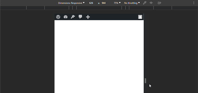
Back-end View (appears correctly):
Front-end View (DOES NOT appear correctly):
Content of CSS file (cc-tp-cwicly_header.css?ver=1703800450):
.heading-c002e14 {
    color: var(--cc-color-1);
    display: none;
}

@media screen and (min-width: 767px) {
}

@media screen and (min-width: 991px) {
}

@media screen and (min-width: 1366px) {
}
