How to set up fluid typography and other globals after "reset to tailwind breakpoints"

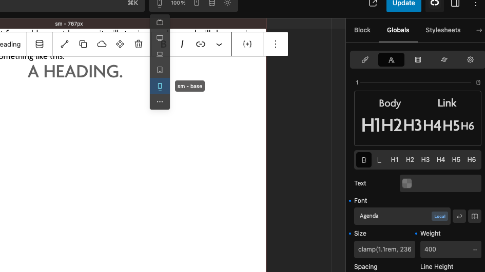
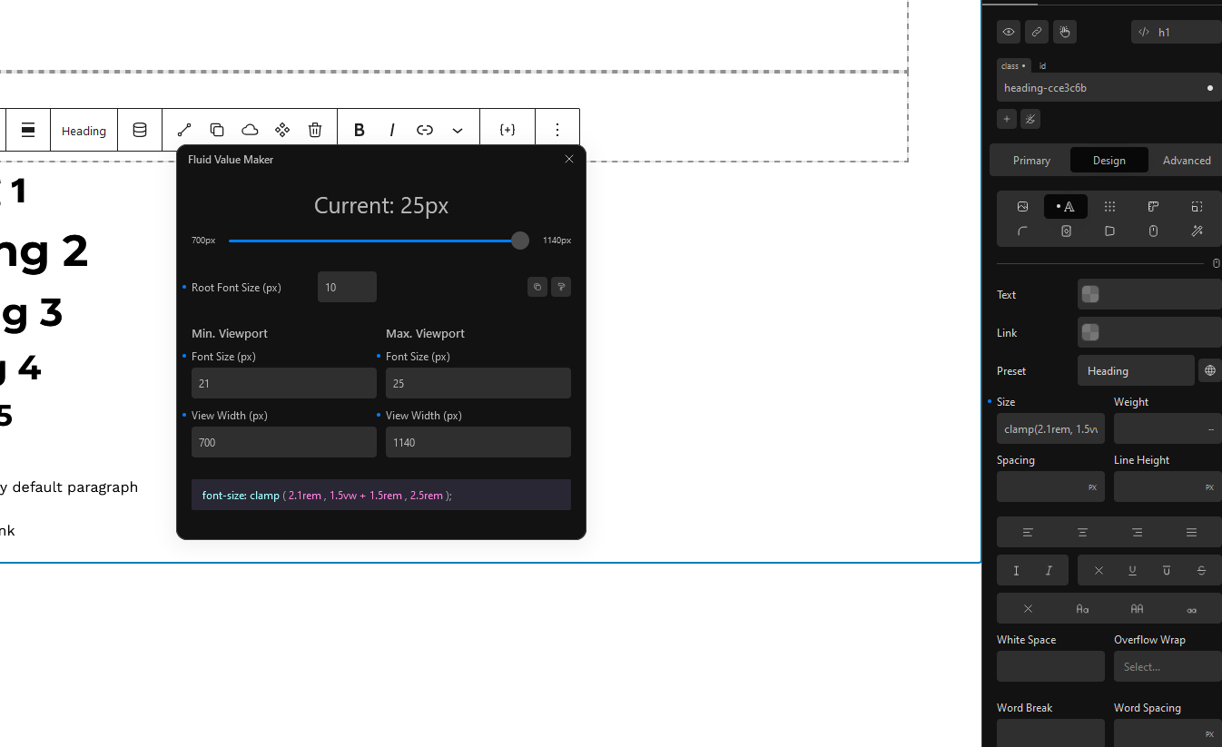
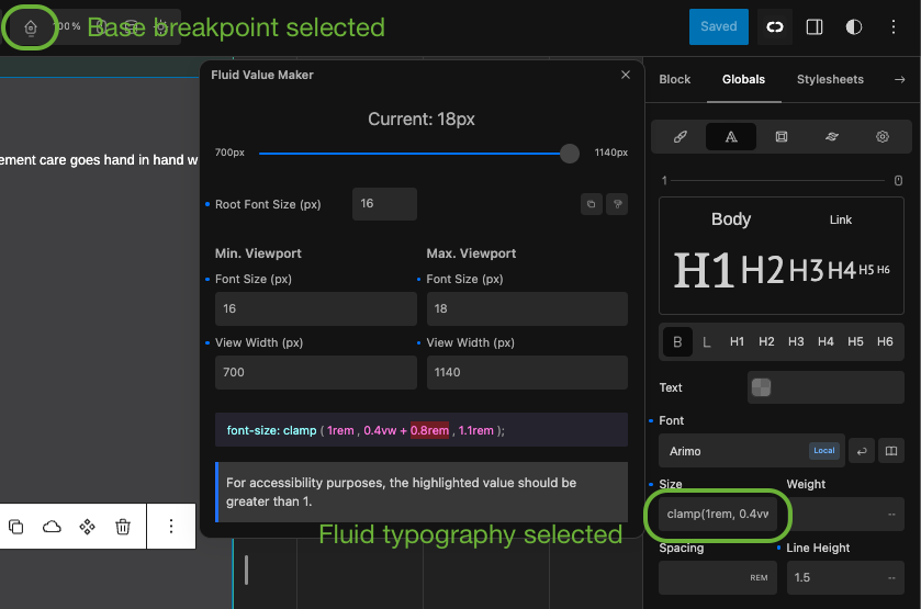
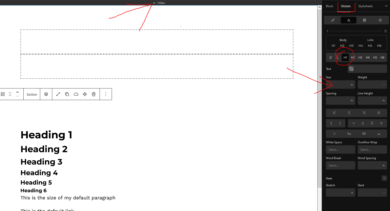
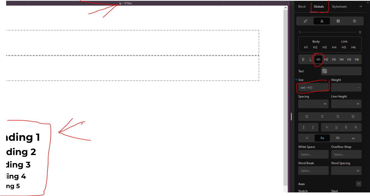
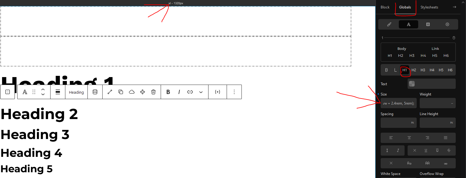
I had my global typography setup using variables, attached to an style sheet with all the tokens and clamp functions as values mostly, a very smooth set and forget approach. Despite the breakpoints the clamp functions managed “the fluidity” of those elements.

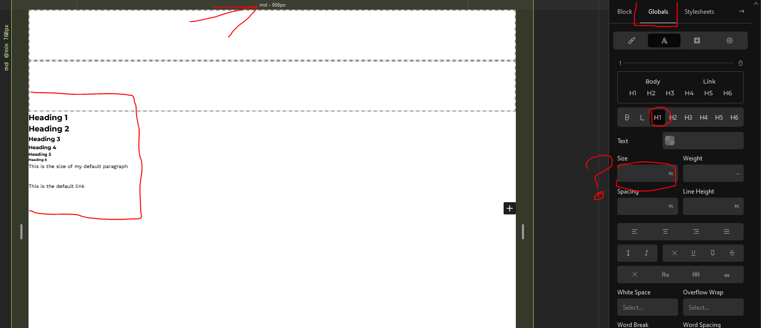
I am trying to use tailwind and first I did the “reset to tailwind breakpoint” thing, suddenly I discover that every clamp function is attached to a specific device size or breakpoint and that probably tailwind is a mobile first approach and it has its procedures and workflows that probably contradict what I have accustomed to.

I guess tailwind has a way to overcome this and I also know that i may come up with a solution that suit my needs but before spending a lot of time researching the tailwind documentation, I post here with the hope that someone could clear this out for me.

What could be the equivalent of using clamp functions to manage tailwind breakpoints without the hassle of setting each breakpoint which defeats the purpose creating of fluid whatever?

Thanks in advance

Hi,

A fluid typography should not be linked to breakpoints, this is the purpose of “fluid”. They should use vw units in order to depend only on window width. Changing breakpoints has no impact on this kind of variables.

Can you give us an example of your clamp variables?

How did you set up your fluid typography?

Check out this tool, if you haven’t already

Set up fluid token for type and spaces as CSS variables and use them in your code.
With a bit of fiddling with the config object, you could generate Tailwind utility classes as well.

After resenting to TW breakpoints i got this


This is an example for the tokens i set up

–h1: clamp(2.4rem, 1.721vw + 1.849rem, 4.2rem);

those work before resetting to TW breakpoints, for the headings and for the block margins, paddings, gaps.

Probably I am missing something, probably i will start from scratch but in the globals tab, it seems it apply the values to the breakpoint as if i was editing a custom class and not to the global setting…

Thank you, I’ve used utopia and other tools but have not dive into tailwind configurations

Those fluid variables need to be set on the base breakpoint so that they apply for all breakpoints.

For instance, if you reset to TW breakpoints, then you work mobile-first, so you need to set your variables on the lowest breakpoint.

Here, you set the size at lg breakpoint, so it is applied only on screen sizes larger than lg.

Thank you, though it was not the case before TW, it was easily set up with clamp functions disregarding of the breakpoints which is the purpose of fluid in the first place, am I wrong?

I mean the purpose of using clamp instead of setting breakpoint by breakpoint settings.

And YES I advice to start from scratch when switching to mobile-first, because the values entered in different breakpoints will mess everything up.

1 Like

Had you ever changed to mobile-first before TW?

The thing is, why are your variables set on lg breakpoint?
Where did you set them before resetting to TW breakpoints?

OK I’ve actually understood why different people have troubles when resetting to TW breakpoints.

In Cwicly’s defaults, breakpoints are Desktop, Tablet and Mobile.
In TW, sm, md, lg, xl and 2xl.

So when switching to TW, the values formerly entered in base breakpoint, which was Desktop, are transferred in the new lg (because the FIRST becomes the THIRD in the new system), which messes everything up.

That’s why one needs to start from scratch when switching to mobile-first (or TW).

No i didn’t chage it to mobile first, i don’t like that approach.

The max size of my container was 1280 so it matches the lg BP

I set them in a separate stylesheet and the variable is what i use on the cwicly fields

@Louis, maybe a warning should be added in documentation about this issue.

Or maybe an option could be added to transfer values in base breakpoint (Desktop) in the new base breakpoint (sm) when switching to TW, even if it doesn’t necessarily make sense.

I found this out on a new project that I had done only a small amount of work on. If you have an existing build and you switch to TW you will have to hunt down any changes you applied to any other breakpoints that are transferred to lg and delete them. Like @yankiara stated it is best to start from scratch with a new install.

Transferring values to the new base breakpoint is a good solution. Also something in the docs at least as a warning will save people stress and time :exploding_head:

It is indeed a mess, but even if I delete or disable my variables, stylesheets, etc, when setting cwicly global typography for example. It ads the value for the breakpoint I’m editing and not the global value, in case I ad a clamp function to the field.

the clamp disappear as soon as i move the breakpoint handle

so setting globals with TW is pointless but the behavior before resetting to TW breakpoints was different.

I know many people work the way i do and it makes no sense.

I would be able to simply ad a clamp to a field and that’s it

am I wrong??

As i understand a clamp function is an automatic calculation of values, based on a max and min viewport dimension, and that save the issue on having to think over breakpoints, so what is the purpose of an automatic calculation or math functions in css if i need to bear in mind which breakpoint is a value being applied, can anyone tell me?

I do accept I’m a f-ing noob in terms of code and stuff but bear with me, I want a hassle free life ffs haha!

Shout out to the holy, godly, eminences here in the forum who just ignore us poor, mere, pity mortals despite their omnipresence and online activity evidence, please may you give us some light or thoughts? at least write a holy book ffs

I think my thoughts align with this:

but then what is de purpose on being dependent of breakpoints if they are not strictly necessary OR how to seamlessly integrate this into tailwind?

Or so at least @louis can you tell how to go back and reset to the old breakpoints

@JulianM no need to stress now. Easily explained :wink:

Setup your global fluid typography (clamp) in your base breakpoint sm only for TW. If you have it in lg delete it. Move it to your base sm. That is what is causing your issue.

Wow! That was very simple to understand and execute, you are a blessing.

Thank you!

I also came across this holy machinations, though I don’t know since when it is there.

@JulianM delighted it helped! @David deserves the credit though:

@grantambrose makes excellent videos as well:
https://www.youtube.com/@GrantAmbrose

3 Likes

Ok so as a newbi, wanting to take full advantage of Tailwind and other responsive features, am I understanding that i would want to use the fluid topography with the Tailwind Breakpoints and make sure to set them to be mobile first? Is this correct? So I didnt see fluid options in TW though… so do i set up the fluid in CY and then use the TW Breakpoints?

Currently as of 1.4.0.3, for the global typography area, tailwind is not integrated.

So, using Cwicly’s fluid typography in the global typography area, is as simple as, going to the BASE breakpoint, selecting fluid from the unit selector of the Font Size style property field and then choosing the options you want from the dialog.

Screenshot 2024-02-19 at 05.59.52

You only need to do this on the BASE breakpoint and it will automatically scale the font on all other breakpoints.

1 Like

Ok so for a newbi who is not set in any ways as far as Headings and Global Styles, and looking at the Tailwind setup and current integration, and considering that I am a visual designer ( I don’t write code). What is the. most beneficial way for me to set up the Fonts and Breakpoints?

Ideally, I wold like to use the TW font editor to set the size color weight etc… on a given screen or breakpoint and have it resize based on that size (I imagine that is why we are using the sm med large etc… for the size selections in TW Font Settings).

However, i am pretty confused about the following things,

  • There is no font type selector in TW I only see the option for sans, serrif and mono.

  • What role do the Headings and Default Fonts play in this scenario?

  • Do i have to literally design my site in mobile view for the base font to work correctly or will it scale down or up based on my breakpoint?

  • What is the recommended base point? Is i see the 640 number but screens go down to 300px wide…

  • Would love to see someone else’s setup on this so i can understand, what i am doing, being new to all of it, i am a bit confused but eager to understand.