How to set up fluid typography and other globals after "reset to tailwind breakpoints"

You can add the utopia plugin for fluid typography in tailwind to do this, however, keep in mind that if you are intending to set sizes on a per breakpoint basis, that is not really taking fully advantage of the capabilities of fluid typography.

One of the intrinsic benefits of fluid typography is, you only have to set it once on the base breakpoint, and it will automatically scale across all breakpoints.

So, if you preferred workflow is setting font size for each breakpoint in each case, you don’t really need fluid typography, although I highly recommend you to consider the time saving benefits of using Cwicly’s global typography.

If you want to have the heading font sizes as TW classes you need to configure them:

In Directives you can use the clamp functions generated with the Cwicly fluid font assistent and create CSS vars for them

@tailwind base;
@tailwind components;
@tailwind utilities;
@layer base {
  :root {
    --font-size-h1: clamp(1.8rem, 3.5vw + 1rem, 3.8rem);
    --font-size-h2: clamp(2.3rem, 1.2vw + 2rem, 3rem);
    --font-size-h3: clamp(1.6rem, 0.9vw + 1.4rem, 2.1rem);
  }
}

Then use these variables in your Configuration:

module.exports = {
  darkMode: 'class',
  theme: {
    screens: cwiclyScreens,
    fontFamily: {
      sans: ['Work Sans', 'sans-serif'],
      serif: ['EB Garamond', 'serif'],
    },
    fontSize: {
      'h1': 'var(--font-size-h1)',
      'h2': 'var(--font-size-h2)',
      'h3': 'var(--font-size-h3)',
    },
    colors: {
      transparent: 'transparent',
      current: 'currentColor',
      'primary': {
        '50': '#f0f5ff'
        '600': '#0065ff',
        '800': '#003dd6',
        DEFAULT: '#013089',
        '950': '#072464',
      },
      'base': {
        '50': '#f5f7fa',
        '100': '#e9eef5',
        '200': '#cfdae8',
        '300': '#a5bcd4',
        '400': '#7498bc',
        '500': '#527ba5',
        '600': '#3f628a',
        DEFAULT: '#344f6f',
        '800': '#2e445e',
        '900': '#2b3b4f',
        '950': '#1c2635',
      },
    }
  },
  corePlugins: {
    preflight: false,
  },
  plugins: [],
}

You will then have the TW classes ‘h1’, ‘h2’ and ‘h3’ as font size.

As you can see there are two font family classes defined (sans, serif) where i use the Web font names with a fallback.

I find the utopia plugin very confusing. It might be easier to set up a few classes for fontSize and spacing.

Thank you @StrangeTech @michelyweb
I’m new to all of this including responsive design. Since this is my first experience with responsive design, I’m looking for efficient, non-coding solutions that align with Cwicly’s direction and the TW integration. I’d appreciate guidance on the fundamentals of breakpoints, fluid typography, and how they work together. Could you provide beginner-friendly advice on setting up a responsive site effectively with Cwicly’s features and Tailwind (TW) integration? My current website has the first few pages set up, but the styling, responsiveness, and global styles are not yet organized. My current goal is to establish a solid foundation on the responsive settings, styles and typography settings, before creating the rest of my pages as they will basically mimic the initial page set up. Keep in mind I am new and I dont write code and I dont have all the history with the way you all have always done it. I am looking forward to adapting the new features and understanding the fundamentals. I sooooo appreciate your help here.

Just so i understand the B, means base and not body then right? Sorry, i know that may seem super obvious but Im new! LOL. At least to this side of things. So I think i understand If i set teh Base fluid size and then set up the TW Breakpoints. Then the the font sizes in the other breakbpoints should resize automatically. My only question is what settings do i apply to those other text blocks headings and paragraphs for them to “respond” to the base? That is where i am getting hung up.

Hello, B is for body, L is for link and the H you may know are the header tags, the base is just where you start developing (the base breakpoint) and i prefer desktop first but after the TW introduction the base breakpoint went to mobile first.

That is represented by the small home icon in the BP menu at the top like @StrangeTech show up here.

Now you can choose your base but TW base is mobile first, make sure to be there or the style will be applied to that specific BP.

Ok i did a quick screencast of my current issue, figuring out how to set the base. I guess once i figure out how to set the base then I can figure out the other things. First Step set the base… um ya… struggling. here is the quick link Single Profile ‹ Template ‹ Editor ‹ ICID — WordPress - 2024-02-20_13-17-28 - TechSmith Screencast - TechSmith Screencast

For me, this one is better than utopia at least for the fonts alone: https://www.fluid-type-scale.com
so you don’t have to guess the size you want for each.

basemodify

Toggle the base box then modify.

There you go.

Before TW there was no BP setup but after TW, it applies the BP similar to pseudo styles work. It messed my workflow until I learned this.

BTW this guy says it how it is

When you’re considering the size of the body text, remember that it’s best to work with the default size set by users in their browsers. This approach respects their preferences, especially for those who adjust their settings to improve legibility. Using relative units such as rem depend on the font size of the body and helps to maintain accessibility, ensuring that your site is comfortable for everyone. It’s about building flexibility and inclusivity into your design. Keep it simple and considerate!

I had already set up the fluid typography by following Davids tutorial a few weeks ago… so I guess I already have this set up. I am now using the TW breakpoints to design the rest of my site. So I think i may be overthinking this. Everything seems to be scaling and looking good at different screen sizes… I was thinking that the new TW integration, there was something new in the way of dealing with fonts… but if everyone is still going with the fluid fonts… then I am all set for now (I think). My base size is 16.
The only thing i am still not sure of is how to set the base in TW. @StrangeTech

Fluid for Tailwind CSS

Video - fluid TW

3 Likes

Oh but are you still designing desktop first? I was trying mobile first but I really dont like it so i have set my base to the largest as that is how i have been desiging for years. So even though the base is set to the largest, I think we still pick the smallest for the fluid typography… at least that is what i think i understood reading your other conversations where hopscotch helped you out by telling you to move your base to small, they were referring to typography right and not your breakpoint base which i believe for you is lg. Right?

Look, things are really not that complicated but you need to understand that tailwind nor cwicly are your friends IF you do not understand HTML and CSS.

In case you know or not, I will say it the way I understand.

HTML: your structure
CSS: your styles or visual representation of the structure.

The breakpoints are just a way to instruct your style to behave for different display sizes.

Fluid its a better way to work with styles in my opinion because it free you from the necessity to be bound to breakpoints for every little change in style but its not possible to detach yourself of the use of breakpoints completely.

Fluid development, includes everything, (typography, padding, margins, borders…) and it mostly, make use of mathematical calculations and formulas to manage your styles for different viewports or display sizes.

So it is a good practice to set your preferences or global values for those properties (typography, margins…) first, before creating your pages to save time and achieve consistency as well as keep your project maintainable.

As you may know, cwicly allows you to make use of variables, which are naming conventions that you apply to a determined value or math calculation to be able to recall just the variable and not the whole code or math function. Complex stuff but easy at the same time.

Now without complicating things a bit more, Tailwind based the development on the use of variables and naming conventions that attempt to release you from memorizing every css style to use the names or tokens that they provide conveniently.

Tailwind also based their workflow in the mobile first approach which is not my favorite for the reasons that Kevin Powell explain in the video i shared above.

So listen, cwicly doesn’t force you to use tailwind or the mobile first workflow and i recommend that you understand what you do, before using the solutions that TW, Cwicly or any other page builder provides.

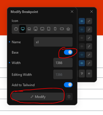
To switch to the desktop first workflow you set it to your preferred display size (by changing the BASE breakpoint) and work from there, be aware that cwicly will bound every GLOBAL style to the given BASE breakpoint that you set.

I advocate to develop your workflow and stick to it until you realize it is good to move to TW ways or what not.

This is a very good guide on page builders and basically all the dev. matters in a very digestible way, i suggest you go and watch ANY of those videos to answer questions you need to aswer.

Be aware that the instructor does not use cwicly or tailwind but the lectures are not bound to a specific pagebuilder or workflow.

In short, I think tailwind its great to save time, though you need to learn it first, but its a pain if you like to have full control and then you will require to dive deep into it.

Even the fluid tailwind plugin shared by @antonijo01 has its limitations and you wont overcome them unless you master your knowledge over css/scss or tailwind. which makes cwicly a no code solution that requires you to be really code savvy or just accustomed to wear blinders and go with what its given.

Indeed, they improved their UI, very nice :slight_smile:
But it lacks fluid spaces with proportional scale instead of exponential, which is great with at Utopia.

Thank you for taking the time to write that details description. I have been working backwards starting wtih Cwicly (since i have dislexia, coding has never been in the cards for me), but with the cwicly setup, i am super excited to be able to have the tools available to me that have until now only been available to those who can read and write code. That said, now that i have the cwicly and now Tailwind cruch, I am comfortable learning and studying the concepts of what is going on under the hood. I am learning so much and it is all starting to make a lot more sense. At some point, it will make sense for the cwicly team to create a course that guides people like me through this process… which will broaden the appeal of the product and help them expand their user base! Until then, I am sort of out here blazing the trail, like you had to do initially from what i gather, you are fairly new to coding as well.

That said let me see if i understand what you are saying, It sounds like there are two primary schools of thought when it comes to designing for different screen sizes. 1. Using fluid workflow, which still involves breakpoints but uses parameters like clamps, flex, css wrap, min-max etc… to design. and 2. Using Breakpoints either mobile or desktop first. Where each breakpoint is designed specifically for that size and is really great for precise designing especially for mobile devices which for some people is really important to create a specific mobile layout that is not simply a fluid version of their desktop (for reasons like button placement, simplifying the offer, etc.).

So for me I believe I want to use the breakpoint approach but starting with the desktop first so that i can take advantage of some of the fluid techniques, for the larger and med breakpoints, and then switch to a different design for the smaller mobile BP’s. I have been designing with the fluid “theology” LOL. for a while now and it is working, but i do see the benefits of the Breakpoints, so I guess my approach is Hybrid, like I assume it is for most.

So now that leaves me with the current question or challenge, Typography. I had set up all of my globals for fluid design with clamps, but I really want to explore the concepts of breakpoint typography where i can set the base and have the font scale across the other BPs. But, I am still not clear on how to do that, since my “base breakpoint” is now lg. not mobile. Is it even possible? My thought was that, I could set the base size on the lg breakpoint and it would scale accordingly for all BP. But I wasn’t sure what parameters to use for the size? I was using clamps but I am almost certain that is not the right answer for this approach, so should i be using em? Or maybe, even using the clamp as another layer on the base?

Adding onto this, after testing out my theory, i believe that works great. So my setup is to set BP’s to TW, then set the base lg (which is the third one in TW and the top one in CY), then make sure i am on the lg BP and set the global font for lg using a clamp and keeping the base font the same as system fonts at 16px for accessibility reasons. Then just testing out the clamp values until i am happy with each BP. So far it is working brilliantly. I hope I am on the right track???

Thanks again for taking the time to help a NUB out.
@StrangeTech @Louis

Did you get it to work in Cwicly?

Louis shows it in the TW video and it is working out of the box.
I tested it too and it’s very easy to customize with your own settings.

https://www.youtube.com/live/8lkY0qM7vJ0?si=9DMpZDog2_yWDYwF&t=6283

Have you also tested it with the “fluid-tailwind” plug-in? It doesn’t work for me. The configuration also differs from the other plug-ins. If the plug-in works for you, do you have a configuration example for me?

Can you give me a precise URL?
Searching “fluid-tailwind” doesn’t help much, there a lot :wink:

As for tailwind-utopia, just add this to your config and it’s done, fluid sizes available in Cwicly’s UI, spaces and fonts, everywhere :slight_smile:

plugins: [ require('@domchristie/tailwind-utopia') ]

And if you want to replace TW default spaces or font sizes, or change the class names, everything is explained on tailwind-utopia github with many copy-paste examples.

1 Like