Design library feedback thread

Thought I’d make this thread for you to leave any feedback you have on the new design library.

Here are my initial thoughts, which I’m sure I’ll be adding to as I start to use it more.

  • Overall, this looks like it’ll become everything I’ve ever wanted out of a design library

  • I’m not sure about the word “Composition”. It’s a fairly vague word in itself, and I wasn’t really sure what to expect when clicking on it. Since it is the main category, I think the naming is important in order to reduce confusion. Maybe it should be called “Sections”?

  • I’m glad to see that the new Cwicly library has reworked layouts. The old library wasn’t very usable for me because it had so many CSS defaults set. The new layouts are much easier to work at first glance.

  • To make them even more useful, I’d be nice if you could easily copy block styles to a global class, and then clear the block styles. (Copying styles to global classes currently doesn’t work properly, and clearing styles hasn’t been implemented yet).

  • Changing the viewport width when saving a section makes the preview a little wonky (at least on Firefox). The preview also looks like it’s at a smaller breakpoint than what it’s set to (the section is more narrow in the preview than when viewing at 1600px on the front-end).

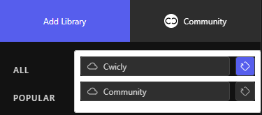
  • I’m not sure if I love that the Cwicly library icon is to the left of the main + icon. Haven’t settled my thoughts on this yet though.

  • Styler blocks don’t seem to be working for me. Had one section that created 5 styler blocks, but only one “background-image” property was actually set.
    EDIT: Just saw that it doesn’t import the styling if you enable “Import Global Styling” either.
    EDIT 2: Disregard. I am dumb.

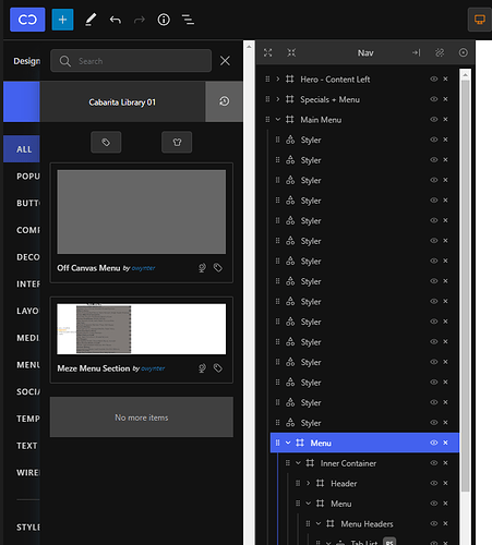
  • I wonder if it’ll be possible to display the styler blocks better in the future. Right now they stack up on each other, and will take up a lot of the page once you’ve added a few sections. Maybe you could add them all to one parent item?

  • Would be nice if there was a setting to enable “Import Global Styling” as the default option

  • Even with the design library, I’d still be great to have the ability to quickly copy/paste sections across domains

P.S. just want to reiterate again that this is a fantastic update, and these are just little bugs I’ve noticed or things that could be improved sometime in the future.

2 Likes

Hi there @sunny,

Thanks for taking the time, really appreciated :slight_smile:

Makes our day, thanks! It now has a solid base, and allows us to plan for some exciting features.

I understand your point, and the confusion/fuzziness it could create. . In the previous library, we named it Sections, although we did spend some time asking around/looking at what others were proposing and Composition did seem to come back quite a bit. Definitely something that can change easily.

:+1: @Araminta. Lots more to come with an emphasis on more specific blocks (query, tab, filters etc…) so that using the Cwicly blocks just gets that much easier with a solid ready-made base.

A quick clear block styles (and responsive properties etc…) in on the cards. While copying global classes does work as designed, it isn’t suited anymore for the new approach we’ve taken recently and is being worked on at the moment. We’re looking at an easy way to toggle from block styles to global classes also (especially useful in the case of the Styler block).

The block preview does need a little more work with viewport adjustments, still working out where it’s going wrong exactly.
Thanks for pointing this out.

Good point also. We’re so used to it being there that the position has never been discussed again. Definitely something to look into.

That’s odd. Just tried it on an example block with quite a few global classes and they all properly transfer to Styler blocks.
Do you get the right amount of Styler blocks added / for the # of global classes?
Surprised global styles don’t get replace either in the case you are import them

Great point. We are looking at a few possibilities for the layout to reduce the space the Styler block takes.

:+1:

Maybe I’m misunderstanding what you want exactly here, but you can already copy/paste Cwicly blocks from one installation to another? Although, global classes and global styles won’t be imported with them.

1 Like

First off, thank you so much for this mighty tool.

I had very high expectations, I have to admit.
I had some concerns as well, because I knew there were at least some obstacles to overcome, juggling with all the different Cwicly features which needed to be included in a proper and intuitive way.

The design library is a cornerstone.
Not only for users but also for Cwicly itself as a product.
It’s crucial for many reasons.

I do have some points on my list and going to share my thoughts and ideas as soon as I find some time to test things more extensive.
In the meantime, I’m curious what other users share here, as well as in the design library :face_with_monocle:

Thanks @sunny for starting this topic and already sharing your experiences.

1 Like

Never knew Gutenberg/Cwicly had cross domain copy paste. Cross domain copy paste is available in Bricks using browser native clipboard api. Clipboard API - Web APIs | MDN

You can copy block on installation #1 and then go to any page of installation #2 to paste it. Bricks also copy over the styling and also create a global class if missing.

I prefer the Cwicly approach here to prevent overriding any existing global class or class with same name but different properties.

I am very excited to use Cwicly seriously with this new design library. Will start sharing the blocks in community library as I make them and lots of feedback also incoming especially with regards to accessibility.

Hey @Louis,

Thanks for the detailed responses.

As always, I’m glad to see that you’re already thinking one step ahead of me on most of them :slight_smile:

That’s pretty interesting - I wonder if it could maybe be a Europe vs. North America thing? I usually only ever hear people say composition when referring to a fancy piece of art or music :sweat_smile: I don’t think I’ve ever heard it used in web design.

That’s great to hear. Even if creating a completely custom design, I can see elements like the FAQ accordions saving a lot of setup time. Full element control + 1-click implementations is a winning combo!

I use the “modern” admin colour theme, which makes the buttons look pretty similar as well:

image

I’m not sure how often I actually use the + button in real life, but yeah, might be a better idea to have the library button to the right of the core tools.

Well here, now we can try it easily.

Add this library public key: kmFiroOTyjPV7AR3hD9s, and insert the one block. The “Free Resource” text and button should look like this:

Yeah, I think I’d like a way to import the global classes since that’s what I use to style most of my components. The design library helps alleviate the need, but it’d still be nice to be able to copy/paste one-off sections/elements quickly.

Thanks for the key, @sunny.
That’s unusual. Can you confirm that the background-color/color properties are linked to a global class? Because they don’t seem to appear in the raw file at all.

Oh crap. I completely forgot that I’m pulling the CSS for those elements from my existing Oxygen stylesheet.

I had still created the global classes in Cwicly so that it’ll make my eventual full transition to Cwicly smoother. That’s what threw me off the trail.

So sorry about that!

1 Like

Thanks for letting me know :slight_smile: Quite relieved!

You mentioned the Global Styles not being imported. When/if you have time, would love to check that out also.

Thanks again for sharing your thoughts and findings!

1 Like

Don’t worry - that one was related as well. It was importing the global classes but of course not any styling. All good now!

1 Like

Is the Community Library working properly?
Seems like some random stuff is showing up for me in the popular tab - even a heading I saved for testing purposes privately on another installation.

Someone already shared something? Everything is empty for me except the popular area.

1 Like

Hi @Marius,

Sorry to hear this and apologies for the trouble caused here.
Could you possibly check again to see if you are still experiencing this issue?

We are currently finalising the setting up the Community Library (for public use, submitting is possible), so this is definitely something that shouldn’t happen.

Hey @Louis.

It was something that I experienced from the beginning but apparently was fixed in a short while, maybe 30 min, after I posted it here.

Just double checked and seems to be fine :+1:

Only the nice community intro section from @Araminta is missing.

Thanks for the update regarding the community library.

1 Like

@Louis

Just a heads up. I noticed that if you try to create a new library with a name longer than 20 characters, the “Create Library” stays stuck with a spinning wheel.

1 Like

To make Design Library Items as accessible as possible to everyone, using custom CSS isn’t something I would want to add for regularly used properties.
Some available properties are restricted as well.

I think this topic should finally be addressed.

Also:

For a full no-code approach, this is required as well.


Ability to add a website link to give the authors some credits for their efforts. This could motivate more people to add their stuff. Also, people could reach out via contact info if there are issues or questions regarding a certain design.

Ability to add a link to each library item, in case the author wants to add some notes or even documentation, video, etc. I generally like to create interactive designs which are above average complex and the average user couldn’t do anything without some additional hints.

Ability to filter by author.

3 Likes

Going the single column route to accommodate the design previews in a sidebar instead of a modal is a great decision.
However, could there be a quick-toggle to switch (temporarily) between one and more columns?
For exploring purposes, the current approach is not very convenient / efficient.

Not a big deal for now, but as the library grows, something should be done in that regard.
Maybe even a resizable panel which displays a reasonable amount of items per row based on some basic flex rules.


Minor issue since 6.1:

image

4 Likes

I’m a bit late to the Design library party. Works well enough, but I might have missed the part about Styler Blocks. How do we handle these? I get that they are used to bring global styles in, but must we keep them?

I have a fairly complex section that I saved from one site to reuse and there are well over a dozen styler blocks.

Is there a way to combine these somehow?

I think it’s on the map @owynter.

Thanks. I haven’t been following up on the discussions as much these days, admittedly.
Really hope this gets sorted.

Hello @owynter,

Can you describe the reason why you would want to import them as Styler blocks and not simply Global Classes?
Might help guide us on your exact needs.

I was not aware there was a choice…

I would prefer if the styler blocks were not imported at all, and that all styles and classes applied to a block are imported. There’s no documentation on styler blocks that I can find, and was just under the impression this was how it worked.