Block Inspector

Hey there.

I want to address a couple of things inside the Block Inspector, mainly the key area, where all the class stuff, etc. is available.
These are based on my personal experience, which I want to share here.
The more I spent time with Cwicly, the more prominent things became.
I wanted to bring it up for a long time, but I decided to wait and see what happens, the tool is just over one year old. Most things I have in my mind from quite the beginning.
Well, a lot has happened in the meantime, Block Inspector has been improved drastically - except the area I have some issues with (minor, not related stuff changed).

Please don’t take anything as suggestions, how things should be in the future, it’s just a single opinion.
Feel free to add your thoughts as well in case you have something to share in that regard.
This way, we might provide valuable feedback which could improve the way how we work inside the key area of the editor, the Block Inspector.
Looking forward to reading your input / discussing things.

Here are the points which I thought to mention.

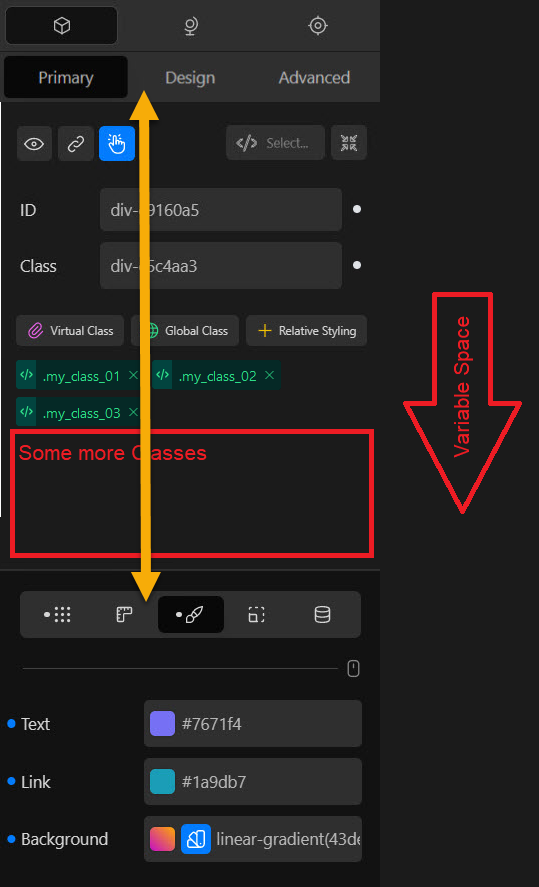
  • The block class input field is too narrow; it should be nothing but full width
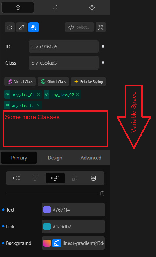
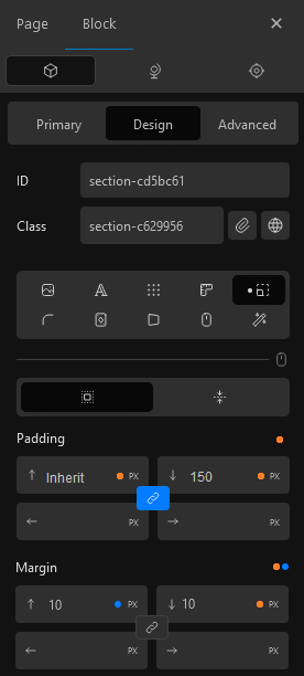
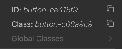
  • I can’t hide, or let’s say show only when required, the ID and block class fields. Once setup (in most cases they aren’t even touched and, in my opinion, they don’t necessarily need to be visible all the time), these fields are a dead area, which in addition increases the distance to the main tab area (Primary/Design/Advanced). That brings me to the next point
  • These tabs are not in the right spot. The cursor hotspot is more in the center, where the actual styling takes place. Switching main tabs makes me lose focus and takes too long.
  • There is a lack of consistency in the main area which contains the essential block info and features, plus the block inspector lacks visual hierarchy. I know the main area on top is adjusting dependent on which tab is active. Even though there is some sense behind it, I find myself too often forced to switch tabs, just to reach a simple but essential option or quickly add a class (writing custom block CSS without direct access to the classes?!), which should be available throughout the block inspector
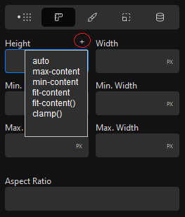
  • This is minor, but the pseudo selector dropdown area shout be consistent in the Primary, and Advanced Tab, as well as in the RS editor panel

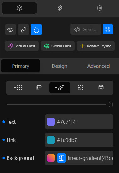
So, what’s important inside the main area and in which order do they make sense?

  1. HTML Tag
  2. ID
  3. Block Class
  4. Additional Classes - Virtual/Global Class & Relative Styling

I know there might be other opinions about this order, but this is how to write HTML, so it feels just natural.
Yes, Cwicly is a builder and I will survive different orders as well (hopefully).
In my example, this even saves a decent amount of space.

A shortcut/icon which would open a modal to add/edit attributes or at least to open the attributes panel in the advanced tab area, is something I wished it would be there so many times.
It’s not necessary (at all), it’s currently only 2 clicks away. But in a contextual way, it kind of would make sense to be available in this main area.

Visibility Conditions, Link Wrapper options and Interactions should be available everywhere.
No one should be forced to switch to the right tab, just to get access to these features.

As you can see, except for the pseudo selector dropdown area, it’s all about the main area.
Based on my experience and thoughts on how things could be improved, I quickly threw some visual references together, just to make things clearer.

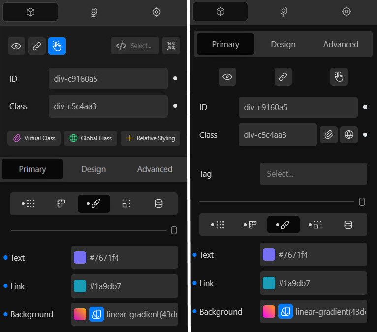
Block Inspector - showing Block ID/Class

Block Inspector - hiding Block ID/Class

Block Inspector - comparison (mockup | current)

Thanks for taking the time to read this entire post.

2 Likes

Hi @Marius,
really like the thoughts that you brought up.
Love the collapsible UI design that you showcased here :heart:

I would directly approve all except for the third?

If you mean these three:

grafik

I think those are as main tabs in the right position and give in that position a better overview.
The other reason would be that if for whatever reason you have a lot of classes or other fields that push down the menu. One would have to scroll, and the menu would be in a different position for each block when the block editor would not be collapsed and with that the consistency would suffer from it.

As for better reach or a better focus I would probably prefer the possibility of hotkeys.

I would like to add my own thoughts to your list:

  1. More dropdowns of properties for not that knowledgeable people and simplicity.
    grafik
Edit Wrong example

grafik

  1. I miss some visual guidance that was removed, which slowed down my working progress by reading labels. I already mentioned it in the big UI/UX topic:

As even the new version would have enough space for bigger numbers…

grafik

Especially for things like Row and Column:

  1. The other thing is, that I am still missing a proper concept for the Indication Of Default Values, which are inherited from a parent, linked blocks or classes.
2 Likes

@Marius, this is good in terms of simplifying the editing experience.

Here are a some considerations/possible further refinements.

The benefit of the current UI for ID and Class is that you can not only edit these, but also see whether they have been modified and what their current value is at a glance.

In your current proposal, when the UI is collapsed, this information is inaccessible.

Since there is enough space, how about adding icons for the ID and class fields next to the html tag that show the modified/enabled status. This would also allow displaying the current ID / class on hover of the respective icons.

Taking this even further, you could entirely remove the expanded view (and therefore the toggle button as well) and just open a modal or dropdown when clicking the ID or class icon.

With the above additions, the only downside with collapsing the ID/class UI is not being able to see the current ID/class immediately in the panel when selecting a block, which, for semantic naming of elements is a probably very valuable.

2 Likes

Thanks for the positive feedback @T-low and also for taking the time to add more to this post - I really do appreciate that.

My main point was that specific area, so thumbs up for addressing other stuff as well.
The Block Inspector isn’t perfect yet, but I find, it made a remarkable process to date.

If you don’t mind, I’d like to pick up some points you made.

Exactly, that’s what I am talking about.

The only reason I can see here, why the tabs are on the very top is, that the main area is involved, since this area adjusts depended on the active tab of these (see image below).
With my proposition, this isn’t the case anymore at all.

These tabs are directly connected to the block styling.

The main area isn’t even connected to that stuff in most cases.
Still, it’s always in the way.

Good point, thanks for bringing this up, since this variable makes the situation even worse.
The more classes you add, the more mouse travel is required without any sense.
These are direct sub-tabs, which are currently kind of disconnected.
Everything between actively interferes with my workflow.

Hopping through these tabs is something I do pretty frequently, because it’s necessary.
Having a consistent main area available, which I have explained above why this is a better approach imo, there is no sense in setting it up this way anymore.

Consistency wouldn’t suffer, the opposite would be the case when showing the main area throughout all main tabs.
There is no consistency anyway since each block can hold different amounts of classes and the design tabs are shifting dependent on that.

Separating the main area (also visually, currently everything is more like one chunk), which holds all important info, from the design part does not make even more sense, it will give you both - a much better UI and UX.


Very good idea, I like it. This could be introduced everywhere where applicable :+1:

For me, the exact opposite is the case.
I’ve read some positive comments about that change here as well.
I also do welcome every inch of available input space, as I work a lot with the calc() function.

I can only speak for myself, but I have the feeling, at least in that regard, Cwicly has finally found the perfect way for this - after testing quite a few things.
Pretty convinced that there was a lot of feedback through all their channels which they also took into consideration.

You could open a feature suggestion for an option to switch between labels and icons and wait for feedback/votes, to check what the community is thinking about that?

Here is room for improvement, I have to admit.
This should be solved in a better way, including the order property.
Still, labels should be kept here as well.


This is an interesting but also complex topic.
I’ve started to write some feedback when you posted it, will hopefully add my thoughts soon.

2 Likes

Hey @StrangeTech and thanks for not only adding your own thoughts, but also for providing positive feedback in terms of my propositions.

I totally agree with this and I’m in no doubt that the Block ID & Class must be a fixed component of the UI.
Moving them around, hiding them behind modals, popovers, dropdowns, icons, etc. isn’t very practical imo.

A simple toggle to show/hide these fields seem to be a straight-forward and efficient method for me.
The toggle should be not block specific, it should transfer/apply to all blocks for a unified experience.

No one is forced to hide these information, they are available in an instant.
It would only require a single click.

There is space, yes. But it would bloat things and significantly decrease the clear UI.
Why display something on hover, when there is a simpler and quicker option available, which also gives you full access to edit or toggle the class/ID?

Again, one simple click and full UI and functionality is retrieved.

That’s horrible UI/UX in my opinion.
As stated above:
“I’m in no doubt that the Block ID & Class must be a fixed component of the UI.”

There could be an option though to select which areas should be affected.

  • Block ID
  • Block Class
  • Add Virtual/Global Class / RS Buttons
  • Virtual/Global Classes / Relative Styles
1 Like

@T-low

With respect to your points:

  1. Definitely agree that having an autocomplete dropdown for known values is a good addition and will speed up efficiency.

  2. Regarding icons vs labels, I think for technical users and experienced developers icons can be something they can get used to and develop muscle memory for with regular Cwicly use. On the other hand, for site editors or non technical users who use Cwicly as a no-code solution, and who likely only log-in a few times a month, labels are essential to avoid confusion and visual fatigue. I am actually going to make a feature request regarding this soon, based on wanting to make Cwicly easier to use as a post editor for some of our non-technical clients.

  3. Having clear information regarding inherited values is a great idea if it can be technically achieved.

Hey @Marius,

I agree 100% about keeping the UI simple, and I also want to be able to take advantage of your suggested improvement, if it is implemented, without losing valuable at-a-glance information in the process.

Having a toggle is great and to get the most benefit from it, it will be optimal to not have to flip between the expanded and collapsed states just to check whether an ID / class has been specified. The small addition of a state indicator means the only time you will need to expand the editor is for actually editing the values and the rest of the time you can enjoy the simplicity and reduced clutter. A win-win.

This is what makes the modified state dots on the tabs so useful in Cwicly at the moment and this would be a way to add this same benefit to the ID/class toggle consistently.

Taking your feedback into consideration, how about a combined button that acts as the toggle and has visual indicators of modified state. On hover I was thinking just show something similar to the right click of the navigator, I can live without the hover though as long as the modified state is shown.

Screenshot 2023-03-05 at 20.27.34

3 Likes

Hi @Marius @T-low @StrangeTech,

Will go into further detail in the next few days, but wow… What a tremendous share.
I just wanted to thank you for putting these thoughts together here on the forum, it made my day seeing this thread and I’m excited going through these ideas.

It really does go along the lines that we’ve been exploring with the team this last couple of months.

Our first change from panels to tabs/icons was decisive last year and had to keep a few familiar UI aspects, and I believe that now is the right time to continue that shift.

Thanks once again!

3 Likes

That is a lot of really constructive feedback/thoughts - thank you.

My little input from a no-coder, who love Cwicly because it enables so much functionality for “ordinary” people:

  1. Remember all the ones who have just now/recently started using Cwicly - Please remember that every change requires a new learning process, updated documentation etc. So consistency also has value for a community with many technical background levels :-). So every change should have a strong argument. And it is a challenge if things keep changing all the time - and for natural reasons there has been a lot of that during the last year (and it has improved the builder so much). So the point is just to find the right “middle-way”. And any use should be “intuitive”/so basically require no manual :-).

  2. I totally agree on the importance of keeping tabs/text/icons organized so that related parts are always kept together. It seems like this is one of the primary points made here and I totally agree. Also with the idea about being able to “collapse” parts of the information. For someone like me (currently) e.g. the ID and class information is seldomly relevant for the designs that I am currently building. It will probably be down the road but not right now - and I think many other “newbies” will feel the same way. But I like that the information is there as I gradually learn about these concepts - it should just not confuse me/take focus away from learning/using the basics first. And every information that is there - but which you should basically just learn to ignore to begin with - slows down the production process.

  3. Colours in the block editor - I noticed that some of the icons in the illustrations were colored. I personally really prefer the (generally) current “neutral” (non-colored) layout, with colors only being used sparingly to show an active state or similar. This is very stringent and professional looking.

  4. Text/icon/floating text - I personally like how these “types” are currently used. I think there is a good use of text and icons etc., in the current block-design. Especially the use of icons with text on “hover” is a great combination of “efficiency” (and use of limited space) and the ability to quickly see the additional text name.

But a lot of interesting thoughts - these are just some quick initial feedback, to add to the conversation.

But please finish the menu builder before starting this project :slight_smile: - not having an easy to use and intuitive menu builder (but instead having to follow detailed instructions in the documentation on how to “manually” set it up in desktop and mobile) is one of the only “big misses” for me now, and I would think a big drawback for many new to Cwicly.
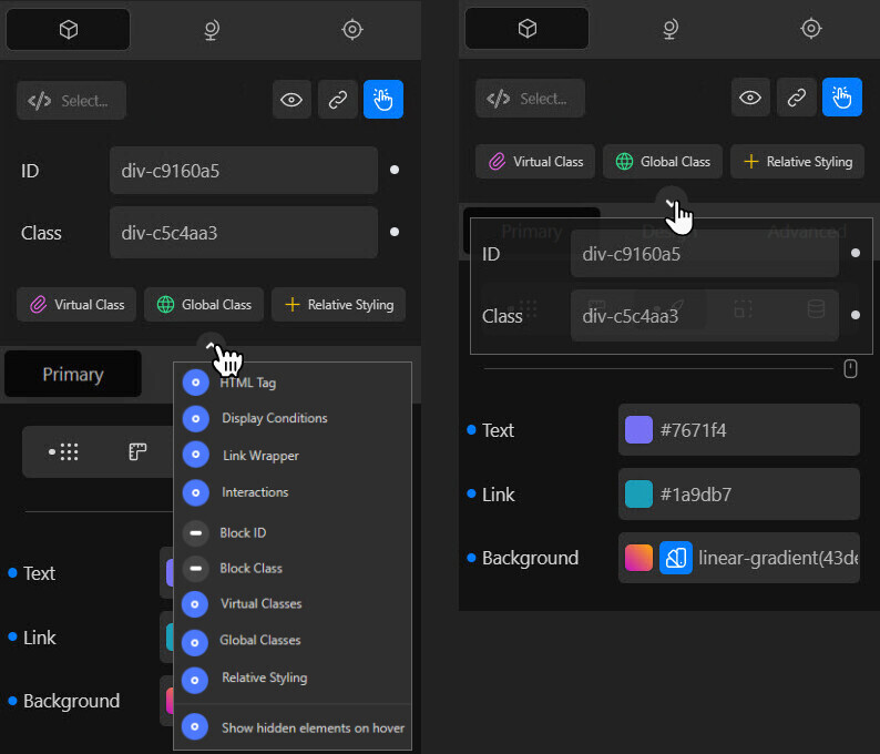
Thanks
Michael

2 Likes

Hey, @StrangeTech.

I think we should have full control over what’s happening. Nothing should be imposed on the user. But that’s a core strength of Cwicly, so I wouldn’t worry too much about it.

You have some points here.
What do you think about something like this?

  • Left Click: Toggle area
  • Right Click: Select from a context-menu what to show/hide from the UI; enable/disable hover ability
  • Hover: Show what’s hidden from the UI (on collapsed state only), if enabled inside the context-menu (could be a read-only mode, but why restricting then there?)

The context-menu could alternatively be a part of the Role Editor.
Would be even more powerful then since these toggles are more general decisions than changing it frequently.
They are not deleted from the UI, just hidden behind a toggle, so it would make sense.

In case this gets considered in some way, the most possible granular approach would be welcome, just to declutter the UI when specific elements don’t fit the general workflow.

Hey @MichaelCph.

Thanks for joining the party :tada: ,
and sharing your experience with the for you overwhelming UI of the top area.
Glad to see that you like the idea of showing elements on demand.

I can well imagine that quite a few users only rely on 1-2 options, like the link options.

The colored accents I added were only for the purpose of a clearer visualization :+1:
Color wise, I only miss a clear grouping of the main and design area (see the mockup).
Thanks for picking up this point, so I can make things clear.

This is something both parties are affected.
Re-doing videos and updating docs is not something which sounds a lot of fun.
Still, I agree with you and hope that we get a polished Block Inspector UI in the near future, which is then here to stay.

Hey @Marius,

As you say, this as a potentially very useful general approach to configuring the block inspector to further make Cwicly highly configurable and put the power in the hands of the user.

I fully support this kind of approach especially if it can be pre-configured in the role editor, so we can provide the best streamlined experience for non-technical clients.

I think it is a good idea to get clearer on the use cases, to be able to isolate the features we are discussing so each one is given the attention it merits.

  1. Hide rarely used or unused elements (e.g. General Show/hide toggle) - For this use case it is sufficient to have a simple toggle because it is all about removing unwanted elements. This could potentially tie in to the role editor.
  2. Optimise the interface UX to reduce the number of steps to accomplish tasks - Less clicks/taps required is often a desirable goal, especially for simple, repeatable and regularly done workflows. Having the most common properties in the Primary tab is probably the best example of this. Being able to type in the unit for values is a great nuanced example of this.
  3. Display only the useful features for the given context - This can significantly increase efficiency and reduce mental effort. For this case, even though features may be used regularly, they don’t need to be always present to be edited by default. Effectively, the optimisations of having tabs for different semantically related groups of properties is already working towards this goal.

As we all know, a balance has to be found between item 2 and item 3 because adding an extra click or two to provide significant additional value can be warranted in many cases.

Item 3 is the specific one I am addressing with wanting to see modified state. I don’t need to edit the ID/class every time I select a block, but it is essential to be able to quickly see the information. It is not addressed by item 1 because even though it involves reducing the fields visually present (when the user chooses to toggle them hidden of course), an important part of the goal is to retain the state information even when the fields are hidden.

Because Cwicly is so flexible and agile in its development and the focus is continuous improvement, I believe we can come up with a creative way in coordination with the Cwicly team to support all 3 cases, while keeping the UI simple.

1 Like

Hi @Marius,

Thank you for your feedback.

Just for clarification - you mention that:

Thanks for joining the party :tada: ,
and sharing your experience with the for you overwhelming UI of the top area.

I don’t think I labelled the UI of the top area as “overwhelming” :-). I generally really like the UI of Cwicly, but I can see that it could probably be structured in a more optimal way.

For me the important part of this discussion is then: What should determine the structure? And I would start any possible restructuring with that question.

I would focus on making some clear and logical groupings within the Primary and Design areas. One way to do this would be to focus on functionality. And then within each functionality area, to order the items in terms of how often you use them and/or their technical difficulty.

Finding/showing items through right/left “clicks” and these drop down menus generally makes the process more technical/flumsy and runs the risk of a lot of functionality not being really “visible” to the new user.

And the functionality and text that you put on these buttons will also have a big effect on how they are perceived by the user. E.g. having buttons with “Virtual class” / “Global Class” / “Relative styling” will (for many) just make the learning curve so much steeper (as these concept are not well known for anyone but coders). Actually I would be afraid that many would just go for another builder with a more easy to use interface.

For non-technical clients or “NoCode users” like me I think the easiest interface to adapt to is the “tab” structure (used very well in the builder right now I believe) and “show/hide” toggles as mentioned by @StrangeTech under point 1 above. This way the information is more visible - and the interface is more easy to follow.

With dropdowns that go over other information, the interface very easily becomes intimidating for many.

But please still remember to have adequate space (white space) between the various items - it makes the interface much more pleasing to look at and work with.

Michael

1 Like

Hey @MichaelCph.

First off, I do apologize for putting words in your mouth, it was rather an issue of wording (not a native speaker).
Still, I think that I got your point, as my following explanation should be correct.

The right-click proposition could be a better fit for the role editor, the dropdown/popover would be optional - nothing to worry about. The core functionality of this idea is clearly the toggle.
Please keep in mind this is just a concept, there might be better approaches.

Again, that’s only for visual reference.
I just quickly put something together, I know there are plenty of flaws.

Valid point, I also see some room for improvement here.
On the other hand, this is also something which is connected to individual workflow.

Show/hide toggles in the design area is something that was mentioned when the Role Editor was released, so I’d expect that to be available at some point.

1 Like

Love your ideas, man… thank you!

I would love to have an area in settings, where I can check/uncheck a lot of these elements, that are needed for seasoned users but a lot for newbies.

Like check/uncheck:
ID / Class
Conditions
Interactions
Pseudo classes
Effects
Transforms
relative styling
(all) Advanced
global classes & stylesheets
dynamic values
dynamic inserter

So you can still build sites, but not overwhelmed with the pro level. I mean I am sure, after two sites build, all will enable everything.

AND: I love your ideas of pulling the two tabs together. They belong together. And the classes belong above, logically way better.

2 Likes

If I think of it, that could be the amount of functions missing in Cwicly Free… :upside_down_face:

1 Like