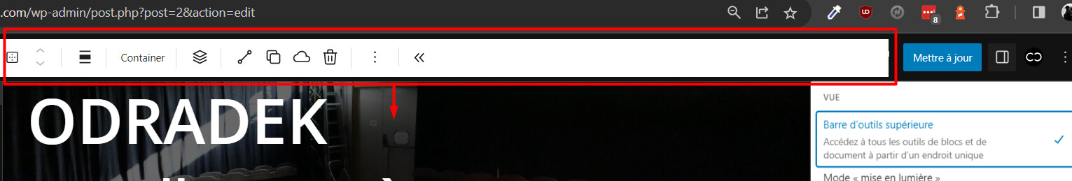
WordPress version: 6.3
Cwicly Plugin version: 1.2.9.9.2
Hi,
With the new WP 6.3 update, when selecting top toolbar in editor, the toolbar is badly positioned over the header topbar:
WordPress version: 6.3
Cwicly Plugin version: 1.2.9.9.2
Hi,
With the new WP 6.3 update, when selecting top toolbar in editor, the toolbar is badly positioned over the header topbar:
Hello @yankiara,
Thanks for the report.
While there are a few styling issues (we unfortunately did not revisit this option), the positioning of the toolbar is not affected by Cwicly and is intended to be there in WordPress 6.3.
Cheers,
OK, I get it…
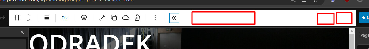
The thing is, in WP alone, we still have access to breakpoints switcher and frontend link with the top toolbar, but with Cwicly, they are hidden, and we have to collapse the toolbar to access them.
So I guess Cwicly’s main toolbar layout could be revamped to match WP header.
Yep, top toolbar is broken. Did face that already in one of my local test installations some time ago.
Was about to post this issue then but was also convinced that this isn’t Cwicly related, as the CSS (source) did suggest so.
Didn’t found anything related on their Github, but didn’t search extensively, I do admit.
Hopefully this will be fixed anytime soon (how can this get past the beta?) since it’s a mess for me to work with it when not fixed to top.
Will have another look later, I think there shouldn’t be any issue to fix it temporarily with some lines of CSS.
By chance, canvas has a padding with same height as the toolbar, so this works for me:
position: absolute;
margin-left: 0;
width: 100%;
top: 0;
That works, plus, in my case, moving the canvas with some padding or margin for the fixed state (.has-fixed-toolbar) @yankiara ![]()
Edit:
According to Louis above and Araminta on FB, this is intended with WP 6.3. That makes total sense.
Unfortunately, I only read the original post in the first place, so my previous answers are not that accurate.
While I didn’t find the previous situation with the pinned toolbar optimal, I tend to dislike the new way it’s implemented.
I tested a lot in the past, since the toolbar is an entire mess in my opinion.
At least it’s not working out that good for me when using Cwicly.
A toolbar on demand (showing only when needed and when hovering a specific area) is probably the most suitable solution for me which I will use in the future.
An alternative would be to position it like before.
I still hope that Cwicly, at some point, will come up with its own solution.
We don’t modify the toolbar at any stage.
Rather, and it’s unfortunate here, the Gutenberg team have set a fixed width for this top toolbar… Adding icons to the header affects it, since Gutenberg doesn’t allow for any extendability natively there either.
We’ll have this fixed for the next update.
Cheers
I wonder if there was a change in WP such that cache / optimization plugins need to be tweaked for 6.3?
FWIW, it seems Ok for me (if I understand the issue right).
Hello @David and everyone,
The main issue here with Cwicly is the styling applied in dark mode (white background).
The other issues mentioned above were unfortunately introduced with WordPress 6.3, and are out of our hands.
This is not a Cwicly issue, but a Gutenberg issue, and will appear with any plugin that adds elements to the header.
This did not come across our testing the 6.3 betas as we have the unfortunate tendency not to use the Top Toolbar.
I have contacted the Gutenberg team and they have been aware of the situation. A positive outcome seems to be drawing itself, although I’m not sure when it will land:
Please don’t hesitate if there is anything else you think needs addressing.
We will be issuing a fix on Saturday for the Dark mode styling issues.
As for the overlaying Top Toolbar, we have been discussing - internally for quite some time - moving most of the Cwicly actions (Library, Global Styles, Navigator) that are currently in the header into the Quick Inserter. This might be the occasion to review some of those propositions.
Cheers,
Thank you @Louis for this update, I hadn’t even thought of looking outside of Cwicly, sorry.
I’m indeed a bit shocked that the block toolbar is so brutally positioned by WP ![]()
Hello everyone,
The dark mode styling issues should be fixed in 1.2.9.9.3.
As for the other issues that concern the toolbar overlapping header content, it seems like the Gutenberg team have a fix for this, although I do believe this won’t be released before WordPress 6.3.1.
We have added a small fix for the width of the toolbar that should not hide the responsive actions.
I will be leaving this bug opened and confirmed, although it is currently out of our control.
Cheers,
This is an excellent idea. Decluttering the editors’ header after all the new GB icons that were added in the last few months (and to separate them, I think that’s important for UI and UX reasons) needs to be done in some way.
On the other hand, the user gets forced to use the quick inserter, unless this is optional.
Also, does anyone really use the pseudo state dropdown menu in the header?
Not sure, but why would one travel all the way from the block inspector and then back again?
There is a dependency of applying styles with the block inspector and making use of pseudo states.
To make it more clear to the user, the pseudo state icon in the block inspector could be swapped with the pseudo state menu from the header (text instead of icon approach).
What I also think is that the scale options/values should be visible at any time and not be hidden inside a modal.
It’s not only a scaling tool, but it also provides information of the actual canvas size in pixel, even when not scaling.
I know that it’s a matter of space though.
Hi,
We’ve fixed the issue by reworking the Cwicly header toolbar in 1.3.
The Gutenberg team also released a small fix in 6.3.1.
Please let us know if you are still experiencing issues.
Best regards,
Johnny