Looks great but should the nav modal be draggable when docked?
I was a bit off.
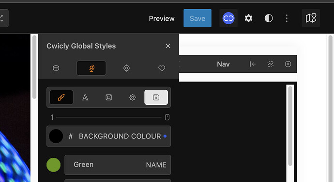
For UI: is there now some way to increase the contrast or to set the colors (background, fonts, icons, etc.)
This has been mentioned several times in the thread:
V1.2 - Class section inside Primary/Design Tab
- When selecting a Global Class and there are existing Relative Styling rules, I would prefer to mute the Relative Styling rules, instead of removing them.
- When clicking the Virtual Classes or Global Classes icon, I would prefer to make the class dropdown menu disappear with a 2nd click on the icon.
- When a Global Class is selected, I would prefer to have a more significant visual indication. For instance, giving the class field a green border, or even the Tab List, so one is aware when navigating around, changes will be made to the global class, not the block class.
- Something I noticed on the live stream already. Disabling Virtual Classes with “only” a line-through as indicator, not sure about it. Maybe lowering the opacity a bit would make it more clear? This also goes for the Relative Styling rules, the current solution is not sufficient. This could be more of an issue when using dark mode.
- When selecting a Global Class, the font-weight turns into bold, this requires more space. In some cases, a following item can be pushed to the next line. So depending on which global class is selected or not selected, there is some class item party going on. This can lead to an inconsistent experience, similar to the 1st point in this list. Maybe using a brighter color shade instead?
I am missing the ability to add a Relative Style from the class area. Seems like the icon has gone. Any plans to re-introduce it in some way?
Is there an option to rename virtual classes once they are set and displayed under the class field?
Do I really need to remove and re-create/-select them?
Navigator
Regarding the Navigator, when an element is deleted, it scrolls up to the top. When there are not many elements (that fits in screen view) it’s not an issue, but when you have a long list, and need to delete multiple ones, it’s less convenient. It would be nice if it stays in place.
Inserting Sections
I always find it tricky when I need to insert a section between other sections. All the quick inserters don’t work as you need to have a preselected element before inserting. (so you have to insert it in another section then move it) Drag and drop also doesn’t work in this case.
Some time ago there was a plus sign on the page (default in block editor) that allowed to do this, but now with that removed doesn’t seems to be other way around to do this.
Very good point.
Also, when selecting a block, it will position the block in the center of the Navigator.
I think there is space for fine tuning and also an option to disable the automatic scrolling entirely.
Thanks, nice valid points @alex.
Inserting blocks in general is something we have to review quite soon, as the experience is not pleasing. We have quite a few ideas and will be putting them to work and seeing what works out best.
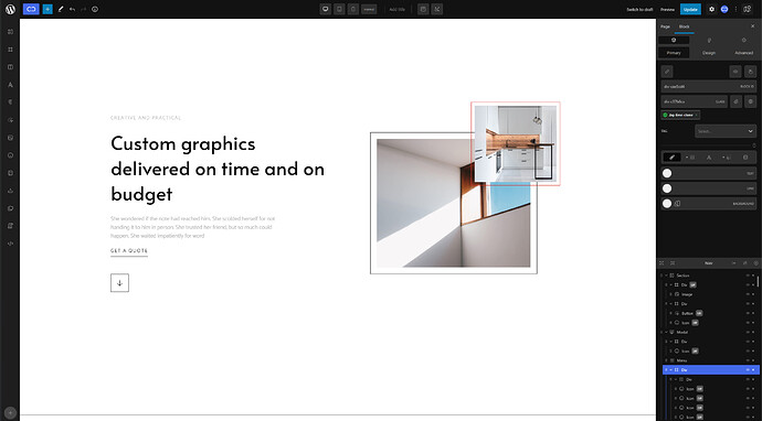
Resizable panel vertical (to change panels width) and horizontal (between Block Options and Navigator).
For me, this would be it.
Thoughts?
Feels like Pinegrow. Nice!
Nice @Marius.
Definitely things to play with here.
Now we have the Role Editor, we can allow ourselves a lot more freedom with customising the panels etc…
I’m also quite envious of the classes reference styles ![]()
Hi there, really like the changes in the UI until now ![]()
Not sure if this was mentioned somewhere, but I was tinkering a little the last few days and had these two thoughts.
In the color picker, the active color graphic is sometimes quite hard to see and could use some kind of shade or outline. That would guarantee the visibility on all colors.

Now to the main part ^^
I think the Block Inspector primary tab is wonderful to find the way into what the different Blocks need and make them special.
Since I familiarized myself to some extent with the Design Options I am staying to about 90% in the design Tab. Especially now since the classes and visual classes are also available here. ![]()
For a better UX on my end I am missing the header selection (toolbar) in the Design → Typography tab. Because of that I have to pretty often switch back and forth to only change a header setting.
I am also missing the Header Toolbar in the menu block, but I think I read somewhere that the menu block is in progress? ![]()
Love the progress ![]()
Hi @alex,
Thanks for bringing this up.
1.2.1.9 should hopefully help towards this. Would love to know what you think ![]()
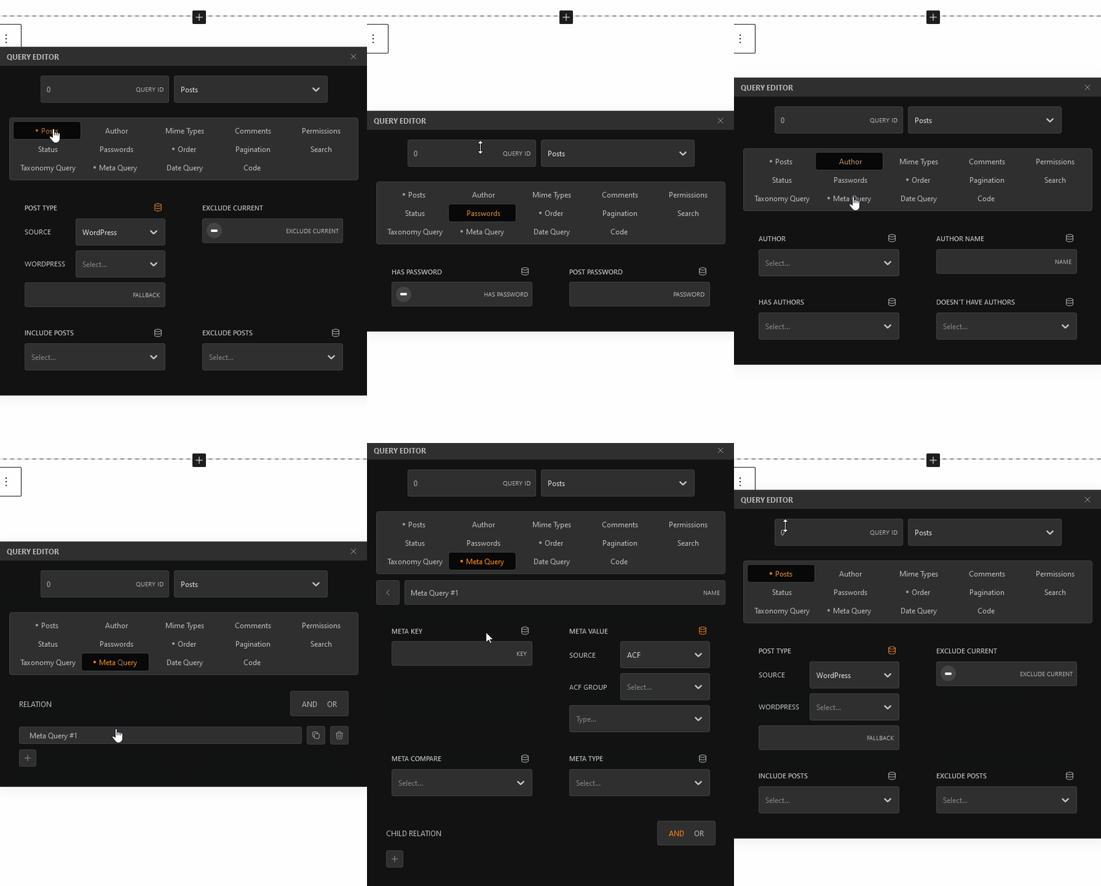
I like the new Query Editor design, prevents one to scroll each time for further query changes.
The Query Editor could use a fixed position or size, for me it jumps way to much ![]()

Agree with that, it’s not the best experience currently.
I’m sure some modal resizing ability would help, maybe only in terms of the height in this case, to keep the original structure?
Neat improvement btw.
Good to see the gradual adaptation of the new UI elements for an even more streamlined experience.
Hi @T-low,
Thanks for bringing this to our attention.
It has been addressed in 1.2.2.3.
If you still experience issues with this, please let us know.
Thanks.
Is there any form of global and/or external classes management available yet?
Like categories, folders, etc.
Yeah…nice suggestion. I like it a lot.

