It is just a discussion.
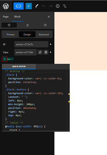
Do you think having an icon for the quick editor next to the virtual/global class icon(or somewhere around the editing there) is good? Just like we hover over the small icon(highlighted) next to the global class.
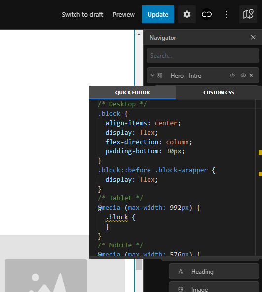
Currently, If I need to copy the block’s default CSS, I have to mouse over the navigator(I usually open the navigator on the right and then the styling panel on the left).
It would be great if both could be on the same panel.
What do you think?
Welcome to discuss.

