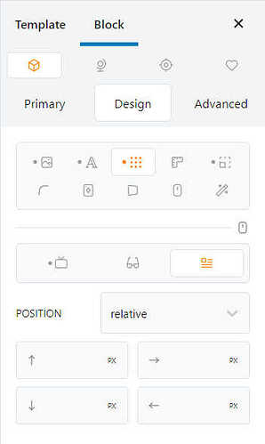
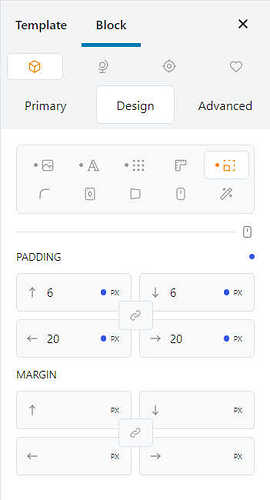
Isn’t it possible to display the same order in all the forms were these settings appear.
Hi @weedor,
Thanks for bringing this up.
Indeed, equilibrating the orders to make them more cohesive is definitely something to fix.
The current set up seems like a good solution to this as these properties don’t serve the same purpose in my opinion.
What do you think @weedor?
It should really be consistent across all inputs of this kind, whatever the order is.
Even if it is not the same purpose, the input fields represent the same locations (top, bottom, etc.).
Maybe to remove ambiguities, a layout representing the actual locations could be adopted.
Here are examples in Bricks and Oxygen:
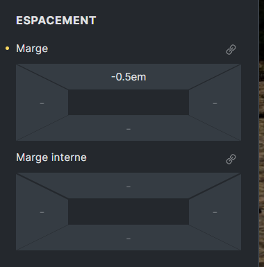
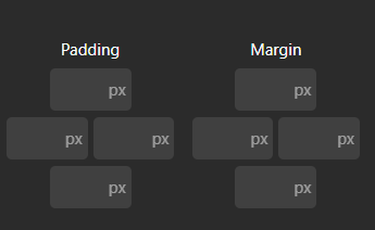
I’m not saying they are perfect, and I actually don’t like any of them because inputs are not wide enough to appreciate values (for instance with calc() or var() stuff), but at least they remove all ambiguity because they look like what they mean.
Something similar and better could easily be done in Cwicly, keeping wide enough inputs:
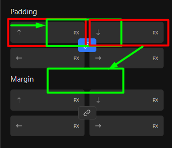
I would like to bring this back into the conversation.
Our team all have had a similar experience, after hours of using Cwicly, even with muscle memory, this is providing an inconsistent experience.
We agree with @yankiara’s suggested approach 100%, as this removes all ambiguity and visually agrees with the mental image of the box model.
When you are working long days, any small time saving can make a big difference and any advantage can help a lot.
This positive change would reduce any unnecessary conscious thinking about which box relates to what side and we would very much like to see it implemented.
Consistency with other builders is not the significant factor because Cwicly already differentiates itself in the ways that matter most, this is simply about providing the optimal intuitive user experience for Cwicly developers and editors.
If one thinks visually, this arrangement makes no sense.
As stated in the original post and the feedback of other users, it’s top, right, bottom, left.
It also needs to be reflected accordingly inside the GUI, @yankiara hinted some possible way to do so.
This has been bothering me the whole time, to be honest.
Unfortunately, nothing has changed since this was confirmed to be fixed 2 years ago.
Which other builders follow this odd scheme?
Hello @Marius,
Agree on this one, it’s been on my mind.
With shorthand, the familiar way is to group top/bottom, left/right, hence our setup in Cwicly.
The reason I’ve been reticent to make the changes up until now is because of the little more space this would take up in the editor, but that consideration no longer really applies.
I do not deny that the current implementation also has its advantages, but from a logical point of view, seen realistically, the disadvantages outweigh them.
Of course, it is always a matter of personal preference. In my opinion, it makes the most sense in a visual builder to implement things as practice-oriented as possible.
@StrangeTech made some really great points here in that regard.
Yes, these were my exact thoughts.
It’s good to see that the new approach brings with it many other positive effects and new opportunities.
The most compact and understandable option)
Implement the connection of values via alt (for two values) and shift (for four values)
In my opinion, these are already generally accepted things; it will be easier to switch from other builders.
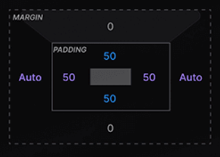
I’ve always been a big fan of this kind of approach because it is both visually and kinaesthetically intuitive.
Thanks for sharing, @DenisKozeev.
I do like the compact approach and have liked using it when trying other builders.
The only issue I see with this is what @yankiara said some time ago:
This doesn’t apply to Tailwind values so much, but definitely values with units and variables etc…)
A first glance won’t allow you to quickly see what’s been applied specifically.
But isn’t that rather a general issue @Louis, especially when the input fields are only 50% in width?
I pointed this out here.
Yes, this requires an additional click, but in the current state, the values are not completely visible either.
Here is some similar approach, just grabbed that from another builder for demonstration:
That’s a fair point, and that thread has been in the back of my head for some time: expanding inputs when focusing in on them (although when trying on my end, I always felt disturbed by the change in size and sometimes position of the value…)
I’ll be putting together multiple examples and will post them here in the next couple of days.
Thanks for your input!
Guys, this layout for spacing looks pretty, but is unpractical and requires unnecessary clicks. Bricks and Webflow are not a metric to follow in this regard. It shouldn’t need to have to click to know a value of a field. Long functions and vars are terribly affected by this layout. I’d much rather see a layout where all fields have the same width, but top and bottom are centralized horizontally, and left+right sit in between them sharing half the space each. Values are easy to glance, and you are not required to have to go out of your way to see the value.
In my opinion this is a regression.
Hey @zeinnicholas, thanks for sharing your thoughts.
There is no perfect solution here either, but as always we should be on the lookout for the best possible compromise.
In my opinion, your description is somewhat out of touch with actual practice.
Spot-on!
But is tedious scrubbing through the narrow input field a better approach to see a value? This requires a click, a lot of precision and, in many cases, too many nerves.
Don’t even get me started on the value editing experience, it’s just horrible.
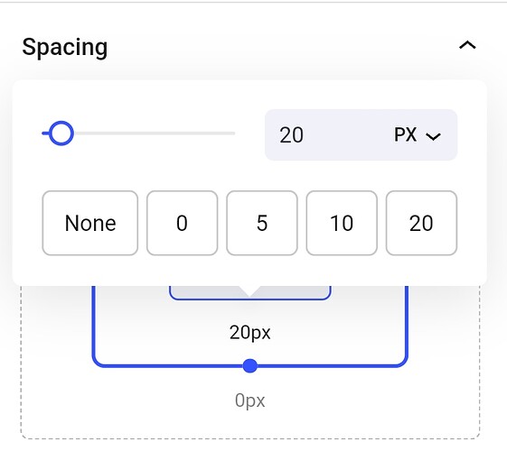
Now, with a single click, you not only can see the value but also set your cursor precisely for editing purposes.
I find it somewhat difficult to follow your reasoning, as it seems a little contradictory to me. Please excuse me if I have misunderstood your actual point.
Yes, you can’t see the whole value at a glance, but that was also the case before. Everything that comes after that is a big improvement.
Only describing my experiences here after a few days of active use and a direct comparison with the previous version.
I’m also curious how other users experienced this new spacing control.
This type of layout is good for strict numerical values. CSS is no longer a strictly numerical language when it comes to “length” properties.
As soon as you have something written like a variable or a calc function, it forces you to stop what you’re doing, click, and then see the written value. It doesn’t even work with 5 characters well (as in 00.00), you have to reduce the font size to display them correctly, and I’m not even talking about displaying the unit.
A Popup with a wider field is great, no doubt, but it is still two clicks away. If the problem is scrubbing through a narrower field (but not as narrow as the visual representation of the box model), one could easily implement Flexbox to grow this field and srhrink the other one only when it is in focus.
With this visual representation, you can only glance at the field to know there is a value, but if you want to actually see the value, you have to click on it. This slows down the workflow.
For me this is a regression because it prioritizes form over function, and there are more negative outcomes from using this layout as opposed to positive ones.
I was against this when Bricks implemented it, and I also mentioned the downsides of this visual representation in Webflow forums. It looks “professional” and visually pleasant, but it compromises the workflow. Especially when you combine both margins and paddings, limiting even more the space for the actual content (what really matters) since they have to share space.
There are plenty of ways to represent these positions, and plenty of UI hints and accessibility solutions that can mitigate the difficulty for new users to understand what they represent. This is just by far not the best one. It might help if you reduce the graphical interface to a minimum, but it will still be terrible to see the values for the X axis fields.
Of course, this is just my opinion, and I know it’s an unpopular one.
Thanks for this valuable and constructive feedback @zeinnicholas.
I think it’s important and helps improving and moving forward.
We probably will see more input on this in the future. Let’s see how users think about it.
I’ve seen that Bricks offers both options. Maybe something to explore, dependent on what users request.
Hey @Louis.
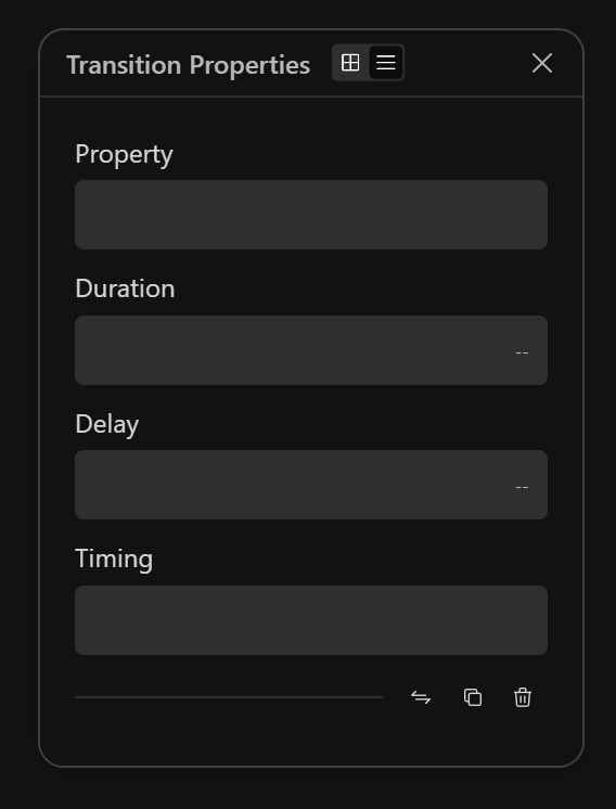
What do you think about an optional list view for the property modals to address the narrow fields for the use cases of vars, calcs, etc.?
Edit:
I know it’s not a global approach and it might not fit in what Cwicly is heading to. Maybe something to consider for the panel options to have global, but also granular control over which properties being affected.
I think for the sake of simplicity, it’s better to keep it the way it is right now, with the visual approach. We’ll learn to click to view the full value when needed.
