I think it’s crucial to have the ability to see any value in its entirety at any time.
This is also important when it comes to editing and the required spot is hidden, because there is not enough space available in the GUI for that particular input field.
All the scrubbing, searching and stopping on the right spot is kind of fiddly and cumbersome.
Changing things in the interface (just because of this “issue”) wouldn’t make sense, as the logic would suffer and there is never sufficient space guaranteed - for instance in reference to working with variables, calc functions, etc.
This “limitation”, which is shared across all builders (did this ever got addressed by any tool?), was already mentioned in multiple threads and different topics from various users, but I think there isn’t a dedicated feature suggestion to date.
I hope there will be some improvements in that regard.
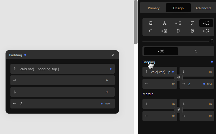
Something like a resizable or auto-adjusting modal that opens when double-clicking the property would be totally sufficient, like:
Though it doesn’t happen so much, I agree that I wish I could edit a value with a full width input, without ruining the current compact display.
You have my vote!
I’m really not into mobile modals, but I could live with some kind of fixed modal overriding inspector on hover or click (not double):
That’s exactly my thoughts.
The compact display should remain the same, and full width input should be made available in a dedicated instance via user interaction and should always be optional.
I’m actually open to anything, as long as it makes sense and doesn’t interfere with other UI elements.
In your example, this unfortunately is the case.
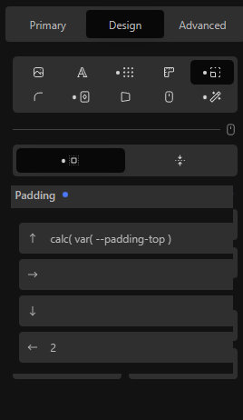
My example fits in the current UI, is flexible because the user can position the modal wherever required and with a click on other UI elements, it automatically closes anyway.
The modal has actually become an integral part of the UI in the meantime.
In case this suggestion is considered and implemented in sometime in the future, I think the team will find a good solution and as long as it makes sense and can be efficiently used, I’m all in for everything.
As always, the visual part serves only for better understanding. It’s not a direct proposal.
This is a good point, then I guess instead of overiding the following fields, the compact (standard) padding fields area could EXPAND on hover or click and PUSH the following area DOWN so that everything remains visible.
Clicking the property label could make all applicable inputs full width. This would only take up 2 additional rows.
In best cases, the expanded mode could remain and remembered throughout all blocks until the user decidedes reverting to the default state by clicking the property label once again.
The apparent issue is that the input’s width would always be limited to the block inspector’s width.
Here again, the modal, as an independent instance, would provide the most possible flexibility without changing the UI.
This might be personal preference but I’m not a big fan of moving/changing elements within the interface triggered by user interaction.
Since the modals do remember their position, you could basically achieve exactly what you suggested but in a more flexible way.
I would be OK with inspector width for most input edits. Sometimes I have a value like calc( var(–blablabla) + var(–blablabla) * var(–blablabla) ) but it’s OK if I have to scroll a bit for such rare case.
As for the modals, I do disagree:
first, they are constantly in the way, hiding stuff (whether it would be on the canvas or inspector) ;
worse, their positions are NOT always remembered. For example stylesheets editor modals are constantly forgotten and it is a pain to move/resize them all the time. (Can’t tell though when they are reset, maybe at Cwicly updates or user logout…)