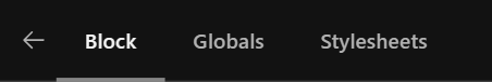
The updated navigation for the inspector sidebar is definitely cleaner and in general I am in favour of it.
There is one aspect that I think can be improved.
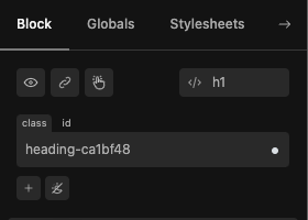
With any UI, keeping elements in a consistent position is a best practice to enable users to develop muscle memory. The fact that the Page tab moves to the end of the bar and turns into an arrow is not the clearest UI in this respect.
Ideally keeping the Page button in the same place will be easier for our clients to understand and use. This is currently additionally compounded by the fact that the arrow icon does not necessarily represent “Take me to the Page tab” and has no tooltip, which means that until you click it, you don’t know what it will do.
Also, there is this bug as raised by @Marius - ideally the button should always return you to the Page tab with a single click for consistency:
Agreed. It provides a more all Cwicly experience which I definitely prefer.
The main advantage obviously is decluttering the UI. In this case, it makes a lot of sense.
Tbh, this always bothered me but didn’t mention anywhere, as it’s part of Gutenberg.
I mentioned it here and there in the past:
It’s important to move to an isolated UI experience to give Cwicly a premium look & feel.
They are almost there.
, but
in this case I don’t agree. It’s a matter of interpretation.
The arrow icon is a navigation element, nothing else. And it’s in the right spot too.
It needs to be considered as a different panel, instead of a tabbed navigation.
This change is a move in the right direction.
While clicking it once will be sufficient to get the idea, especially when familiar with Gutenberg, a tooltip won’t hurt indeed.
This might be more helpful for clients, but also is a matter of consistency.
Icons should always have tooltips.
If it’s not a bug, the current behaviour doesn’t make sense.
The issue with this is, the existing Gutenberg buttons look and behave like a tab bar with a selection state and the new Cwicly bar also behaves as a tab bar with selected state and contains a button with the identical label “Block” as in the Gutenberg bar.
Based on this, it’s very easy for a user to not know how to get back to the Page tab unless they are explicitly demonstrated, or they start experimenting, which is unintuitive and not desirable for non-technical users.
It is also not just about the positioning, it’s the icon itself. A back arrow would denote going “back to the previous tab”, a page icon would represent going to the Page tab, but a forward icon doesn’t have any semantic meaningfulness connected to its purpose in this case. So, ideally aside from any horizontal spacing considerations, having the word “Page” as the label is the clearest option.
I remember back in the early days of web development and UX, having an icon button with no label and no tooltip was called “Mystery meat” navigation, alluding to anonymous tinned goods that have lost their label. You can open it up, but you don’t know what you’ll get or whether it’s what you were expecting.
@Louis, I am interested about your take on this, as well. I think the new menu bar optimisation is great, it’s just the Page button that I believe can be improved upon, specifically for non-technical and first-time users.
I also thought about the icon itself but found any other approach than an arrow as problematic.
Considering the new navigation as a sub-tab, a top arrow would make sense to return to the main navigation (page/post & block).
But this would be rather opinionated, like the current solution with the arrow to the right
A back arrow would only make sense in this constellation, which is not an option in my opinion:
What’s your opinion about this one?
I think this is quite descriptive, intuitive and self-explanatory.
Of course, and as discussed above, an additional tooltip “Page/Post Options” should be added as well.
I don’t think that it interferes with any of the other interface icons.
This is certainly more intuitive, although may still be confused as an undo icon. My preference would be to have the label, but if for some reason that wasn’t workable, something similar to what you have proposed with a semantic icon and tooltip would be an improvement to the existing arrow for sure.
An undo icon inside a navigation isn’t something common, especially when the counterpart redo isn’t available.
This particular constellation wouldn’t exist.
The post/page label only would make sense as a first menu item (like the ), but as mentioned above imo doesn’t make sense in the block inspector menu.
I think they found a pretty sweet compromise in favor of the UI which requires a tiny tweak yet in form of a suitable icon and a tooltip.
Thanks for bringing this topic up and the constructive discussion so far
It certainly would be helpful if we can hear more opinions from other users.
I know it appears as not as important, but it kind of is.
Think of your clients too.