Thanks @Louis
The navigator seems to be working as expected now.
1 Like
-
When loading / refreshing a page in the editor, the first block in the Navigator is skipped, so it actually starts with the 2nd block which is placed on the very top.
It requires to scroll to top then. That happens as soon as there are enough blocks available to fill the entire height of the Navigator and only when docked.
Anyone else experiencing that?
Edit: Created a separate bug report for it. -
Is there a specific reason why the Navigator always loads with all blocks expanded?
It’s very minor and I think it doesn’t require any attention, I’m just curious - as well as how other users do think about it.
Hey @Marius
Yes! I noticed the same.
Thanks for confirming @jornes ![]()
Since the navigator is a virtual list it makes modifying its height more complex for users, but we can definitely think about a small snippet that would allow a custom value instead ![]()
It would be nice if the Navigator layout persisted when docked / undocked or moved from left to right etc. I find it a bit jarring when I have, say, one section open in undocked mode, but if I dock the Navigator it expands all blocks. Not a big deal, but it would feel more consistent.
1 Like
When the Navigator is undocked, it is spawning copies of itself (appears to be limited to 5 stacked on top of each other). Please refer to screenshot:
Good point ![]()
I’ve seen you mentioned that earlier yet, but couldn’t find a scenario how to reproduce this.
Are there specific steps required? Which browser / OS do you use?
Thanks @Louis, that would be highly appreciated.
As soon as JS comes into play, it gets quite complicated to achieve a desired tweak.
The only areas I got stuck was the horizontal/vertical item spacing and the labels for IT/LW/CD/RS, which seems to be generated dynamically without specific classes to target them individually.
Just as an additional idea (GB List View inspired), a visual indicator, like a slightly different background color, for all child blocks of the selected Navigator item.
Not sure if this would be a complex task to add or users would request/need it.
I want to add that with the new Navigator design, this is not necessarily needed at all, since a pretty decent (and in my opinion totally sufficient) hierarchy indication is already available.
What do you guys think?
1 Like
Hello @Gary,
Thanks for noticing this one.
It would happen in the Site Editor when switching between templates.
This should be fixed in 1.2.8.
If you still experience this, I’d be grateful if you could let me know by replying to this thread.
Cheers,
@Marius as mentioned by @Louis (below) it was only happening when switching between templates, and I can confirm as of the 1.2.8 release, it is now fixed.
I think it is a nice subtle contrast in the GB List View. As you said, not necessarily needed, but I do like the way it simply highlights the children of the selected parent block.
1 Like
Where do I find the option to name the blocks in the navigator?
f.e.: I always name the sections to really have a clear understanding which block is what.
thanks
lol! Didn’t see. thanks Marius.
1 Like
Is there any chance to improve this situation a bit?
Undocking and re-docking will also do, so it really isn’t a big deal.
Just in case there is a quick and easy fix…
1 Like
With the new UI, I completely got rid of any custom CSS to weak things per my needs.
That’s awesome, thank you for consistently improving the experience.
Still, there are 2-3 things that could be discussed for UI reasons.
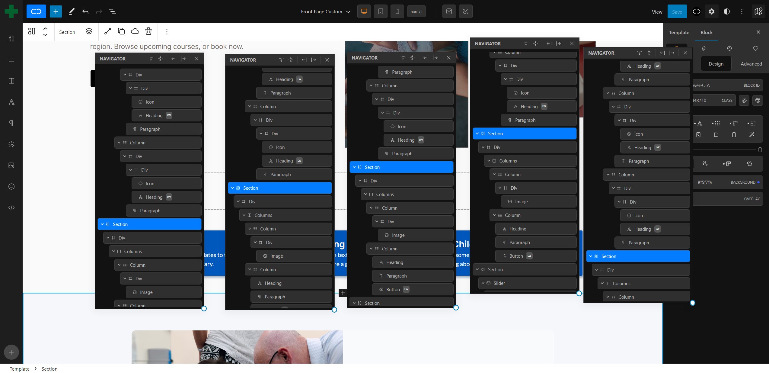
- make CD/LW/IT labels more readable
- slightly increased font size
- maybe a bit of letter spacing
- increase of contrast
- equal padding (or slightly increased horizontal instead of the current vertical)
- decrease the spacing between the CD/LW/IT labels by 25-50%
- decrease spacing between block icon and block name
1.) current situation
2.) proposal
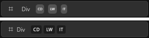
1.) collapse icon visible
2.) collapse icon not visible
- Move the block collapse icon outside of the navigator item
Why?
- there is a spacing inconsistency dependent on its visibility
- it’s much faster to see whether there are nested blocks or not (when the parent is collapsed). For me, it fails UI to display it inside the actual navigator item
- some additional space would be saved
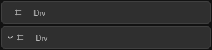
1.) current situation
2.) proposal (with spacing improvements)
Everything mentioned is personal preference.
Maybe we can collect some more opinions about the points that were made.
Thanks!
I just discovered the changes that were made in 1.3 in that regard (how could I even miss it in the live?)
It’s so good! Consistency and readability are perfect now. Thank you, Cwicly Team ![]()
![]()
Excellent improvement that has been introduced with 1.3.0.3, which beside a more modern look and streamlined experience, specifically addresses readability issues when working with a high pixel density.
Amazing to see that for the finishing touch as well ![]()
The Navigator is a fundamental part of Cwicly which can make life so easy under specific conditions. Now it does, without any doubt.
By far the most superior UI/UX I’ve ever seen in any tool.
No complaints left; I appreciate you for always having an open ear to the community.
Just a little thought, which could be handy, especially for inexperienced users or clients → displaying the block type in a popover while hovering over the block icon in the Navigator.
When giving the block a custom name/label, the only descriptive fallback (Navigator or Block Inspector) is the randomly generated block class/ID name - if not changed.
PS: Sorry for being so annoying on this topic, it’s just such an important part.
1 Like