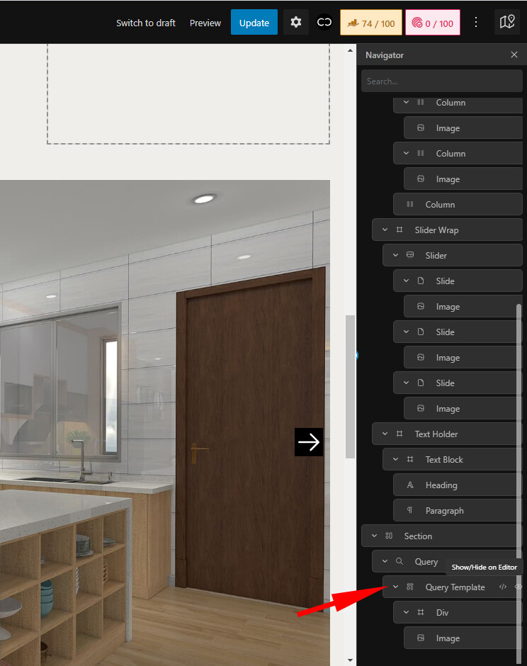
In the area I pointed to with a red arrow, you will see that the delete icon on the element is outside the visible area. I have to scroll to the right to see it.
*Scrolling to the left/right on the navigator is not a good UX experience.
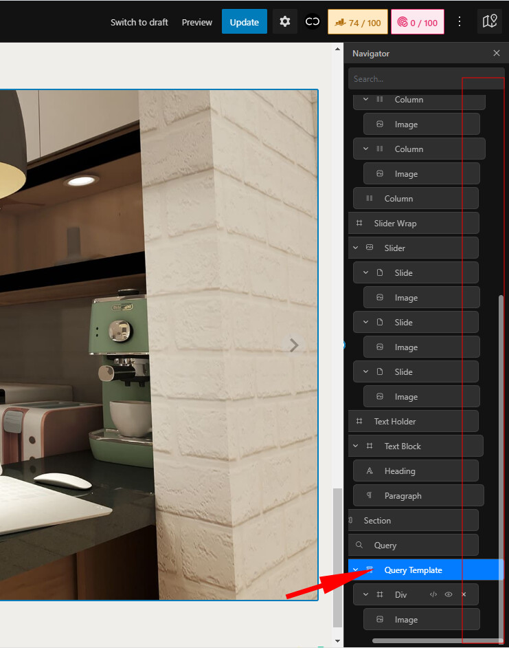
On the right side, all the elements on the navigator are right-aligned, making the entire navigator look nicer.
And the other side(left side of the elements), you will still see the nested elements. With this improvement, we don’t need a scrollbar within the navigator. And we can easily use all the icons on all the elements.
Hey @Louis
As promised, I checked the navigator this morning.
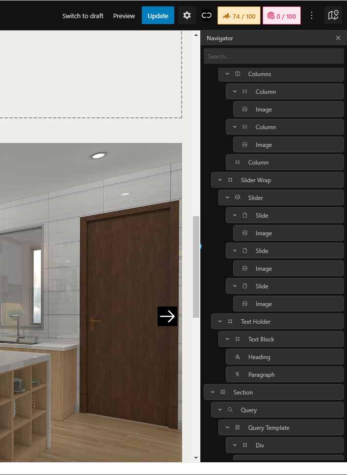
I expanded the navigator to the exact width of another builder. Everything in the navigator behaves the same as another builder. All the elements on the navigator on the right side are right-aligned. That is great. But, all these are applied when the navigator is expanded.
I think there needs to be a bigger space on the right because there is no fresh air to breathe there.
Also, I’d suggest giving the navigator a bigger min-width by default, and the users can still make it smaller whenever they want by dragging the panel.