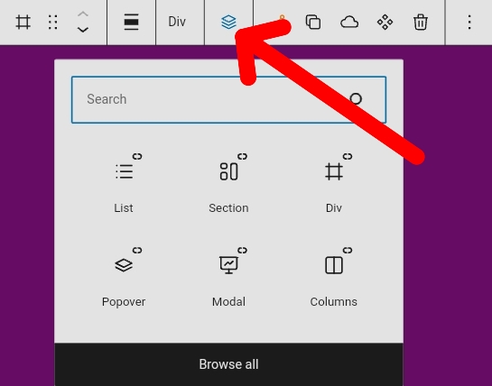
Can you improve this add block from Gutenberg? or add your custom add block feature
Very annoying in my opinion
both when docking on the left and right
Can you improve this add block from Gutenberg? or add your custom add block feature
Very annoying in my opinion
both when docking on the left and right
I pretty much ignore the block editor “plus” button and insert most blocks using the Quick Inserter or the inline “stacked icon” inserter. It’s all about finding the workflow that works best for you, but there’s no use hacking the block editor to death, when there are already multiple ways to do the same things.
Ok, #4 was a joke, but you get the idea. Also, yes, the core “plus” button is kind of wonky, but it’s much easier to use on of the alternate “better” options, rather than spending time trying to fix the WP method. Just my thoughts!
I use Quick Inserter
However, it can only add a few important shortcuts
Do you mean inline by this button? I tried it and it got the same reaction as when I pressed the plus button above
Screenshot by Lightshot
to much click
but I agree with your argument, it’s better to do something else than waste time here because it’s gutenberg’s mistake not cwicly
but it can’t be helped that it is cwicly built on Gutenberg
That’s not Cwicly’s fault.
The Quick Inserter is the most efficient way to add blocks.
In case you didn’t know, you can add more icons than visible and find them by scrolling.
However, it could be considered to add a compact mode for the Quick Inserter.
As explained above, here a visual addition to understand it better:

Cwicly did an excellent job to get around the Gutenberg block inserter by providing highly flexible solutions.
Not sure why one would still use it.
Not as efficient as bricks or etc but this is better
Thanks [Marius]
You might be interested in this Feature Requests then:
Search function for Quick Inserter - Feature Requests - Cwicly
Please add your vote/thoughts if you find this important.