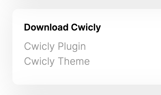
This is just slight UX improvement as the first time I wanted to download Cwicly theme and plugin, I did not find it. It was under my eyes but if the links were underlined, or as buttons, or blue, that would have helped a little in my onboarding.
Maybe subtle aligned buttons since we add the child theme ?
I would also appreciate a download starter child theme because it’s always nice as I always use them on every project and it takes me 5-10 minutes to change template name and check stylesheets are loaded properly.
Thanks for this suggestion, much appreciated!
We’ll do just this, and also add the child theme to the Getting Started wizard so that you can install it directly from there, just like the current Cwicly theme.
It seems the question asked by @Refica has not been answered regarding the timeframe of the child theme installation under the Getting Started wizard. I just checked using version 1.2.9.5.8.3 and at this time there is no option to install the child theme.