Mykyta
November 30, 2023, 4:55pm
1
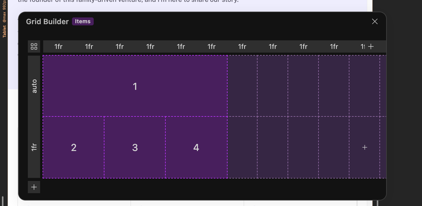
I’m trying to change the number of columns in tablet mode and I can’t do it.
Mykyta
November 30, 2023, 5:09pm
2
Problem solved, it was due to the fact that I accidentally added the grid settings to the block class. But still, sometimes it is difficult to manage columns in such a small window. You need a scroll bar.
And I really miss the button to remove all styles from the block after I’ve moved them into the class.
Louis
November 30, 2023, 5:22pm
3
Hello @Mykyta ,
Can I know which window you’re referring to?
Definitely something we will be implementing soon.
Cheers,
Louis
November 30, 2023, 5:26pm
5
Can you show me an example of a layout that utilises this configuration?
Cheers,
Hi @Mykyta , you may be interested in this feature request:
As discussed in this thread:
While there is no one-click solution, this is possible using copy/paste.
It will be a great timesaving feature to be able to copy styles from an existing block directly to a global glass.
[Copy to global class]
Ideally this would include the relative styles, or there could be a second menu option to do those also.
For a very powerful additional feature, there could also be a “Move to Global Class” menu option, that copies the styles to the global class, remov…
More good news! Thank you @Louis