since I rely heavily on components, it’s becoming more and more time consuming to go down the component tree for editing or viewing. Unless I’ve missed something again
Red it over here too:
And apologies in advance, @oppi, if this was not your point for this topic.
I would like to see a toggle mode where all components are viewable and if editing in between would be also possible that would be perfect. But the main point on my side is that I would like to be able to see the open component tree without having to click on each component individually.
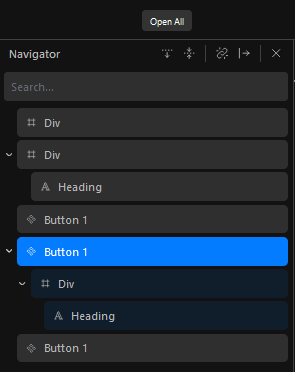
Right now I’m only able to see a single component on the page, or the nested gomponents that are in that one.
For the edeting it is not possible to drag other blocks directly into a component, but this is not a big deal as we can copy the block we want to add and simply paste it into the component.
Your idea plays along nicely what I’d like to see for Cwicly in a Design System Manager.
Managing Components in a central place is an important part there. Has almost a documentational character as well.
The opened component idea is nice, but should be toggable in the navigator options as an perma open component brings difficulties for mr. fat fingers here.
Jokes aside, this would be a cool feature, especially in the process of building a component.
The component inserter could be beefed up, but we need to take care for performance so that global component editing experience must not degrade editor speed. Which happens super fast with 10 to 20 complex components on one page.
Totally agree! Would think of a cached block structure to display the blocks statically & not editable in the navigator and only load the component when selected.
I very much agree that it is currently a pain to browse through components content and I personally wish it was more seamless like all other container type blocks with a permanent arrow to expand, which would remove the need to click on Modify component, be it for browsing component structure or editing parameters.
An additional global option could also be useful to prevent components from being expanded when expanding the whole structure, because one could need to expand the whole structure without seeing inside components which can be considered as more atomic elements, and only expand a component when needed.
As I’m still not very into them for different reasons, including this one, I don’t have a lot and I can’t yet speak about performances, but I agree this is an important point to keep in mind, as bloated pages can already slow down the editor a lot, particularly at load time.
Totally agree. I don’t understand where the benefit of collapsing the components automatically lies. I think it heavily worsens the usability instead of making it better in any way.
If others like this behaviour, to me an option to disable it in the cwicly settings would be REALLY appreciated.
I’ve noticed that this topic is gaining some attention.
As this comment doesn’t seem to draw a crucial distinction, I wanted to make sure we all understand the process behind components.
Components are not standalone entities, they are connected to a single source of truth.
This connection gives Components a unique status, allowing them to be customised and modified.
Customisation, in this context, refers to making changes to the specific entity created when a Component is added. These changes are only applied to properties you have defined at the original source. Modification, on the other hand, enables you to alter the original source of that Component, with those changes being applied to all the unique entities relying on that Component source.
When you select a Component in the navigator or on the canvas, you are actually selecting a distinct entity associated with the Component source, not the source itself.
This puts you in customisation mode, where you can adjust properties either directly on the canvas or through the block inspector.
The key idea is that in customisation mode, you’re tweaking preset properties and not directly accessing the blocks that make up the Component (not unique to Cwicly, you’ll encounter a similar approach in coding as well).
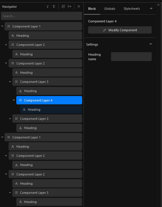
This is the reason why we currently limit the navigator view to only display the Component entity and not the individual blocks it consists of.
I’m open to changing this approach and displaying the blocks used within a Component as long as it makes sense and doesn’t crowd the navigator.
To better understand your needs, could you provide more details about what you feel is lacking when customising (which is most of the time) a Component (more precisely, what you’re looking for in the navigator etc…)?
I personally wish that components were always at the same time in customisation and modification mode, so that we can easily expand any entity on the page and select a block inside it to edit it or delete/add blocks.
They would be always expandable/collapsable like all others containers with a toggle, like Gutenberg reusable blocks.
But with a global option to allow NOT expanding them automatically when expanding the whole structure with existing dedicated button (because it’s true that once a component is finalized, we might not want to expand it ever to save room).
Nevertheless, I understand that the inspector panel would a bit crowded for the component block itself, so for this component root block, a switch or tabs could be used to display either customization or modify section.
I think that it will be especially useful in the Tailwind context, given that we might create more components.
Hope it makes more sense now.
I may have been a bit excessive with this feature request, and it probably needs to be broken down into different topics. Essentially, what I’m suggesting is an enhancement in the navigation.
What I’d like to see is the ability for components and their content to be visible in the navigator. This means I would like to easily see what’s behind the component I’m currently viewing on the screen. For instance, if I have a section component, it becomes quite time-consuming to delve into its components and navigate through the layers.
Essentially, I would like to see the block structure that the component contains, which we are able to see in the navigator. It doesn’t necessarily have to be live (could be cached / saved data), but upon clicking on the component, I would like to be able to see and modify its content like the normal settings of the components and still not be able to edit the blocks. And then if I click on modefy, I would be able to directly edit the blocks (source) in the component just like before. This would be a significant time-saver in using and viewing components.
For instance, if I’m deep within the section tree of components, trying to inspect a single button used across the entire site, and my client requests an additional shadow on that globally used button, I’d have to navigate to the specific component, click modify, initiate edits, all while being able to see the full structure in the navigator.
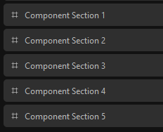
A different example would be a full page of section components. This would leave me on a page with 5 sections with only 5 collapsed components in the navigator, which is not really helpfull in grasping the structure of the content.
Hope this was discribed better
Overall, this enhancement could greatly improve the navigation and editing processes, resulting in a more efficient workflow… at least for me ^^
When we click on “modify”: we expect to expand automatically the corresponding component in the navigator.
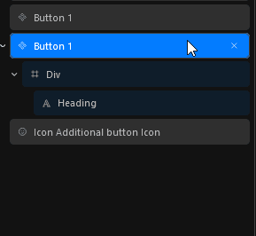
For the drag and drop into components: that’s great!
A nice addition would be to have an alert or a toast notification that said: “You should be in modify mode for this component to be able to add element to it” when we try to drag elements into it without being in modify mode. Otherwise, if we try to drop something in the component, it’s not working… but we don’t know why.
