As mentioned here:
Components are extremely useful. As there are property groups, which work well, one really powerful enhancement will be to have the same flexibility for component styles (i.e. style groups) as mentioned above.
Thank you!
As mentioned here:
Components are extremely useful. As there are property groups, which work well, one really powerful enhancement will be to have the same flexibility for component styles (i.e. style groups) as mentioned above.
Thank you!
Hello @StrangeTech,
Thanks for this feature request.
If I understand correctly, you’d want multiple style presets to be applied at a single time?
Property groups don’t hold any logical functionality except visual categorisation, whereas this feature request seems to be directed at how one could apply multiple style presets for one component entity.
Have I understood correctly?
I’d be interested to know what other users think about this.
Cheers,
Yes, that is the ideal.
Having used the Styles feature now, I can see there are UI implications to my proposed request and possible complexity.
When the whitelisting of classes feature request is implemented, that will provide an alternative way to achieve something very similar.
Hi @Louis Louis,
I assume that @StrangeTech is looking for the same feature I am.
To provide a simple example: let’s say I have an info box, and I would like to offer my client some style options: whether to display this info box with a shadow or not, and whether to have it with round corners or not. One solution would be to add a class property and use appropriate classes, and as @StrangeTech mentioned, class whitelisting for a specific property field would mostly solve this. However, in an ideal world, I wouldn’t want my client to deal with classes like “has-border-radius” or “has-shadow”, but instead to engage with more human-readable options such as “With shadow” or “No shadow”, and “Round corners” or “Square corners”. Currently, it is hard to achieve this with the Style property (unless I make all possible variations) because it doesn’t allow multiple sets of options.
So, I also wish there was an option to have multiple style property groups with the ability to name each.
Wouldn’t that perfectly be a use case for the options property @krievinshj?
I might miss your point though. Do you explicitly want to use global classes?
But not sure why a single rule should be a Styles and not a Property thing.
Isn’t that exactly why one wants to use a property, especially in these cases, instead?
Imo, your current approach would restrict your client in design choices.
I agree with this for the most part. There are some limitations to using an Options property versus using the Style but it should do the job well.
Options and the whitelisting of classes (when it is added) should fulfil most needs.
Perhaps my example wasn’t illustrative enough to fully explain what I meant, but I’d like to add a few things:
Yes, that’s exactly what I’m aiming for, particularly external (utility) classes. When you work with multiple team members and mostly use global classes, custom utility classes, or some frameworks (like Tailwind), it’s important to maintain a consistent workflow and methods throughout the entire project. This ensures that everyone on the team is on the same page.
The Option property was the first one I tried in my case, but it can’t add classes, and as far as I tested, it currently can’t set certain attributes, such as border radius or box shadow values. It would be great if it could. After watching the spotlight video, I thought it would be possible to enter a CSS value in the Option value field and then apply it to any CSS property (like border radius S, M, L, etc.). But when I tried, it seems it only works for CSS properties with pre-set options, like display (flex/grid/block/none), position (relative/absolute/static), etc. Well, unless I’m missing something or doing something wrong.
The reason I prefer the Styles property over others is because you can apply multiple classes or multiple CSS rules to each style option, which isn’t possible with other properties.
In my particular case I have a “simple” and a “fancy” box, both of which have multiple classes or styles applied. Both of these can also either have a shadow or not. By default, there’s a border, but if a shadow is added, the border is removed. So, there are multiple CSS rules at play again. If I want to give the option to choose between “simple” or “fancy” and then “with shadow” or “without shadow”, I’m stuck.
Okay, maybe this is not a very common case, but it still demonstrates a current limitation.
As I mentioned, whitelisted classes would almost solve my problem, aside from the fact that class names may not be human-readable enough for the client.
Every case is different, but in this specific situation, I am actually trying to limit the client’s styling choices. A professional designer has made designs and UI variations for each element, and I don’t want the client to act as a designer and choose the border radius (number property) or any other property on their own. I want to limit them to specific options. And that’s why Style presets felt almost perfect, except for the fact that I can’t add multiple sets of Style presets.
Based on your most recent post, I can confirm this, wholeheartedly.
This is indeed what we were thinking as well. The appeal of Component Styles is the usability and human readable names. Having style groups certainly solves this elegantly. So we are in your hands @Louis, as you are the only one that can confirm whether this is technically feasible.
Hello @StrangeTech and @krievinshj,
Thank you for going into a bit more detail here and sharing your thoughts.
Technically feasible? Definitely, depending on how we would put it in place.
To be honest, I am surprised that the components beta hasn’t brought up more discussions (positive/negative) here, which makes it difficult to position ourselves.
While I do find this request important, I’ll leave it up to community votes.
Cheers,
We are very excited to be testing components and we are also fully immersed in multiple large projects at the moment.
I will certainly be doing more testing and giving a lot more feedback in the coming days when there is more time.
That is understandable, one thing I know you are already aware of is, something like this is immensely powerful and because Components are so useful and applicable to so many different use cases, once they are released into the live Cwicly version, changing features in a backwards compatible way becomes trickier.
So from our side, as long as this can be done in an elegant way, then it is very much requested, as going forwards, this will have a significant positive impact and benefit to our clients.
@Louis, thank you for the Components announcement! Some really exciting and very powerful improvements to look forward to today.
From the live I saw Style Collections have been added - this looks great and ties into this thread.
Based on the demo, it looks like Styles is still essentially a single select feature - meaning there can only be one style or style collection selected at any given time, please can you confirm whether this is the case.
When you previously said:
I can see that technically Style Collections fulfils this by grouping multiple styles into a single named entity that can be selected, which definitely is a step in the right direction in that it will significantly reduce duplication because individual styles can be reused between collections.
There appears to be one distinction between Style Collections and our original request, which is that we were hoping that multiple styles could be selected individually at a single time.
Example 1:
With a component having the styles “Not available”, “Available”, a single selection works well because these are mutually exclusive options (i.e. OR).
Example 2:
With a component having the styles “Highlighted”, “On Offer”, “Not available”, “Available”, a single selection does not work well, as the component may be “On Offer” as well as “Available” because the options are not mutually exclusive (i.e. AND).
With the existing Style Collections implementations it appears the only way we could support this use case would be to define an exponential number of extensively named collections for each combination (e.g. for two style combinations: “On Offer & Available”, “On Offer & Not Available”, etc - or for three style combinations: “Highlighted, On Offer & Available”, “Highlighted, On Offer & Not Available”, etc), which would quickly become untenable.
So, having the ability to define multiple Style Collections and have them individually selectable (just as you can define multiple properties and have them individually editable) is one way to solve this.
I hope this makes sense to you.
@StrangeTech, I completely agree with you on this.
@Louis, first off, thank you for the components, this is a game-changer. And thanks for implementing this request right from the first version of components. I’m genuinely excited to try everything out.
However, I must agree with @StrangeTech that, while this is a step in the right direction, it’s somewhat different from the request I (and seemingly @StrangeTech) had in mind.
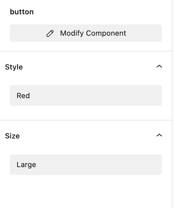
My idea was that each style collection would have its own separate select box. Let’s use a button as an example. I’m currently working on a website that has Primary and Secondary buttons. The Primary button is black, while the Secondary one is red. Throughout the site, there are three button sizes: small, medium, and large.
I envisioned creating a button component that I could use throughout the website, and which would offer options for both: style (black or red) and size (small, medium, or large), covering all possible button variations for that site. I expected the interface to look something like this:
Currently it is single dropdown and I need to create style or collection for every possible variation: black small, black medium, black large, red small, red medium, red large.
So, having a separate select box for each collection could make this much more efficient.
@StrangeTech I am completely agree with you. Many thanks
@Louis Components are great. Many thanks for bringing them.
As @krievinshj mentioned having separate select boxes could not only be more efficient, but also helps the organizing the styles collection for each component.
Hello @StrangeTech,
Thanks for going into more detail here, I might have misunderstood the exact concept you and @krievinshj were referring to.
@krievinshj, your screenshot resumes it perfectly.
Considering the votes on this request, definitely something we’ll include in the coming weeks.
Cheers,
Came here to request this, and @krievinshj outlined the exact use case of being able to assign a button style and size using multiple component style selections.
As mentioned above in the thread, the main benefit is that it allows us to utilize existing global/external classes.
@Louis Out of curiosity, is this something that might be considered for the near-ish future?
I’ve held off on creating certain components (like buttons) for the time being since you need to manually create all possible variations with Style Collections.
No rush, just thought I’d see where it falls on the priority list 
I experienced this problem / limitiation on nearly all components I built so far.
1.) Asking the editors to use class names is going to be a mess. Even with whitelisting I am sceptical.
I even dropped classes completely, because inside a component I have global styles for the component instances encapsulated nicely. Together with the component styles and the global variables I have no need for classes anymore. If I want to alter a style or add an option I modify the component and it is changed/available everywhere in the instances. For Colors, Fonts etc. I use global variables. What is missing is that custom css can be set for a component style.
2.) Adding all possible combinations can become impossible quickly, depending on how many options you have per style. If I add a color I’m really busy each time to create all combinations.
3.) In my components it’s mostly not one style property per component style but multiple styles I need to alter in combination.
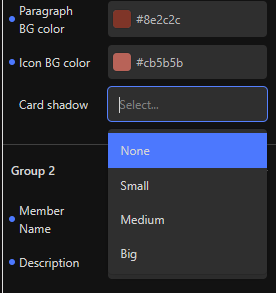
Example for 3.): If you have a component with multiple blocks inside (f.e. div with an image and a text in it) you sometimes have to change styles on multiple blocks in the hierarchy to get a certain layout. So maybe I have a simple component style like color but also want a more abstract compnent style like “Image position: left, right, top, bottom” where I have to alter the flow direction of the div but als that the the text in the component is centered when the image is top or bottom. Now the Editor should be able to pick a color for the color style and one for the image position. This is basically what @krievinshj showed in the screenshot:
It would be amazing if we could add multiple style options, especially as it would make it easier for editors.
Hi @Louis,
Just wanted to check if there is any progress regarding Component Style groups. Currently, I feel this is the only thing holding me back from incorporating components effectively across websites I build. It would be really game-changing for components and the way to use them.
While trying to figure out a button system I landed here. I would be glad if this concept went higher in the priority list. This would make working with components way more flexible.