@StrangeTech, I completely agree with you on this.
@Louis, first off, thank you for the components, this is a game-changer. And thanks for implementing this request right from the first version of components. I’m genuinely excited to try everything out.
However, I must agree with @StrangeTech that, while this is a step in the right direction, it’s somewhat different from the request I (and seemingly @StrangeTech) had in mind.
My idea was that each style collection would have its own separate select box. Let’s use a button as an example. I’m currently working on a website that has Primary and Secondary buttons. The Primary button is black, while the Secondary one is red. Throughout the site, there are three button sizes: small, medium, and large.
I envisioned creating a button component that I could use throughout the website, and which would offer options for both: style (black or red) and size (small, medium, or large), covering all possible button variations for that site. I expected the interface to look something like this:
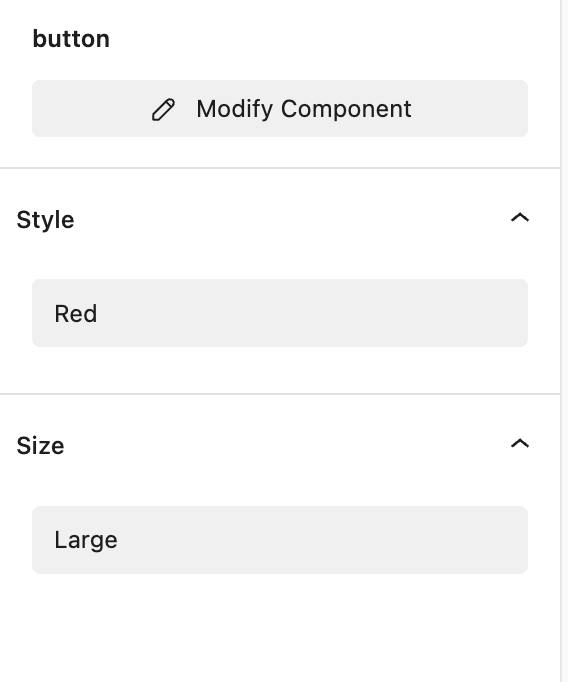
Currently it is single dropdown and I need to create style or collection for every possible variation: black small, black medium, black large, red small, red medium, red large.
So, having a separate select box for each collection could make this much more efficient.