Hi,
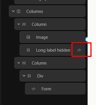
I don’t find the current navigator buttons display very handy:
- With a few nested blocks or long labels, buttons appearing on hover are partly hidden because they overflow the navigator panel.
- The only way to access the buttons is to scroll horizontally.
This becomes terrible when you need to delete a few blocks in a row because each time you delete a block, the scroll resets to the left 
Maybe limiting button width to panel width and displaying them with absolute positionning – possibly masking the label, which would be OK for me – would solve this:
We were thinking the same thing.
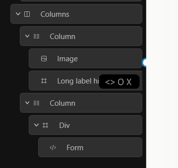
One minor enhancement may be to make it horizontally sticky rather than absolute. By sticky I mean that normally they would be fixed to the right in a consistent position but if the action buttons do not fit within the available width for the button (for example in a deeply nested block with a small sidebar width), then they should behave like they currently do to enable them to be accessed via scrolling.
Yes I guess sticky could be nice, maybe leaving room for a medium length word after the block icon.
Or keeping absolute but only allowing buttons to appear on hover when block is visible enough (icon + a few letters in label), forcing us to scroll a bit if needed.