No I deleted WP
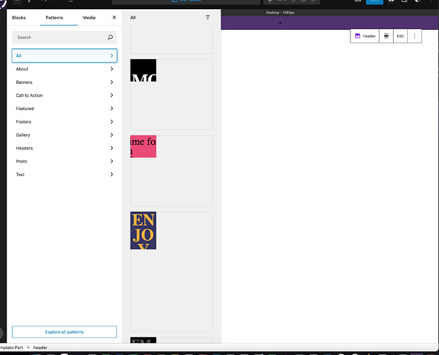
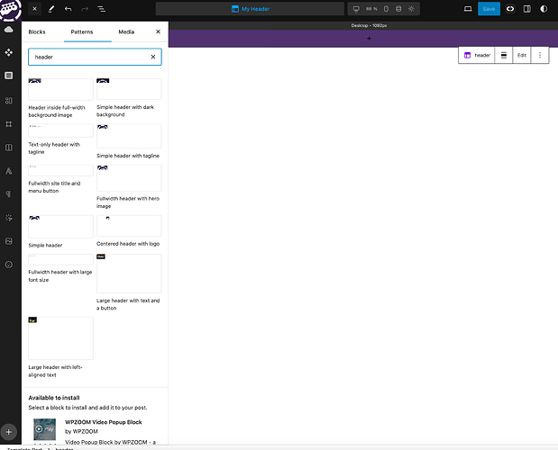
but there are pre made headers, footers and patterns if I search in
the Cwicly editor.
Ok so in the Child theme, add header and footer and write in the Paragrph header and footer, ok
The parent them stays with empty templates and parts ?
And then where do I add the real header and footer ind the child ?
Which thew the error ?
Making it from scratch ?
There where some simple premade ones when the thing was working with the “name of a person”- header like mikes-header
Nope, I added the Header and footer after I switched. again.
bu that doesent work. trying to set up a frontpage template it throws the message
“Template part has been deleted or is unavailable: header”
I recreated the same situation at least 4 times so far and didnt customize anything before switching.
I did it, dosent work.
I have used the cwickly blocks before when it worked,
now its very limited and looks diffrent.
but why these blocks are not there anymore after installing ?
Is it a setting ?
Why are there layouts, if there is none ?
I dont think its a WP layout it looks way too good =)
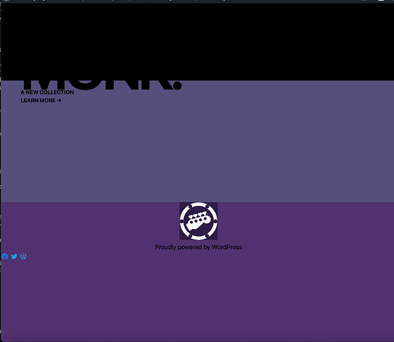
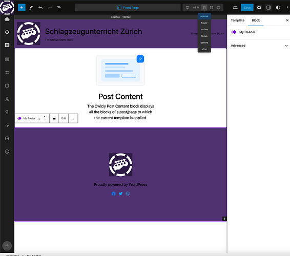
Now post content works, but the footers and headers dont show, no matter if I create a “my header” part or if I fill the child theme part,
The Cwicly blocks work again now.
Holy Cow !!!
I think it works now.
(I hope …)
Choosing My Header in the Front Page Template did it.
But before there was definitely something wrong, this is on a fresh install.
If I could import that menu I made last week when Cwicly still worked, would be very cool.
The only way importing i found so far is .txt. That doesent seem to work
it says, template part is missing or similar. what i can think of is that the Navblock needs to be there because the txt contains the styling. but it also is the whole site i think.
Somewhere I read importing json, how to export json, I didnt find in the docs page.
If this runs its very good, but the annoyance level getting it running is pretty high =)
I hope I get my page online soon, fall is is a bad time for the site to be down, no new students for winter and spring.
Still wondering where those patterns come from, it doesent look like WP to me. If this is not a technical issue, it would help a ton with the layout.
I hope the worst is done now.
You guys must have had a good time laughing, seeing me search ![]()
Thanks a lot again for the help.
Heh, yes those are WP patterns.
This is good news!
![]()
If you still have that instance somewhere you can simply go into the template on the old instance copy the blocks, go to the template on the new instance and paste the blocks (no need to export/import).
It seems like you had some teething problems and a lot of them were not related directly to Cwicly, more so environmental issues and adapting to using WP FSE (Full Site Editing), block themes and templates.
Starting up a new Cwicly site is usually very fast once you are familiar with the process.
![]()
The quickest way to help you isolate this is to see the actual output online.
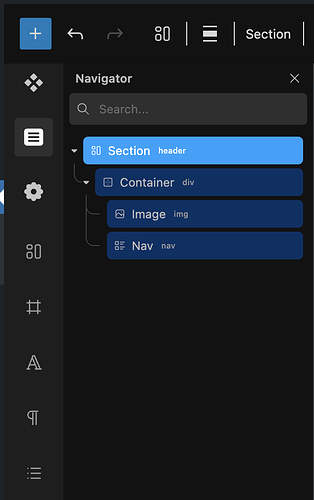
In the meantime, if you share a screenshot of your blocks structure in the navigator in the Template editor for the Header and Footer templates I will be able to give you some pointers.
Example:
I have to gain access to the online site first, set everything up on the server. At the moment Im not home, tethering the net over a phone and have very weak reception.
However, the left side display was my bad.
3 days ago I realized, in the very beginning I built the Nav inside a GB container and mixed GB and Cwicly blocks.
I know you, mentioned several times, Gutenberg blocks cant be edited with the Cwickly, and that there is no headers or layouts.I didnt get it at all.
After I got the editor to work and set the preferences,
I have seen the differences.
Since your last message, I started over, only using Cwicly blocks, and following the A-Z website menu video, in the docs
Result: Looks good, works bad.
The header looks is the way it should, the problem is:
-
The modal menu does not move clicking the menu icon.
-
The icons are linked to the Modal menu with the ID, as in the video.
Tried:
- Open for opening Close for closing
- Toggle for opening and closing
- Toggle for opening, Close for closing
- Open for opening, Toggle for closing
Setting the Trigger to click in the Primary Settings of the Modal opens it, but there is no closing trigger.
But thats probably not how to do it.
Searched the forum what it could be, didnt find anything related.
After almost 2 days, trying, I still could not find out why.
The good thing is, getting faster building headers … =P
Your modal seem to technically work:
This suggests that something might be wrong with the trigger icon.
There are several possibilities what’s happening here.
Could you first check the HTML tag of your menu icon? It should be <button>:
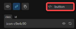
Aaaaaahhhhhhhhhhh what a releife.
Thanks
OK cool, it is fine to do it this way, I recommend the Cwicly Nav block as that has the functionality and visuals you want built in already, so it can give you a head start for the next time.
I got my old site working again, that makes things a bit easier. If I update to WP 6, it will break the site again.
So I will have to build a new one anyway.
- Now I have a question again.
In Avada there was a content box, I used it for making "blocks of content which move on top of each other in mobile view.
I didnt use all the features of the Box, I
basically add an icon title and text.
On my feedback page I used one for each student feedback.
On the Feedback page it is not that important which feedback comes next, although it would be nice to have control over that.
On the Frontpage it is really important to get the order of the boxes right, otherwise looking at it on a mobile phone, the content doesent make so much sense.
The lower part is done the same way as the feedback page. Avada calls those things Content Boxes.
I tried to make such a feedback box. A container as the frame of the “Content Box”. In the box is a DIV for the icon, a Div for the title and a Div for the text paragraph, some padding and margin.
Now Im not sure whats best way to get all those boxes to flow in the right way throughout the tree viewports.
In Avada it is in columns, but there is the usual problem, if in the left column text is very long, and in the right column short, there is a empty gap which cant be filled.
- Then there is one more Question.
If I want to save that Box I made so I can use it again how can I save it other than Components.
Editing a saved component again is not editing its adding, for example a new style.
I would need the same I made, and just being able to add text Icon and title.
Would that be Fragments ?
Thanks =)
By the way
I hope its ok to keep posting here in the bugs reports.
Hi @Lemon,
For additional questions, the best way to get the fastest and clearest answers is to add a new “General” topic post.
If I understand correctly it sounds like Flex Row layout with or without wrapping may be a good solution for you. This will avoid the “gaps” you mentioned.
This is definitely a job for components, so you are on the right track.
To do what you want, you will need to add properties to the component and the connect those properties to the blocks inside of your component.
