Working with larger breakpoints while ensuring canvas scaling works on desktop

Description:

After the recent breakpoints update to 1.3.4, we can now add custom breakpoints.

In some cases when adding a larger breakpoint you may notice the canvas scaling is locked to a specific value and clicking on other scale factors just reverts back to this value.

if you create any breakpoint larger than the available space that causes the scaling to be lower than 50%, the scaling factor will be locked.

Example: Assuming your base is desktop and you create a “massive” breakpoint at 1920 - it creates a min rule and then due to this larger value, the desktop breakpoint will go to a maximum of 1919, which causes it to scale down proportionally on screen based on the available viewport size.

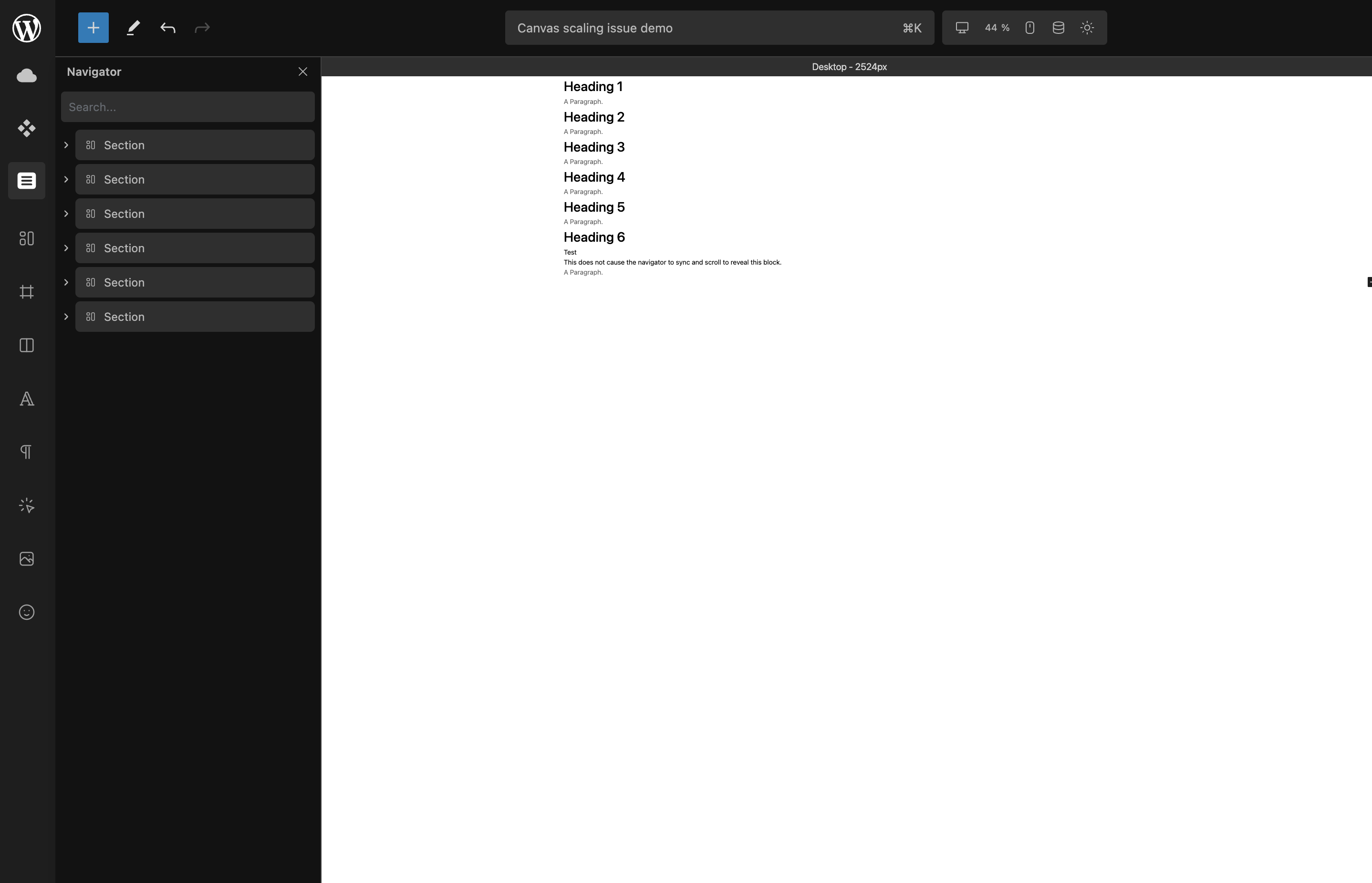
Example of the scaling factor being locked with a larger breakpoint of 2500 added:

Solution:

If you want your desktop to be the base and you want an additional “bigger desktop” breakpoint that covers everything larger than that, you can set the “bigger desktop” breakpoint to 1px larger than the desktop value and this will mean the desktop displays correctly and allows you to scale down.

Then, you can add any number of larger breakpoints to that without issue, including the “massive” one above.

Note: This was not a bug, but a feature that is a necessary side-effect of the new breakpoints system.

When using breakpoints larger than the available viewport size, the canvas automatically scales accordingly.

This might be rather connected to how scaling works in general and is likely not related to the new custom breakpoint implementation.

However, when checking the recent related fixes earlier today, I wasn’t able to select my desired scaling value, it somehow didn’t let me change it, and this definitely was not related to the expected behavior (auto-scale to available width).

I’ll monitor and return (or create an new report) if I run into this again.

This is the behaviour I was talking about - if you create any breakpoint larger than the available space that causes the scaling to be lower than 50%, the scaling factor will be locked.

I have moved this comment to the main post for ease of access.

Hey @StrangeTech, thanks for your feedback.
I’m convinced this post will be useful for some in the future :+1:

As mentioned above, what I described was not related to or dependent on anything.

Indeed, I thought about it and converted it to a tip for this reason.

Understood.

Hi guys and @Louis,

Sorry but I have a similar issue and it’s driving me crazy…

I haven’t created any breakpoint, so only using the default ones, and since recent scale system update, I’m stuck at 86% on desktop with navigator and inspector panels opened. I can reach 100% only if I close one of the panels.

So, I actually can’t work at 100% any longer, which is very confusing, especially working with text sizes or spacings.

What is even crazier is that if I zoom out just 10% with the browser zoom (CTRL -), then I can reach the 150% scale with Cwicly, which is way bigger than the 100% without browser zoom.

Sounds related to this thread but I’m not even sure, and I can’t understand the reason why we couldn’t scale more.
Is it really a feature?

Thanks in advance if someone can clarify this :wink:

Hi @yankiara,

I can understand your considerations in wanting to view it at 100%, there are some technical considerations in this regard.

Effectively the current implementation in Cwicly appears to be that the canvas view displays the full width of the selected breakpoint within the available space and scales accordingly.

Logically the only way to maintain 100% scaling and reduce the available canvas display width is to introduce horizontal scrolling.

So, unless Cwicly allows scrolling as an option, there is no way to both retain the 100% scale and decrease the visible width below the breakpoint width.

Therefore, if the width that is available on your device’s screen resolution (or your browser viewport width if not displayed full screen), minus any visible sidebars is less than the selected breakpoint width, there will be some scaling.

I hope that makes sense to you and clears things up a bit.

OK, I’m starting to understand my confusion now…

When this update was released, I was expecting this scale mechanism to be a kind of physical scale/zoom that would get us closer or farther from the screen, so without modifying the logical viewport, thus without affecting content.
A sort of width LOCK like in Bricks builder (which is awesome by the way: lock at 1920px and whatever the viewport, open panels, etc, canvas is zoomed to show the site at 1920 on frontend).

Of course, if it was like this, there would be no way to scale above the max viewport width available without having to scroll horizontally, so I totally agree with you.

But it is not like that, according to my tests. The Cwicly scale is actually a logical viewport scale and not a physical canvas zoom, so I guess I was (wrongly) expecting that I could work at base breakpoint and see 100% size, like if no responsiveness was applied, which would actually make no sense :rofl:

Thanks to your explanations, I understand now that if we go above viewport width, logically we should switch to the breakpoint below, and it must be the reason why it is not allowed (reset back to max available), because we would edit base breakpoint seeing tablet view, which would be confusing.

So in conclusion, it looks like it is working OK, but that unfortunately my laptop settings won’t allow me to see the base breakpoint at 100% (zoom 125% in Windows 11 and some zoom factor in the browser to be more comfortable).

I’ll try to handle this in some way, thanks!

1 Like