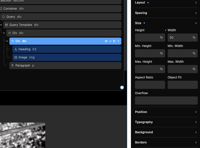
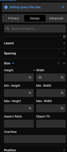
After a query, to display my “divs”, I use flex (row, center, space around) and a “vw” size.
But, as they are inside a div and a container, It would be much more logic to use a “%” size.
And… it brakes everything.
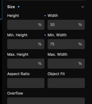
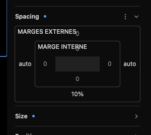
For having my divs back mor or les correctly, I have to introduce two more values, a min-width one and an “auto” marging left-right.
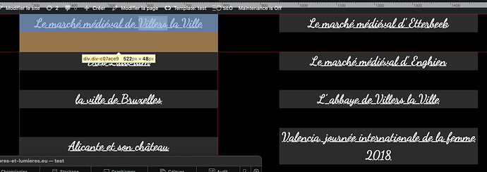
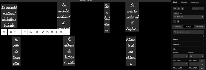
Here 's a series of print screen.
First, with “vw”.
Second, with “%”


I thought I had the solution.
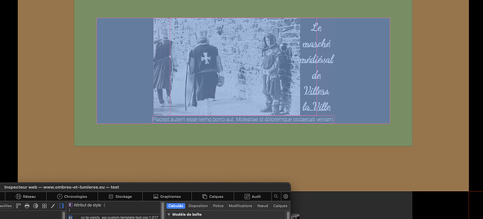
So I added a paragraph and… an image that is braking again the design.
and with the inspector, you can see that it takes all the screen width
Hi @Ombres-et-lumieres,
This is less of a Cwicly question and more of a CSS question.
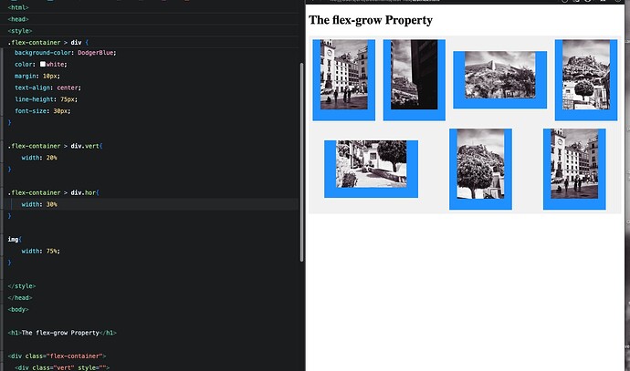
The width of the child elements in a flex box layout are determined by default by the direction of the layout in coordination with the constraints of the parent size and the children size combined with the values of the flex-grow, flex-shrink and flex-basis properties.
There are plenty of good guides to explain this, here is one:
1 Like
Thanks for the answer
… even if it is not cwicly stuf.
But I didn’t know where to ask
1 Like
After more testing, it was really a Cwicly specificity: after the query and the query template, I added a “div” to enclose everything.
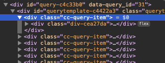
But, if I look at the Html produced, Chicly introduced another “div”, named “cc-query-item”, between the query template and my div, so it is impossible to give a dimension to my “div”.

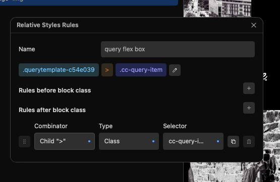
So, I had to add, once more, a relative styling instruction for having the size on the right div.

And, as I tested on pure html, it works
