Since I discovered the “flex” property in css, I felt in love with them. ![]()
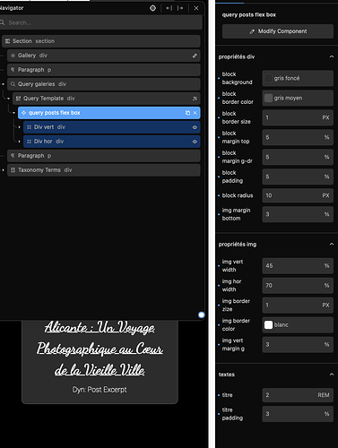
As photographer, I need to types of box for my pictures, vertical and horizontal. So I build a component for it, with display conditions.
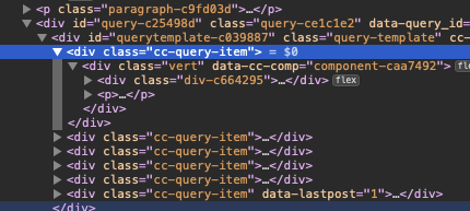
But, I had a problem: impossible to give a responsive size to the box, the fault of Cwicly that introduced a “div” named “cc-query-item” that doesn’t appear in the back end.

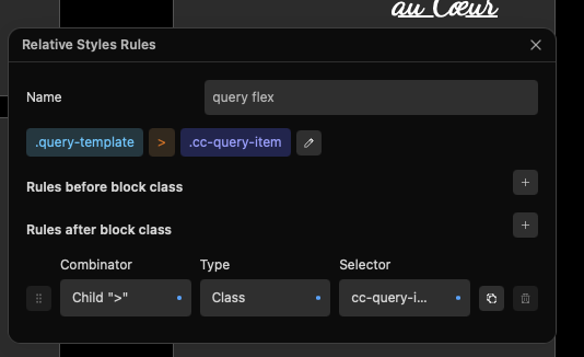
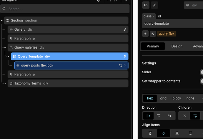
So I used a relative styling for that

The component is quicker with the right default settings

