I do agree with the part of consistency and find the best solution would be to replace the text with icons.
This saves valuable space, size is always the same, and also makes it more “readable” in my opinion.
A tooltip that appears on icon hover (with position description; e.g. “top”) could be added, if necessary.
I do disagree with the position swap, it should stay where it is.
It could become a possibiliy in case icons are used instead of text
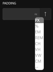
In addition, the dropdown values should be larger, right now they are barley readable.
Also, if possible, it could be made dark-mode ready.
This is my suggestion: