Any guidance on how to solve this?
https://i.imgur.com/KhERaPP.gif
I am using the Header template part and the simple menu element. I am scratching my head for a couple of days to figure out what’s going on.
Any guidance on how to solve this?
https://i.imgur.com/KhERaPP.gif
I am using the Header template part and the simple menu element. I am scratching my head for a couple of days to figure out what’s going on.
It is not possible to isolate the cause from the video alone, but the first thing I recommend checking is whether you have added any margin between the parent and nested menu item container.
Any gap with no blocks present inside the hover area will cause the menu to disappear because technically the mouse will be “over” the underlying page in that case.
Thank you for reply!
I a have defined a top: 40px through custom css on the dropdown to achieve the visual layout of the menu so to speak. On :hover I want the dropdown to be positioned at the edge of the black div as it appears in the video.
I am a newbie in web developing and I am trying to understand what I have to do to achieve what I am looking for.
This is how the Cwicly’s Navigator panel looks like:
I recommend changing this. Instead, make the main menu and the height of the buttons inside of it 100% of the dark div height.
This should give you the exact result you want without the gap.
I might be dumb or for some reason is not working.
I removed the top: 40px from dropdown and for the Menu element, under Design->Sizing->Height I added 100%. The dropdown menu is not aligned at the edge of the black div.
Also I do not see options for the buttons inside the Menu element. I mention that this is an element added from Cwicly and is not custom made by me. I don’t think I can control the styling of buttons from the interface. Maybe with some custom css to target the UL tag
There are two ways to ensure your menu is the height of the container:
Depending on your specific design, you can choose which one works best for you.
For the sake of an easy demo, I will assume the second option for now.
The Menu block has style options for the main block and its items as well as for sub menus and their items:
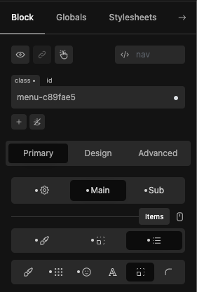
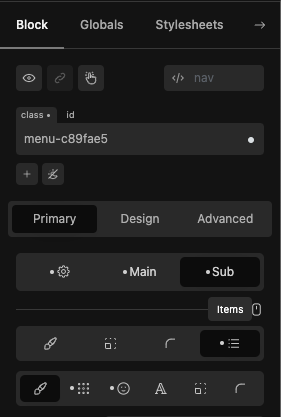
These do not provide direct access to the padding of the items though, so we can do that either using relative styling or custom CSS on the Menu block.
For this specific method to work the prerequisite is:
Any Section, Container or Div blocks wrapping the Menu block do not have a specified height and automatically take the height of the menu.
Here is an example using the Advanced SCSS tab for the menu block.
Simply add the following CSS to the Menu block (note: blockclass dynamically targets your block):
.blockclass .cc-menu > li > a {
  padding: 2.5rem 0; // change 2.5rem to whatever vertical padding you need above and below the menu items
}
Here is an alternative example using relative styles for the menu block.
Add the following relative style:
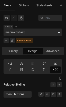
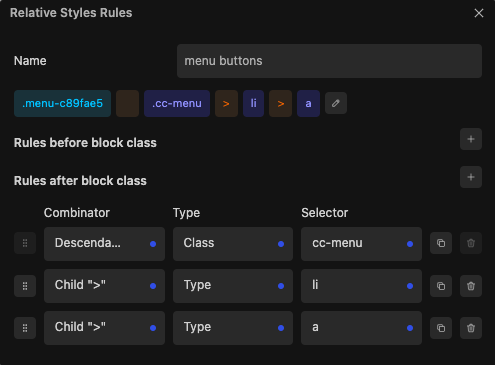
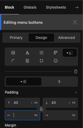
Note: Use the relative style method if you prefer to work in the Cwicly UI.
With either method, your menu dropdowns should appear directly below the menu items including their padding, you don’t need any other styles to make this work (i.e. you don’t need height: 100%, etc anymore).
It works! One step further for me into the learning process. I appreciate your willignes to help me and thank you so much for your time! ![]()
![]()