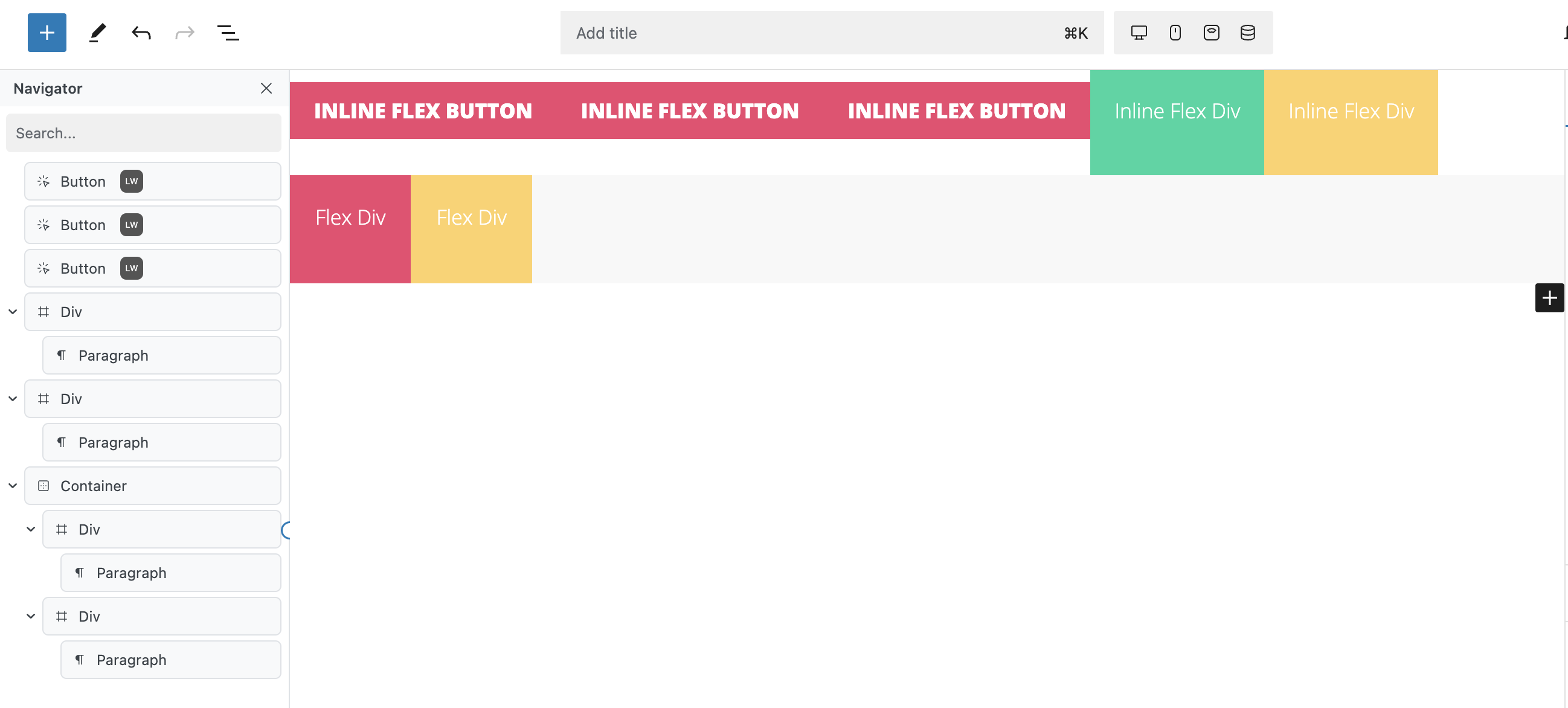
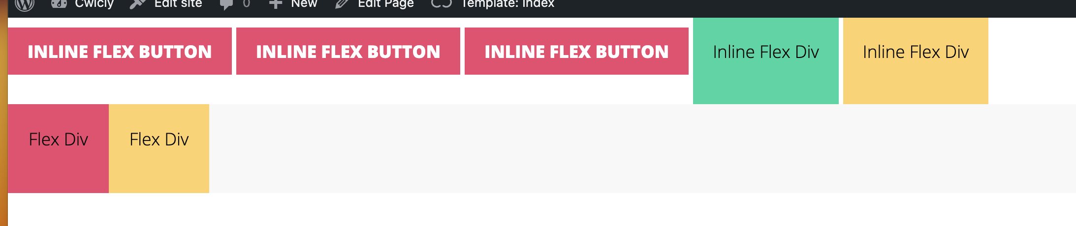
Elements set to display: inline-flex render differently on the front end than in the editor. In the editor they have no gap between multiple element, while on the front end they have a gap of several pixels. This is true of Cwicly buttons or of divs set to display inline-flex, inline-block or inline. It’s not entirely unexpected to see a gap with inline elements, but the inconsistency between the editor and the render is.
Elements set to display: flex; render as I would expect for flexbox.
Do you recommend wrapping buttons in a div and using flexbox instead?
Step-by-step reproduction instructions:
Add three Cwicly buttons in a row. Add some padding and a background colour. They buttons will have no gap in the editor but a will do on the front end.
Unfortunately, this is currently out of our hands, and I highly recommend you bring this up with the Gutenberg team so they can provide users with an alternative.
The basic reason these gaps appear on the frontend is because Gutenberg automatically separates every block with a space/line break (the same way you would write nice looking HTML in most cases) → inline elements take this space into account.
In the Editor, the logic is different and blocks follow each other consistently without that added formatting.
Thanks for the fast response. In all my years of writing HTML and CSS, I have never noticed that this is actually default browser behaviour - it’s not even Gutenberg according the test I just ran. If one runs the anchors on the same line in the markup (ie no line-breaks, as you referenced), there is no gap between elements. I guess it makes sense logically, to a degree.
I can also now confirm GenerateBlocks does the same.
It was the fact there was a discrepancy between the editor and the front end that threw me, but that’s just down to the additional marking in the editor, is presume.
Sorry for taking up your time on this one.
Really enjoying Cwicly so far. Components looks great, and the minor UI tweaks in the editor just released make the world of difference. Much neater now!
Regardless of this gap discrepancy, I would highly recommend this for other purposes like justification, alignment or line wrap (multiline or not).
Using inline elements without a wrapper always result in some raw ouput and most of the time unwanted (because uncontrolled) behaviour.
It is also much easier when you need to copy/paste/move the entire line
Or to style it globally (padding, background, etc.).
Yes, totally agree. In a real-world scenario, they would always be within some container or another, it was just whether the button group should have it’s own - dedicated - wrapper. That’s how I’d usually hand code it in order to take advantage of flex controls for stacking etc at break points.