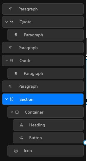
And when you do have a lot of items selected on the Canvas, like say you selected a bunch of Paragraphs, they are not active on the outliner, they are also not blue-bordered on the Canvas:
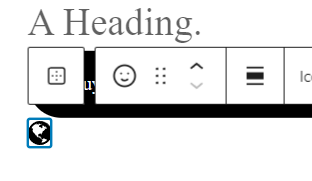
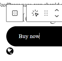
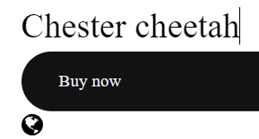
On the canvas, a lot of elements are not blue-bordered on the page when you are focused on them / are editing them. Seems to be mostly text-based blocks (heading, button, paragraph, etc but probably more I have missed). Like this example here, the Icon is bordered when selected. But the Heading and the Button are not. It can easily get confusing at a glance as to what you have targeted / accidental miss-clicks / selects happen
Selected the Icon
Selected the Button
Selected the Heading
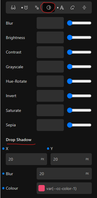
There is no Dot indicating Drop Shadow is enabled as a filter on the Filter toggle. But enabling any other filter turns on the Changed Dot thing:
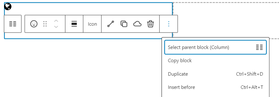
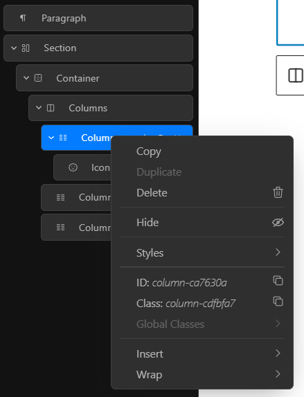
When editing on Canvas, you cannot right-click to get the quick-edit options. You have to go to the end of the editing pop-up and select the three dots. But in the Outliner, you can right-click and see the quick-edit options. Makes it inconsistent and I find myself getting frustrated
When Cwicly opens up popups, they’re centered on the screen instead of close to the right panel. Small popups like this should be close to where they’ve been opened, makes it quicker for the user. And isn’t Cwicly about speed? It’s in the name ;D
And last for now, but probably most important, I would like to be able to have the option of making the Cwicly interface a little bigger. It’s very small on my monitor compared to other tools.
To get a faster response and to ensure each point you raise gets the attention it deserves, it is usually worthwhile to create separate requests for each point, especially if they are about different features and/or distinct parts of the UI.
This is already requested:
If I understand your point correctly, @Louis has already commented on this elsewhere - this is by design. Any element that has styles associated with it respects those styles on the canvas. This behaviour was chosen based on user feedback with a view to make the editor more closely reflect the frontend appearance.
This is a good find. @Louis, highlighting this one for you.
As the Cwicly editor is built upon and enhances Gutenberg, this is a convention from that. I can see how it could be useful.
You can drag the modal dialogs to any position you like and that position will be remembered.
In terms of general UI, the navigator width is resizable, the overall UI responds to zooming in the browser (e.g. Ctrl/Cmd+ / Ctrl/Cmd-) and there is a preview scaling feature in the top bar.
Perhaps there is something specific you are wanting to be bigger and if so, let the team know.