hi,
I have some pages setup which render just fine on mobile. Example: https://webmaat.nl/wordpress-website-analyse/
But a duplicate page with different content: https://webmaat.nl/website-onderhoud-bestellen/ got an overflow which I somehow can’t get rid off.
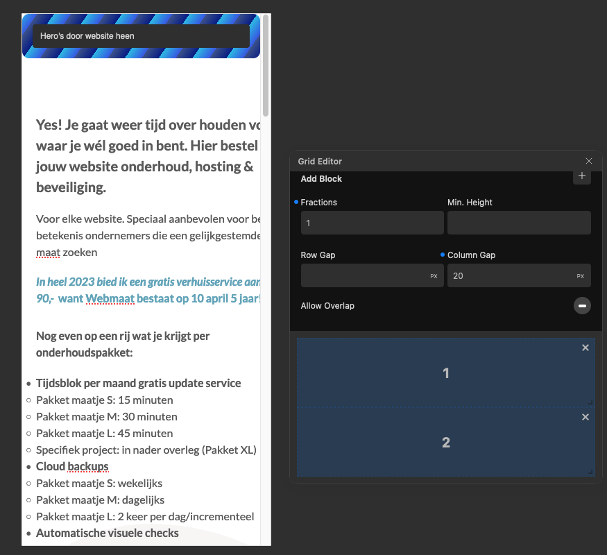
The only difference in DOM between the two is the grid specification that is there on the good rendering page (like: grid-column: 1/2;
grid-row: 1/2; )
But I got the grid exactly the same. I overlook something. Anyone any thoughts on this? Thanks
I’m sure you have already ruled out the difference in column gap being a contributing factor, so I won’t mention that.
There may be other factors causing the overflow, such as the layout used for the individual columns and/or the sizing/layout applied to elements within the columns.
Perhaps worth checking this as a starting point.
Also, may be worth checking the Auto Grid and Auto Template properties are consistent for both grids/pages.
1 Like
Hi @webmaat,
Sorry to hear you’re experiencing trouble with this.
Thank you for helping out, @StrangeTech!
I would suggest setting overflow:hidden on the column block containing the checkout form, as it seems to be causing an overflow issue.
Please let me know if this helps!
1 Like
Hi,
For me at 300px width, both pages overflow.
At first glance, it looks like the forms you use have some incompressible width, so the grid extends with the width of the 2nd column, so the first colum extends too.
1 Like
Thanks all for helping me out. (I love this forum). @Araminta overflow:hidden on that column did it. thanks.
The form is part of a headless Surecart e-commerce solution. It got some less CSS control.
1 Like