Show post content's relative styling in back-end

I believe I may have briefly mentioned this in the past, but it would be great if post styling in the back-end closer resembles the front-end.

For example, let’s use Jaume Blog Post from the Cwicly design library as a post template.

It has relative styling set for headings and paragraphs within the blog post:

image

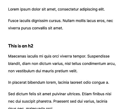
On the front-end, it appears as:

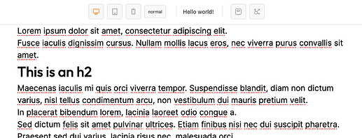
But on the back-end, it doesn’t take any of the styling into account:

3 Likes

Already forgot about that, thanks @sunny :+1:

1 Like

I agree. It would be nice to see on the backend how the front-end looks and vice versa as close as possible.

Many other page-builders can do this (although not always 100%), so peeking at how they render both back and front-end might give ideas/insights.

Constantly switching from back to front-end to see how things get rendered is not ideal for single monitor setups. I really wish I had two monitors!

2 Likes

In my experience most page builders actually don’t already do this, because they’re not based on Gutenberg. You just get a simple default post layout set by either the theme or builder.

I see people mention this from time to time, but for me, it always looks identical on the backend. Even with my own custom CSS that I’m pulling in via virtual classes. I’m using the Cwicly theme though, so maybe that is the magic?

This topic is about reflecting specific rules of a template inside the editor, which are setup via relative styling, not the general editing experience, which in most cases should be pretty accurate.
These are only visible on front-end currently.

Thanks for the suggestion @sunny.
1.2.8.1 brings this into action whenever editing on the Post Editor.

I’d be very interested to have feedback on this one, and how it translates in multiple and various environments.

2 Likes

3 Likes

On first test it looks much better! I’ll be able to give more feedback once I start building out a few real templates over the next couple months :slight_smile:

1 Like

Hello Louis, as you ask for more suggestion, please have a look if you have some spare time.
Cheers.

Hey @Louis, have three more suggestions for you here regarding the Post Content styling in the back-end.

1) Inherit display property value set on Post Content.

I currently can’t get element margins on the back-end to match my front-end.

My post content wrapper doesn’t have a display value set (which is effectively display: block by default), meaning element margins collapse into each other.

However, in the back-end Cwicly applies this rule:

.editor-styles-wrapper .is-root-container .edit-site-block-editor__block-list, .editor-styles-wrapper .is-root-container.block-editor-block-list__layout {
	display: flex;
	flex-direction: column;
	width: 100%;
}

Which causes each margin to stack instead of collapse.

That leads to margins on the back-end that are considerably larger than the front-end.

I tried explicitly setting the Post Content to display: block, but it gets overwritten by the rule above.

Assuming that setting the Gutenberg canvas to display: flex is necessary, it’d be helpful if it could inherit the display property from the Post Content element.

EDIT: Somehow I forgot that the editor pulls in your global styles :man_facepalming: Adding this rule allows me to overwrite it:

.is-root-container.block-editor-block-list__layout {
  display: block;
}

2) Apply Post Content styling from classes as well

It appears that only styles applied at the block level get reflected in the back-end.

Given that I’ll use a Post Content block across various post types & templates, it’s currently a bit tedious to work with.

I need to copy the Post Content element to each template, and any time I make a general change to a relative style, make the change to each element.

Modifying the global class would of course be much easier :slight_smile:


3) Make it possible to use :where in Relative Styling to reduce specificity

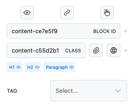
Another issue I’m running into is when adding styling to my heading elements using the Post Content’s relative styling.

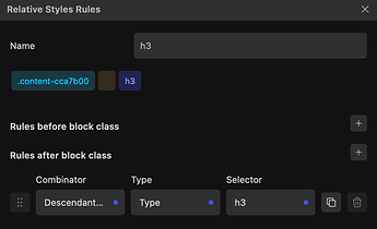
I have this RS set up:

And then I’m giving the h3 a font-size and margin so that they look good within blog posts.

This works, but it’s giving the styling too much specificity.

If within my blog post I have a CTA box with an h3 element, the block will have a lower specificity than the general h3 styling.

Ex. “.content-cca7b00 h3” takes precedence over “.my-cta-heading”.

If I could instead use “:where(.content-cca7b00) h3” for my RS rule, I wouldn’t have that issue.


Hopefully those make sense!
1 Like

I think this fourth idea might solve all of the above? (if it’s possible)

4) Add Post Content’s CSS classes to the editor DOM

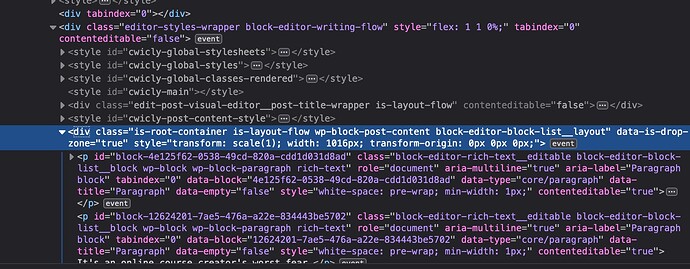
Let’s say you have a Post Content block and have added a .post-content global class added to it. That class would then show up on this element in the back-end as well:

This would allow you to reference your Post Content from your global CSS.

That means something like “.post-content h3” in your stylesheet would show up in the editor.