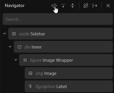
Visible HTML Tags inside the Navigator with the ability to quick-toggle it inside the header:

Visible HTML Tags inside the Navigator with the ability to quick-toggle it inside the header:

This is brilliant!!!
You have my 10000 votes!
I like the general idea of this and was thinking of something similar - I am wondering if the positioning can perhaps be different.
My consideration is, currently the label is the main identifier for the block in the navigator - having it consistently in the same place reduces cognitive load and allows us to find what we want visually more quickly when scanning through the blocks.
So introducing another variable length element before it (i.e. the html tag name) means you have to “find” the label for each block.
Perhaps it can be shown smaller and either above the label or after it or be displayed on hover?
Having the toggle is a very wise choice indeed.
Thanks for the positive feedback @yankiara ![]()
Thanks as well for adding your feedback @StrangeTech.
As always, it’s just a quick mockup to visualize my thoughts.
I indeed played a bit with the positioning and came up with this one.
In any case, it should be displayed in a very discreet way.
I 100% agree with you.
Displaying the HTML in 1st position is no option either because of this very reason.
But that’s rather an issue when intending to display it permanently.
Apparently, it’s not easy to find a quick solution for this one.
Displaying on hover makes zero sense imo. It’s missing the concept and intention behind it.
Showing it after the block could harm the readability too, like you mentioned with the actual block labels.
Hopefully we get more input from other users to see what they think.
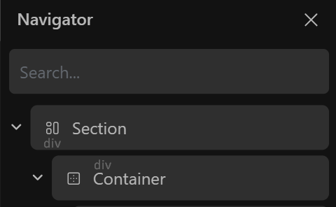
I think that the html tag has to be discreet and should not alter current label & icon alignement.
I would try either below the icon or above the label, with low contrast color:

(I don’t mind it being very tiny but for accessibility purpose I guess some minimum size has to be used.)
I think that’s not very readable in terms of a DOM tree list view.
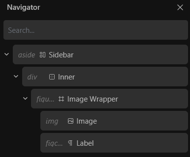
Giving the HTML tag a fixed width could be an idea to keep overall consistency.
Another approach could be a dynamic width which would be the width of the widest HTML tag in the entire Navigator (with a capped max-width which could be something around the section tag length.)

Remember, the proposed quick-toggle could provide a very flexible workflow.
The navigator width is already too small for a decent depth, so I personally wouldn’t add length to the content.
I hear you, but I can only partially agree with you.
What we need is granular control over the elements inside the Navigator items (via Role Editor).
Personally, I don’t have any issue with the width of the Navigator. I prefer to have important info and options available instead of reducing everything to a minimum.
HTML tags only make sense if they are readable in a list view, otherwise it’s only an additional info which can be read on a per block basis. That would be fine, no questions - but that’s not my idea here.
This would be immensely helpful! Site structure at a glance instead of drilling down to each element to check. And remembering to do so…