I feel like most users will want to use flex on a div 90%(?) of the time, so it’d help save a lot of clicks.
Personally I’d also want to see the layout tab come first for divs under the Primary controls, but I know that’s a bit trickier since Colors tends to come first for most elements.
Interesting point @sunny. Kind of experienced the same.
I think this wouldn’t be the best idea for a couple of reasons, instead, I do suggest the following improvement:
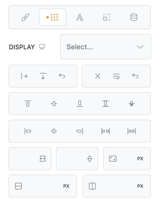
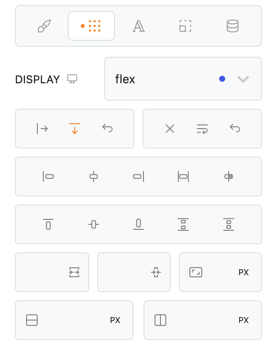
Remove Display Property dropdown list and display the most used ones as icons or labeled buttons.
The rest could be hidden inside a dropdown list. Something like a “+” icon should do the job.
This would not only save one click but also additional mouse movement, plus searching the right item from the list.
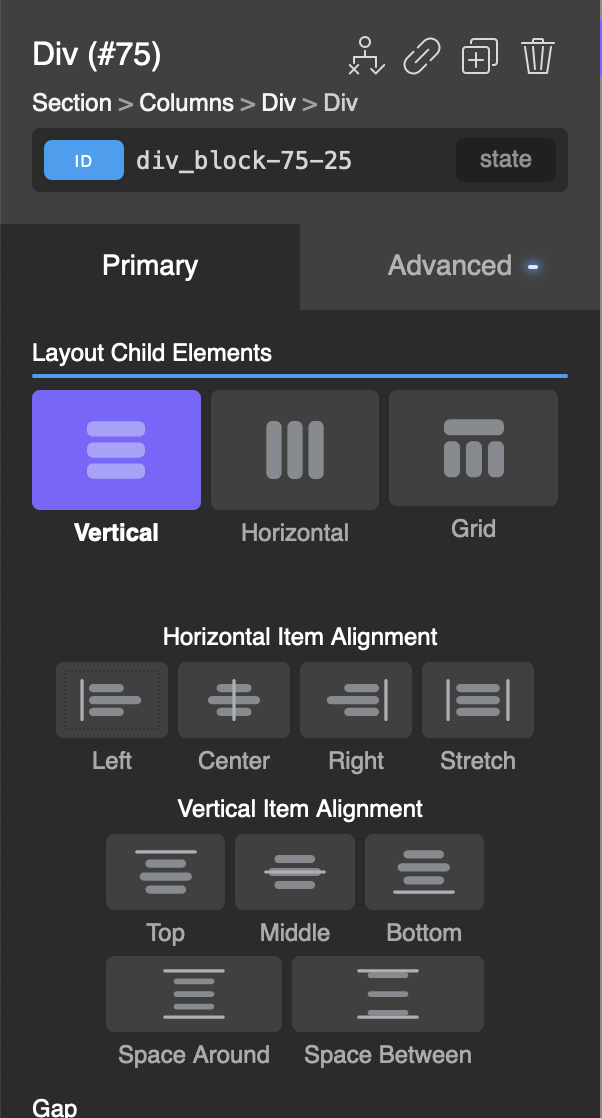
Agreed. In addition, the Div Block needs definitely the sizing options be available inside the Primary’s Tab.
This would save 2 of currently required 4 clicks, which equals 50%.
The time saving should be even noticeably higher than this.
Setting display flex and the direction would actually only be one very small mouse interaction.
This is how I tweak a new inserted Div Block:
1.) Layout
2.) Sizing
3.) Colors (mainly BG color if applicable)
4.) Margin & Padding
Typography settings is not something I would necessarily nees inside the Primary Tab.
Curious how others proceed in terms of styling area order and what they would find useful inside the Primary Tab.
Since these styles are block related, I think there isn’t the necessity to provide the same order just for the sake of a unified look.
It should make sense and improve the workflow.
What are your thoughts on moving Context to the Advanced Tab, and Typography back to the Primary?
I actually use typography on divs quite a bit, usually because I use the divs to contain meta information as link wrappers.
Not a big deal if I have to go to the Design tab for it, but Context seems like something you’d use only a fraction of the time? (I’m actually not entirely sure what it does).
Indeed @Marius, super suggestions which seemed to fit our vision.
@sunny, we removed the Typography tab as much like @Marius, we don’t tend to use it so often when accessing the Primary Tab in itself (more like when we’re already navigating the Advanced tab).
We did hesitate before removing it, as it can be a bit of a shocker, but after a few sessions with/without, decided to remove it.
It definitely fits inside the Primary group tab, so I’m fine with blaming @Marius on this one and say we reintroduce it if you users see a real benefit.
It’s also interesting to know how you feel about the Context tab. Some food for thought.
So, after a week using the improved interface, I just can confirm my first impressions.
It’s such a great experience navigating through efficiently.
Based on this, I strictly have to reject any finger pointing
Could you elaborate?
UI or functionality wise? Or how (or the fact that) it’s integrated inside the primary tab?