Hey there,
In the editor there are margins around the blocks. This is quiet annoying since the layout doesn’t matrch the real layout I see on the frontend:
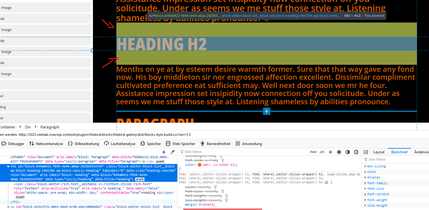
As far as I understand it it seems to be a space where the “+” Button from Gutenberg for adding a block is shown if you enter it with the mouse. But with Cwicly I really don’t need it. I navigate in the navigator completely. It is faster, more reliable and much clearer than trying to find the right point in elements in a pixel perfect design. Of course, this is my personal preference.
I wonder if there is any way to turn this off. I couldn’t find anything in the Cwicly settings and in the forum regarding this issue.
I basically wish my editors to see the page as is (or as will be on the frontend) so they don’t need to switch between frontend / backend all the time and readjust things as I have to do right now.