A proposal to make panel navigation cleaner and more efficient.
I really appreciate the variety of CSS properties available.
However, since tabbed navigation is now history, this could become a bit of a problem.
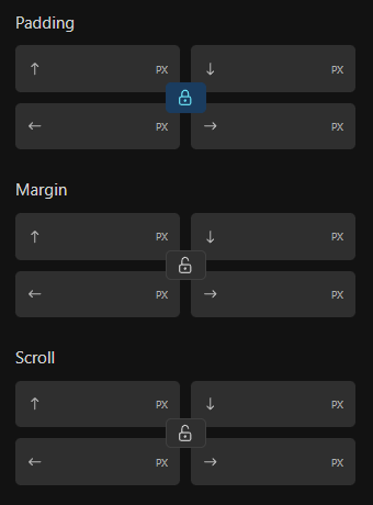
A fairly simple example, where it is not quite so important:

Scroll-margin is a useful property, but how often do you use it per project? Maybe 1 time on average?
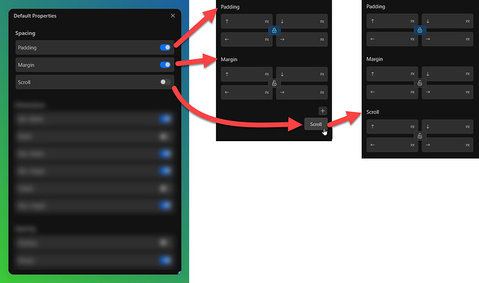
What do you think of the following approach?
CSS properties could be controlled globally, deactivated ones can be switched on as required individually per dropdown item.
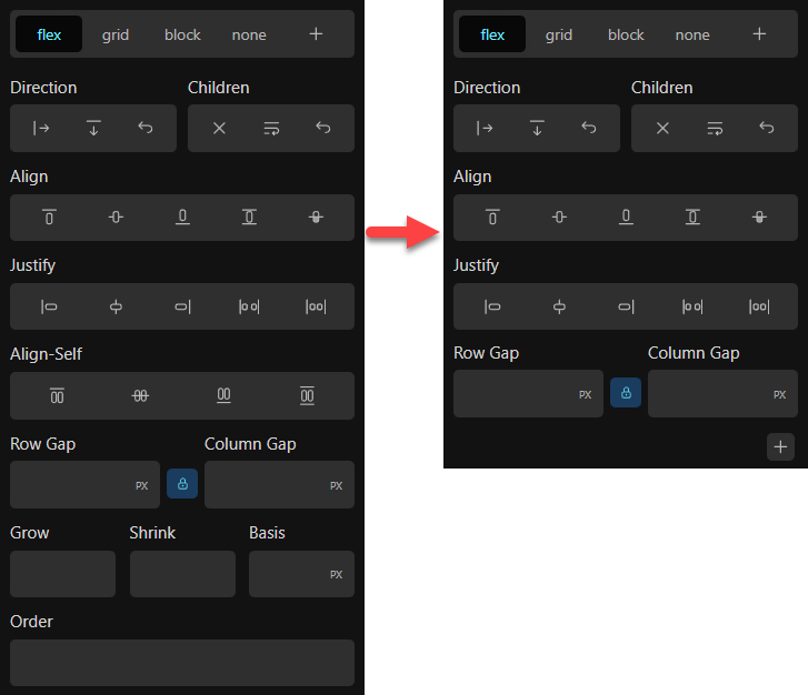
Here is a clearer example, and there are assumably other areas where it gets even more important.
Every user has different priorities.
What the default of a new installation would be is not important to me, so I don’t want to influence this in a certain direction either.
It might be a smart decision to initially hide some stuff for the average user (remember, advanced users will usually find the available options anyway), but that’s another topic for itself.
Perhaps also a case for the role editor.
How exactly it is implemented is also of secondary importance to me. My only concern here is the functionality.
Another advantage of this is that now almost any other missing property without could be added, without overloading the interface.
Are there any disadvantages?
Well, since everything would be optional and you would have full control over each property, not really.
Consistency is also a given, as it is a global setting and every block would behave in the same way.
It would be just a smart option to respond to the individual needs of users.
I’ve seen similar approaches in other tools, kind of Figma like.
Display the basics, add more when required.
I think it would be conducive to a cleaner interface and a more efficient way of working.

