I stumbled upon Cwicly while searching for a bloat-free builder that would integrate easily with dynamic data (mainly query loops and ACF repeaters). I learned a lot using Cwicly. From correctly writing HTML markup to understanding CSS and interactions. Most of this thanks to this great community. It made me think about getting into web development.
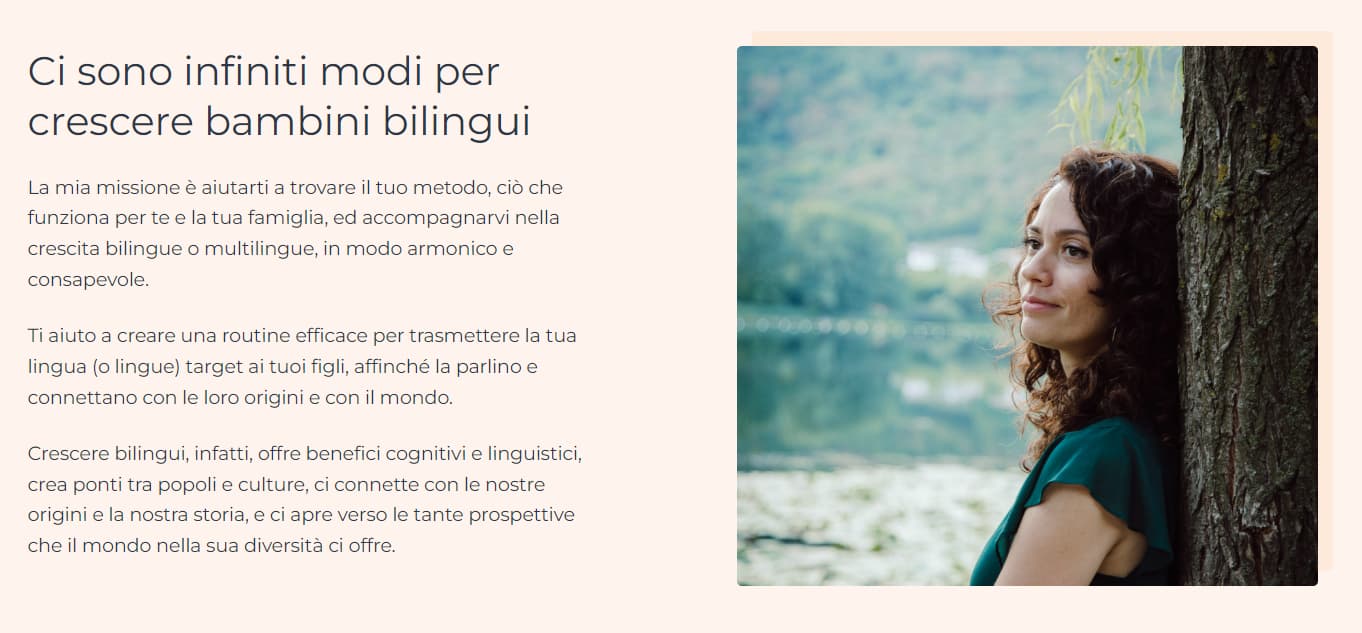
Last month I celebrated 1 year using Cwicly. So thought it’s a good time to share the website/platform I’ve been working on. I don’t work in an agency and I’m not a web developer. This is the first website I build and had to do it on my spare time. It’s a website for a language coach that provides online events, courses, and consultations.
Many implementation and design ideas were borrowed from tips and links provided be @T-low, @Marius , @sunny , and @StrangeTech . (I already mentioned that the community is as important as the product, right?)
Plugins used:
Cwicly
ACF Pro
CPT UI
Amelia (for 1-on-1 consultation booking)
Apart from that, there is heavy use of plain old PHP to integrate with BunnyNet for video streaming, Brevo for CRM, Zoom for events, and Stripe to get paid. (The maintenance of most of this could have been greatly simplified if code blocks could access Component properties)
I am very interested in advices related to design, accessibility, usability, and well anything you see that can be improved.
You may not know, but you can migrate over custom post types created by CPT UI into ACF Pro, then delete CPT UI afterwards. It’s under “Tools” menu of ACF plugin in admin menu.
I like the design scheme. Colourful, soothing.
Some things I noticed:
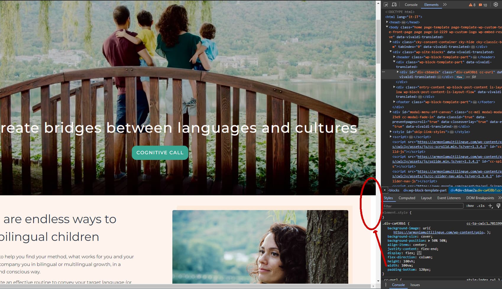
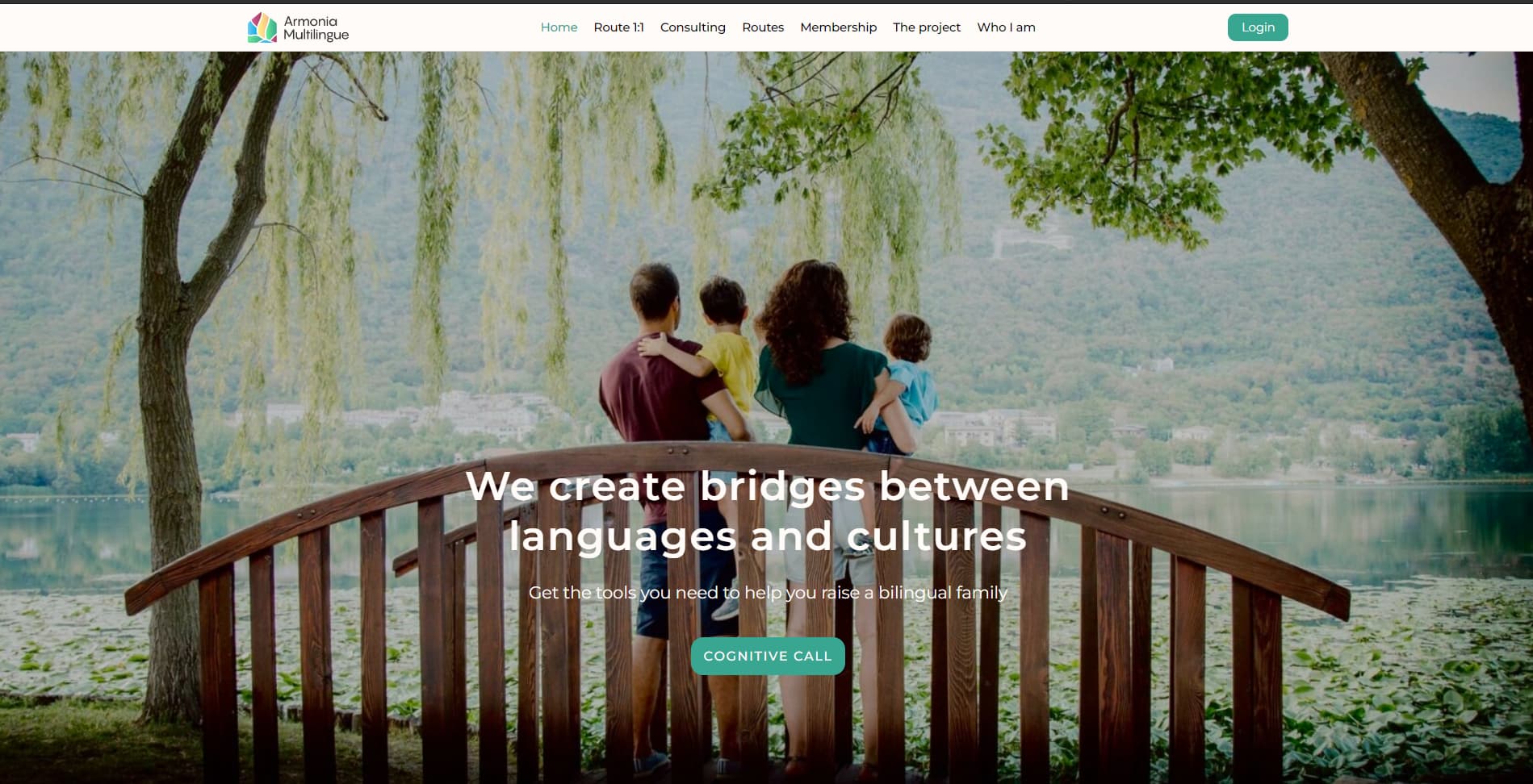
Change the hero image to 100%, not 100vw. 100vw includes the width scrollbar, so we have some overflow happening. See below:
Finally, and this is more of a style suggestion, so it’s fine if you don’t want to, but I would consider bumping up the font weight of the hero headline (H1). I would also suggest a max-width, so that the text sits within an easier-to-read block (I tested with 960px). I would also add a bit of clarifying copy just below the headline, just so that people know what the site is about.
I’d also raise that block off the bottom of the section a bit.
Sorry for the long critique. I loved the site though. I think it fits her personality a lot, which is always a great thing. She seems like a very soft-spoken, easygoing person, and the colours and design scheme matches that energy. Well done.
Thanks a lot, @owynter . Your suggestions are very helpful. I will implement all of them, apart of maybe the heading font weight which is not up to me.
I knew about the support of CPTs in ACF Pro but got a bit lazy to do the migration. I should get it done.
As for the color choice. I cannot take credit as those were chosen but someone with a better taste than mine :D. I just tried not to mess it up.
Thanks again and I do appreciate the long critique.