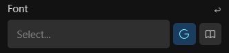
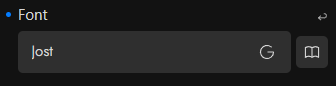
Currently, when selecting fonts, this is the default state/UI:
Google Fonts are selected (although not applied) as default. so the dropdown list only contains Google Fonts.
I’m not sure why (or if?) the Google Fonts must be separated from the Local Fonts.
Even with an option to make Local Fonts the default selection, when a Google Font is required, it must be toggled on first.
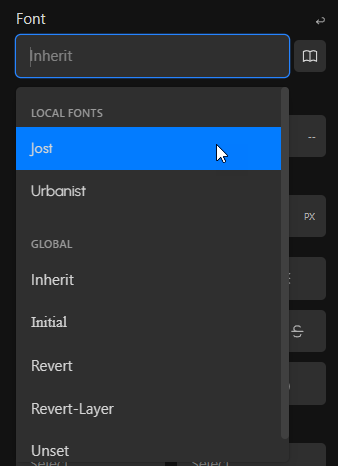
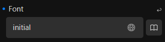
A universal dropdown list that contains
Local Fonts
Global
Google Fonts
could make more sense.
As long as Local Fonts are displayed on top of the list (if available), I can’t see an issue.
Universal Font UI
Universal Font Picker (local, global, google)
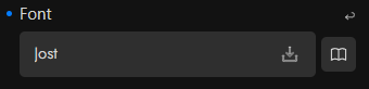
Local Font applied
Google Font applied
Global Value applied
As always, I might miss something, and it doesn’t make sense at all.
Any thoughts?
Indeed, the recent Google Fonts thread made me finally create this feedback topic which I had in mind for a longer time.
There a quite some other more or less related posts across various threads.
I wasn’t a fan of this implementation from the beginning (mainly because of the active by default G Fonts button, not because of the split font categories), but it’s not something which is bothering me either.
I just think there is room for improvement.
I find the Google Fonts toggle button not only redundant, but it also creates issues (splitting font categories and forces user action), and for some users confusion.
The process could be streamlined much more when removing it, thus decluttering the UI and make it more intuitive.
Currently, there are 3 buttons for the font family area (fallback fonts, font manager, google fonts) in addition to the actual font selection dropdown.
Oh. I thought that it is applied. Given that the G button is lighten up.
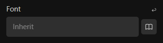
The first thing I do when adding a new block is deactivate the G button and input “inherit”. I guess that’s a redundant step that I didn’t really need to do.
Implementing this proposal would be a great improvement for my workflow. Thanks for sharing, @Marius .
Thanks for taking the time to share this detailed review of the font family selector.
There is definitely a confusion share on this forum that we were not aware of.
A reworked font selector is now available in 1.3.4.2.
Thank you @Marius for this thread and the valuable ideas, suggestions and proposals you shared with the community.
Thanks to everyone for putting forward their different points of views in the multiple threads on this subject as well.
Please don’t hesitate to let us know what you think.
Amazing, customer support is king and you nailed it with this kind of attention to details, I appreciate this workaround, it eliminates the confusion with the G active button. Thank you
The Fallback Fonts right next to the Font Family make perfect sense.
Beside the mentioned points, users, who rely on local fonts and work rather block based than following a more global approach, will appreciate this change too.
I also prefer the label approach, instead of icons with tooltips