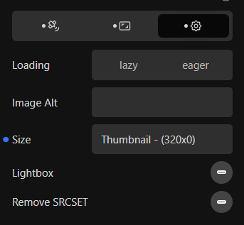
You are correct, the sizes attribute is missing. This joins some of the other posts posted here about this specific issue.
Our next update will be retaining the sizes attribute and should allow the browser to select the correct source without having to modify the srcset.
I could be wrong, but I’m guessing it is because iPads, for instance, have such a high resolution that images that are twice the size specified look better.
And you could be very right
I actually read that browsers detect devices pixel density and automatically choose the right image dimension, which allows not to bother with 2x modifier.
I actually have concerns about this… It works when image is full width, but what about small images or multiple columns grids or masonry?
With full srcset, big images are always loaded on large screens because of the full srcset
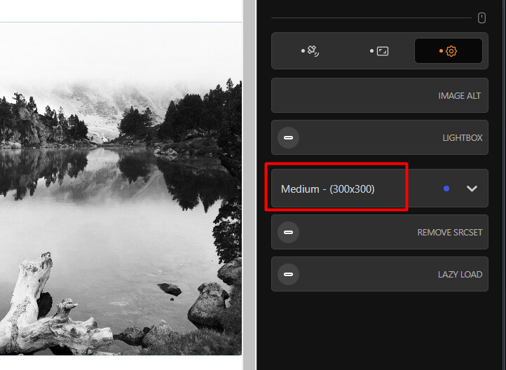
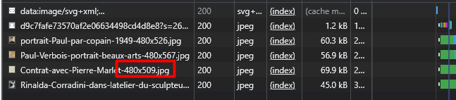
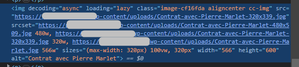
OK so I have emptied browser cache and checked everything again, and indeed sizes attribute has been added, but it seems there’s still an issue because the wrong image size is loaded.
I might be missing something so here are my settings and browser informations:
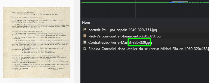
Note that when reducing window width, the right image is loaded:
OK so I’ve checked my Device Pixel Ratio and you’re right, on my big screen the value is 2, explaining why bigger sizes are loaded.
Nervertheless, I think if we have the choice of the file size, it has to be respected, regardless of the screen size.
So, larger sizes should not appear in srcset.
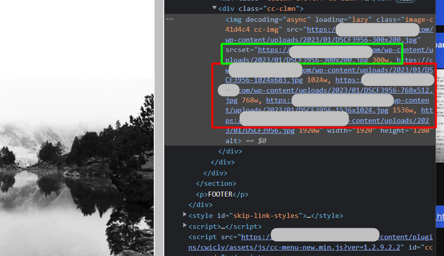
The setting has actually no effect expect changing the src file name, since it includes all srcset like when we choose the biggest size
I’ve made a few tests and same files are loaded with any selected file size and with no file size selected (default).
And the “Remove SRCSET” setting is not an option for me, since it totally removes srcset and brwoser can’t load smaller images.
In conclusion, the setting looks useless to me in its current state and it should be modified to remove sizes above the selected size in srcset list, so that we can limit the file size as we need.
Then people can choose a bigger size if they want it to be OK on 2x ratios or so.
(Maybe a warning about quality and device pixel ratio could be added below the setting as a hint.)
NOTE: If I’m wrong about it and the setting actually makes a difference I’m missing, then maybe a new “remove” setting could be added to only remove sizes above the selected size.
Removing srcset is there for multiple reasons, one being having consistency (one file)…
Although you might not see a use for it in your own situation, there are a few where users do use it quite a lot, so definitely not useless.
Once again, the 2x image size is there to prevent users getting a pixelated version of the image.
I get your point about having chosen a specific size for the image, but not sure this should be a default behaviour.
I’ll look into adding this as a an option (feel free to open a Feature Request).
Moving this to fixed as the original issue has been addressed.
I was not talking about the remove setting but the file size setting, sorry for the confusion
But I must have hallucinated for now the file size selection seems to work fine, regardless of the device pixel ratio. I’m losing my mind.
I suspect I mixed things up with my webp generation, thumbnails regeneration, page cache and pagespeed cache… Because now that site is stable in production, everything looks OK.